Choosing the right color palette for your website is tricky. A website design comprises of a variety of elements – text, buttons, links, logo, banner images to name a few. Over 90% of our initial assessment of a website is made on color alone, so it would make sense to choose your color schemes with care. To come up with interesting and attractive color palettes, designers spend a lot of time studying color theory and following schemes that tend to trend more than others.
To get you started we have gathered some of the best website color schemes you can take inspiration from. We have included color codes for each design – this way you are able to plug in the codes and create a site that evokes the same look and feel of the original site.
1. Forever Agency
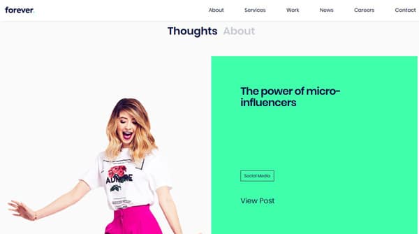
The use of bold color is apparent in this website. The bright green remains to be the main color while accents of other brighter hues are introduced in various other parts of the screen. This hue is a trend that is hugely popular among website designers. The green seen here is slightly different from the others as it is a lot brighter and is seen in locations such as the footer, icons, the sidebar and other parts of the website.
2. IC Creative


The background overlay and the oversized headline in contrasting color creates a huge impact on the viewer. Color overlays are another major trend that we have been seeing a lot this year. With the bright yellow on a dark overlay creates the dramatic effect that draws the eye of the viewer on to the screen.
3. Pittori di Cinema
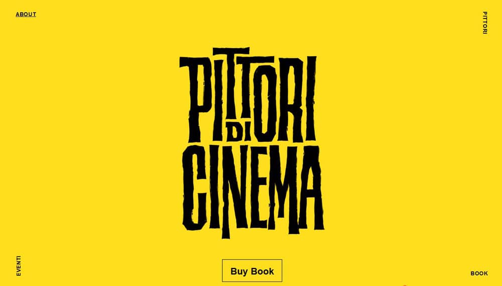

This site is a great example to showcase the effects of high color minimalism on a viewer. The bright yellow color with black is a commonly used color scheme is quite popular among designers that work on this genre. The brighter the palette, the higher the impact.
4. Cowboy Bike
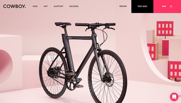
The color scheme on this website attracts the viewer to the content. The color black placed on a bright, monotone palette helps push the main content to the surface.
5. Pavithra Portfolio
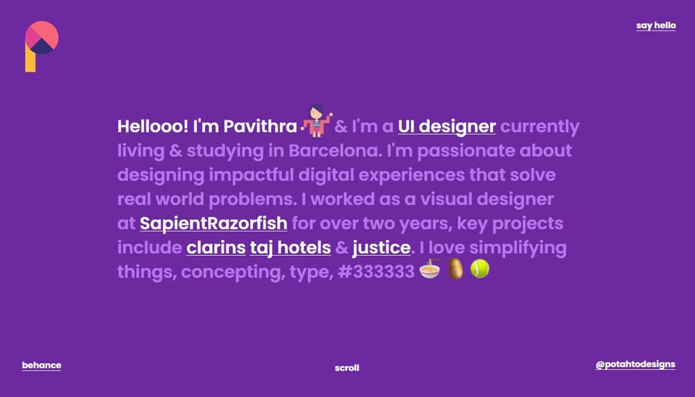
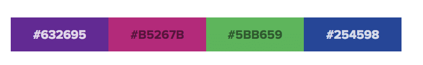
This brightly colored website draws the viewer in from the get-go. The designers use of solid colored backgrounds on each scrolling screen is reminiscent of the material design color palette. While it might look like its a lot of color at first glance, the toned down hues create a strangely calming effect.
6. Gabrielle Dolan
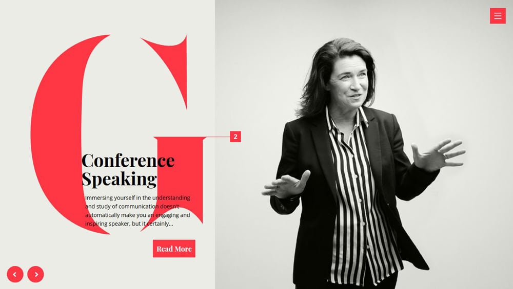

Gabrielle Dolan’s website uses a combination of gray-white and red. The serious lack of color on this website makes the color red jump off the screen. The letter G creates the perfect focal point and the right amount of contrast.
7. Pixel Pantry
![]()
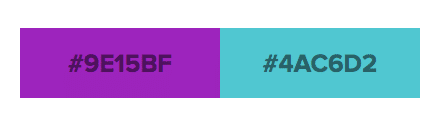
Pixel pantry used two distinct colors to showcase its brand – purple and teal. With a combination of different hues, tones, and shades, pixel-perfect creates perfectly balanced visuals that draw the user to the main content. Variations of this color scheme are seen throughout the website.
8. Dropbox
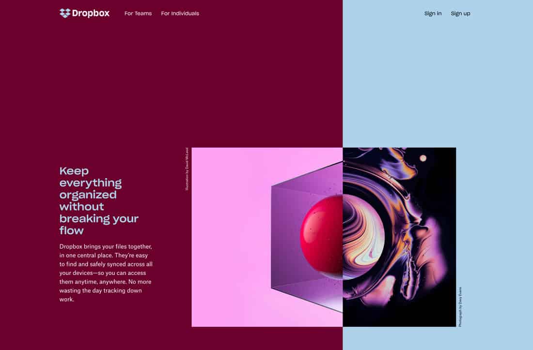
Dropbox uses two colors that usually are not paired together. The contrast between the deep maroon and the baby blue creates an interesting movement. Using opposite color schemes for the text balances the overall color scheme and the design. Sometimes you have to try interesting pairings to see if they work.
9. Jean-Baptiste Kaloya Portfolio
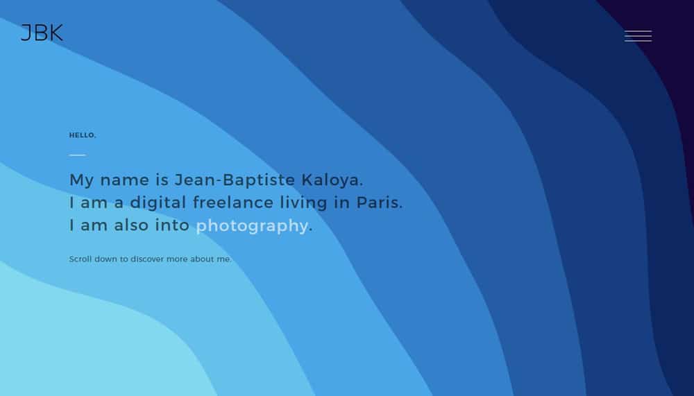
Jean Baptiste Kaloya plays with different varying shades of blue in this portfolio site. You will see this color palette displayed in various forms as you navigate your way through the site.
10. Konstantopoulos/Olymp
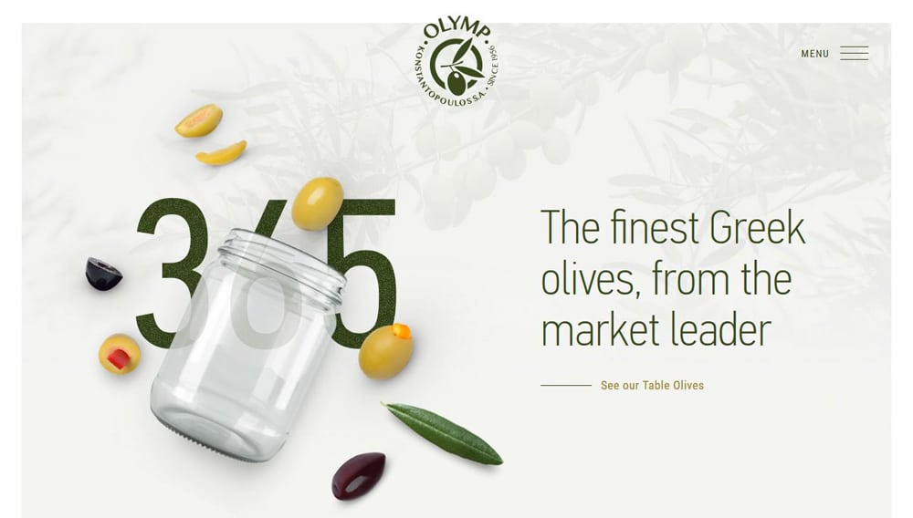
This site features a light green background with a dark green logo that pulls everything together. The use of light yellow with varying degrees of green creates an interesting combination that emphasizes the main elements of the design.
11. Amber Xu
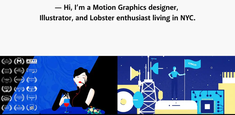
Amber Xu is a motion graphics designer and an illustrator based in NYC. She uses a combination of black and solid backgrounds in her work. You will see that the primary colors red and blue are the main colors in her palette.
12. Bluebottle

Bluebottle is a popular coffee chain. The website color scheme features the most important aspect of the brand – the fact that they serve coffee and the main color is blue. The other hues are used as an accent color throughout the site.
13. Better Energy
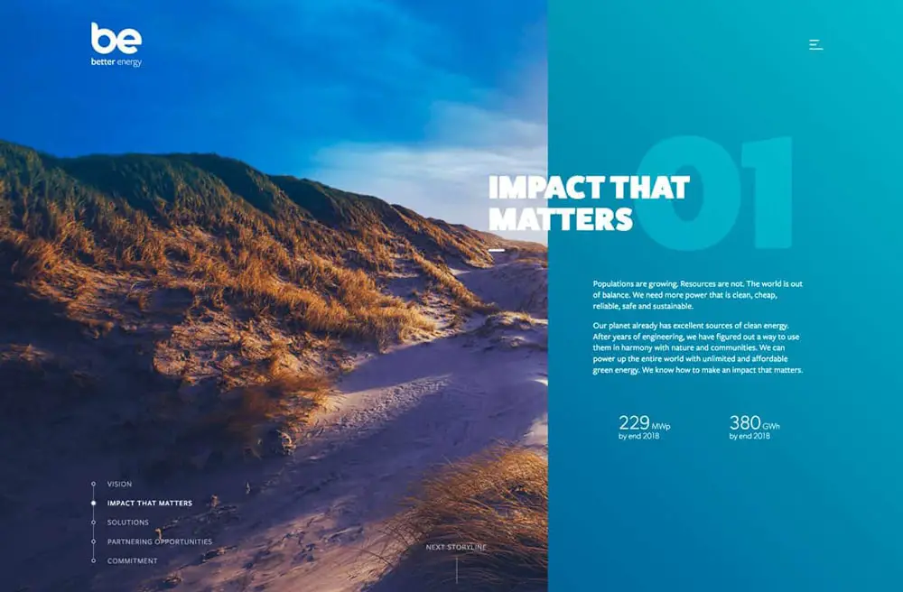

Better energy used brighter color and imagery associated with nature. They are able to use interesting color combinations and imagery along with text pairings to tell a story that keeps the user entertained.
14. Proud and torn
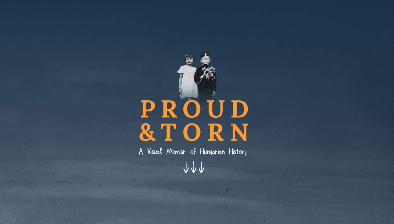

This website showcases a muted color jewel tone combination. This limited palette helps accentuates the colorless imagery and brings the graphics and other elements to the surface.
Conclusion:
It is important to choose color wisely when building your website as it has the power to make or break your designs. Having an idea of what emotions you are looking to convey will help you in your color selection process. Studying trends can also help you build a website that can capture the interest of the user. Did you know that color is linked to psychology? Different colors have different meanings and can help invoke a feeling that is completely different from another. For example, the color red stands for confidence, yellow for fun, and green for peace. Use these colors effectively to set the tone of your website. If you use these guides and color codes the right way, you will be able to build a site that not only looks good but also converts well.
Hey, thanks for this article.