Graphic designers help build the brand of a company. In order to effectively translate concepts and ideas into form, designers must have a thorough understanding of the fundamentals of graphic design. There is a constant need for high-quality design, whether it is for ads, banners, video or web content. As designers, you should be able to tell what worked better visually and why. To explore this connection, designers must spend time learning and re-learning these principles.
1. Alignment
Every element you place on the page affects the overall design of the page. If the elements are placed in a random order, the design is bound to look messy or sloppy. By making multiple elements in sync with each other or the background, you will be able to clean up your design and create a seamless visual connection that will bring more order to the overall layout.
2. Balance
Balance is created by evenly distributing the elements throughout your design. Every element on your page carries weight. By understanding this, you are able to make to smart design choices on where to place them. Balance can be symmetrical or asymmetrical. Symmetrical balance weights the elements evenly on either end of the page while asymmetrical designs weight the design just on one side of the page. Symmetrical designs tend to be more pleasing to look at while asymmetrical designs bring more visual interest to your composition.
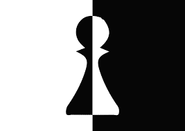
3. Contrast
Contrast can help add emphasis. When you have 2 design elements that are on the opposite side of the design spectrum, they create contrast. Designers create contrast in typography by choosing two typefaces with completely different characteristics. It is also possible to achieve contrast by placing dark colored text on a light colored background and vice versa. Contrast can create a difference between the same elements in your design.

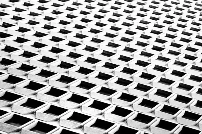
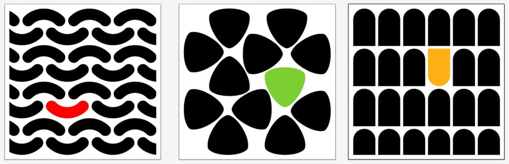
4. Repetition
Repetition is a fundamental design element that creates rhythm. By creating repetitive patterns, designers can bring consistency and this, in turn, can help make the overall design stronger. Being consistent and repetitive is especially helpful in creating a brand since you will want your visual identity to be instantly recognizable.
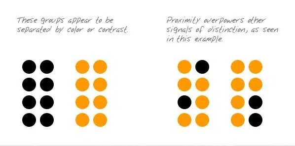
5. Proximity
Proximity helps in creating a relationship various elements in your web page. This also can make the elements in your design to be more organized. By clustering elements together and having them connect visually by color, and font size, you can play with proximity in your design.
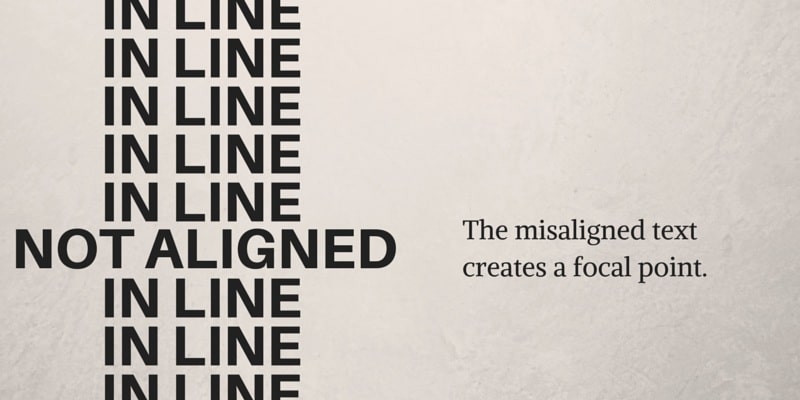
6. Visual Hierarchy
Visual hierarchy is the order in which individual elements on the page is created. By assigning different weights to different elements in your design, you can create a visual hierarchy that can help guide the viewer through different elements in your design. A visual hierarchy can be created in a few ways. Placing the most important element at the top of the web page, using larger/bolder fonts and using shaped to form a focal point. Figure out what the most important message or graphic would be and find a place on the page for it. By centering the element and creating a visual connection with the secondary elements in your design, will help you create an engaging layout.
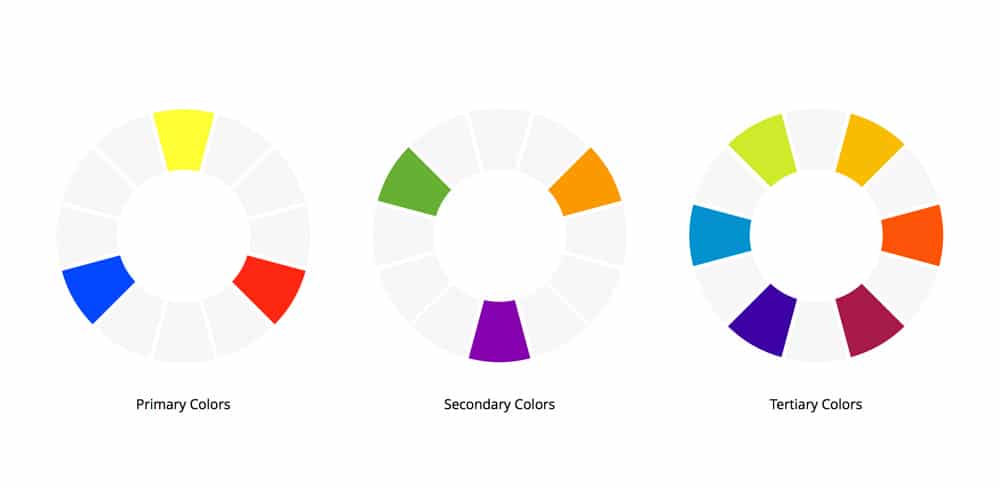
7. Color
Color plays a big role in web design and usually dictates the overall mood of your project. When working on a project, it is important to choose colors carefully. Each color can represent something significant and this can, in turn, help the viewer get a better grasp of your graphic. For example, the green color is often associated with calmness or peace while reds can represent anger and yellow a sense of happiness. Learning more about color theory and its impact on your design can bring more clarity to your design choices.
8. Negative Space
Spaces in your design that are often left blank are called negative spaces. When used creatively, it can help shape and highlight important areas in your design. Adding white space or negative space in and around your elements can give your composition more room to breathe.
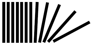
9. Movement
To be able to tell a story through your designs, designers have to be able to guide the viewer through various elements in your design. Movement creates the story. If the viewer’s eyes get stuck on an element in your design, that means that all the elements in your design are not working in harmony. Alignment, contrast, and balance work together in creating movement. So make sure to adjust the elements so that everything can help bring about harmony.
10. Emphasis/Layout
When you are working on a visual concept always start by creating a mental outline of the final layout. This will help you understand and reflect on your design choices. Like where to place the most important element or graphic in your design. Having a sense of the layout can bring the clarity and order you need to create a beautiful layout.
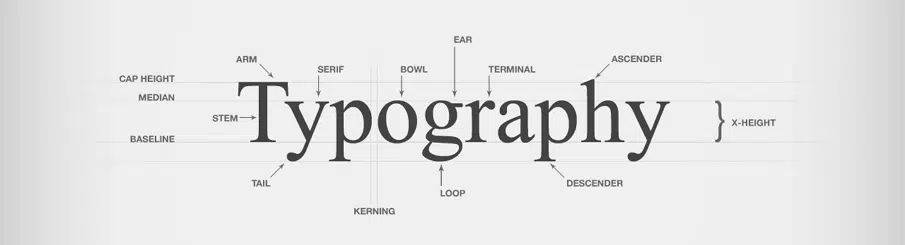
11. Typography
When it comes to typography in web design, font choices can have a huge role in setting the overall tone of the page. By experimenting with font sizes, contrast and styles, designers are able to invoke strong emotional responses in their audiences.
How to use these principles in your design
Now its time to apply these rules to your design — this will help your work be more effective and eye-catching. Although to be able to create your own unique styles, you should also be willing to break the rules. We hope that these tips will help you create an eye-catching composition that will help you form a great impression when working with your clients. If you found this information helpful, write to us and tell and why!
I love what you said about finding a way to tell a story through a design concept. My friend is currently trying to launch a catalog for a line of clothing she designed. She wants the design to be cutting-edge and trendy like her clothes. She’ll have to look for a graphic designer that can come up with a fitting concept.