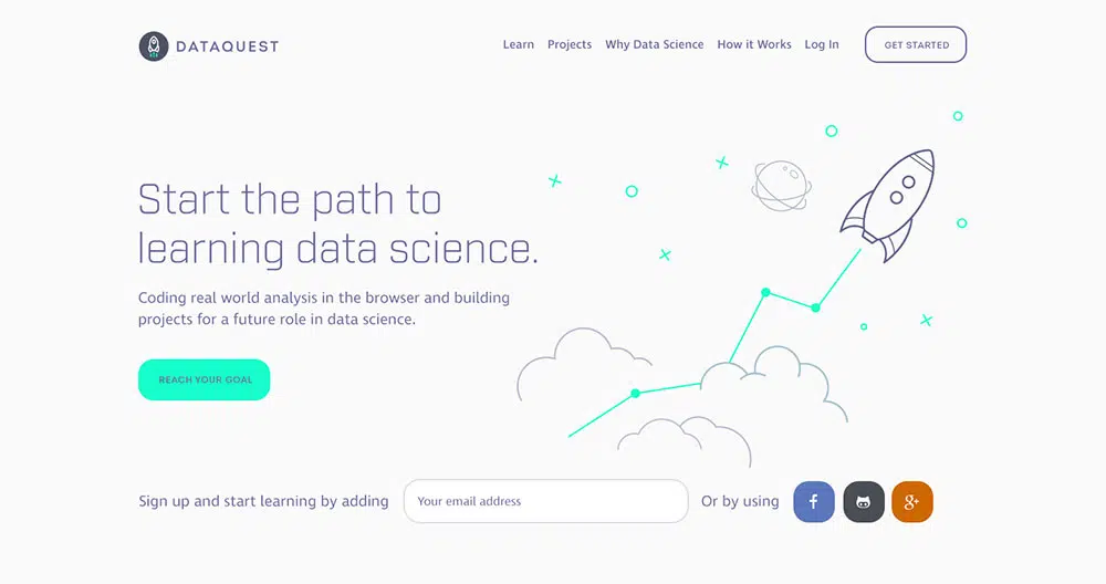
For a startup company, having a website is crucial. The modern business world is very web-driven, and having a startup website may be the only way your potential customers can find you.
It can be a challenge to make sure your website design is right, especially if you’ve never been involved in website design before.
Many people expect startups to be on the cutting edge of whatever industry they’re in. They expect the site to be functional, professional, and user-friendly.
So how can you pull it off? Here are some web design tips for startups to put you on the right track in designing a successful website.
Begin with a Design Strategy
The design process can be intimidating. The best way to make it more manageable is to develop a strategy. Start out by asking yourself a few important questions:
- What are your startup’s primary objectives? Are you looking to drive traffic to a service or product? Or are you looking to increase your conversion rates?
- Who are the primary visitors? What info do they want or need?
- What are the messages you want to communicate to site visitors?
- What is your plan to push people through the buying cycle?
Write these answers down. You now have some end results that you can design the website around. Keeping them in your head isn’t the best idea, as they can be easy to lose sight of while designing your startup’s site or dealing with other aspects of getting your startup business running.
Also, look at the competitors’ websites and analyze what works and what isn’t. Let’s say you are designing the website for Calendly. The first thing you need to do is look at the Calendly alternatives and see what they are doing better than the current design they have. Do a SWOT analysis. See what’s missing.
Design Around User Experience
People expect websites to function well and have a good user experience. The load times should be short and all the links should work. Studies have found that people expect websites to load within two seconds.
Longer load times—four seconds or more, typically—will drive them away and anyone who does wait for the site to load probably won’t come back.
One of your startup website’s top priorities should be responsiveness. Do what you can to reduce image sizes with compression.
Get rid of duplicate scripts. Use JavaScript files and CSS externally. Implement browser caching to store static resources. All of these things will reduce server lag and increase overall page speed.
You should optimize your startup’s website for display on mobile devices. It’s best to start building it with a mobile display in mind, rather than trying to convert it after the fact.
Mobile optimization is an increasingly important part of website design since so many people surf the web through mobile devices.
And I know you are tempted to add lots of website animation effects, but it would be wiser to keep these at a minimum.
Your navigation should not only be functional but also simple. People should not have to think very hard when using the site.
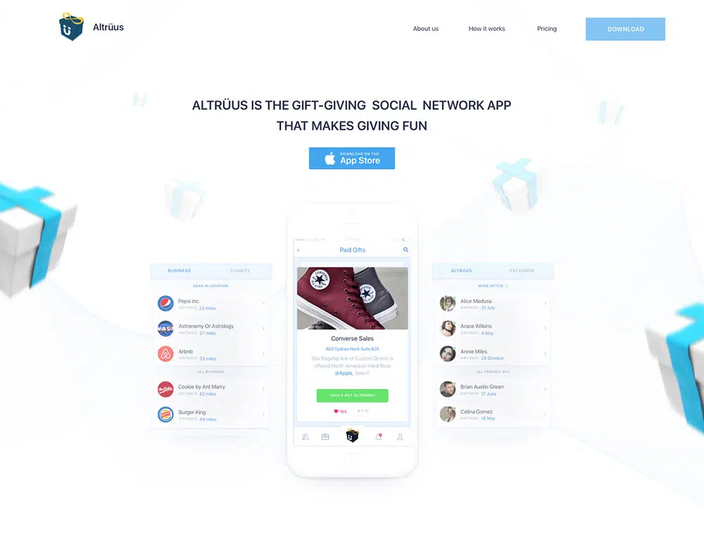
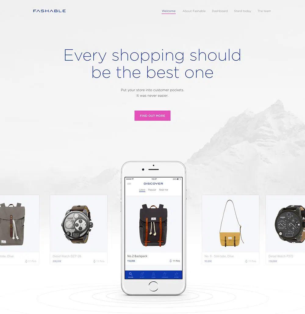
It should only take a click or two for them to find what they’re looking for. For example, if you are creating a website for an app, a simple menu is best. You don’t want to overwhelm users with text and options. Keep it to one or two columns at most.
Remember to have the menu stay within the color scheme of your startup’s website. You want it to stand out, but you don’t want it to be jarring. A coherent, fitting menu will help your startup’s website stand out from all the rest.
Also, make sure the font selection is good. Pick a readable font to make sure the visitors see the menu entries clearly. There are plenty of fonts online. Choosing a good one shouldn’t be challenging.
Keep it Simple
While it might be tempting to load your website with information, images, and links, it’s not the best idea. Good modern website design is simplistic, focused on what’s important. This makes it much easier for users to find what’s the most useful and important on the site.
You should stick to normal web conventions. Have a search button and a logo that can be used to get to the homepage.
These simple designs have worked very well on many websites for a reason. Don’t break rules that work. There’s still a lot of room for originality and creativity, even if you stick to these conventions.
Use Visual Hierarchy
Visual hierarchy is how users determine what to look at first and what to look at next.
The main headlines should be bigger than sub-headlines and body text. Your primary buttons should be bigger than other items. Use color in the same way.
Make Good Use of Contrast
Contrast, when utilized properly, will improve the readability of your startup website.
Choose colors that work well together. Make sure your color palette allows you to emphasize some items, allowing them to be easily distinguished for ease of use.
Make Sure It Flows
Avoid redundancy in both copy and navigation. The journey to your call to action or the info a user is looking for should be easy and simple.
Proper use of visual hierarchy is key to this, as is a good understanding of how the human eye processes information.
Use a Simple Color Palette
Too many colors get confusing and also hurts any attempt at branding. Think of Coca-Cola, Starbucks, or Twitter.
How many colors do they use for their branding? It’s typically two, with maybe one other that is more neutral on occasion. This simple use of color allows for near-instant recognition of your startup’s brand. It also prevents user confusion.
Run A/B Tests
As you design your startup website, test and measure your design choices. Make two or three iterations of different key parts of the website.
And if your website also has a web app included, you should look into web application testing before launching.
Test them with actual members of your target audience. Use the lessons from these tests as you move on in the design process. A few of the elements you should test in this way are the main message copy, any forms, images, and your call to action buttons.
Have an Obvious Call to Action
Without your call to action, there’s little point to your startup’s website. If you’re looking for an increase in conversions, your call to action needs to be very obvious.
Make sure you test different versions of it for the best fit. Make sure it’s obvious what the users will be doing if they click the call to action button, as terms like ‘jump in’ aren’t really that intuitive.
Conclusion
Designing a good startup website is fairly simple, though getting it just right will take time. Stick to website design basics and conduct thorough testing.
Make sure you take a look at what the trends in the industry are. Apply effort and care, and you’ll put your startup on the path to success.