Creating a structure for your designs can be difficult and time-consuming. Applying a grid system to your layout can help structure the contents better and improve your overall design process. It is a tried and tested technique that was first introduced for print layout. When you have a good system in place, you are bound to achieve consistency. Grids act as an invisible glue that holds all the elements in your design together.
Grids can be applied to interactive design as well. When designing a web page, users like to see the same features laid out where they would expect to see them. It is one of the most effective ways to organize content on a page. About 90% of all the interactions are done using a screen. We are now easily able to browse websites and read information on a variety of devices – mobile phones, tablets, laptops, TVs and smartwatches to name a few. As designers, if you are not able to design taking multi-screen behavior into consideration, then you are going to run the risk of losing customers. To create enjoyable and delightful digital experiences, you have to be able to understand how to use grids effectively. This way you are able to structure the content and scale it across various devices and platforms. In this article, we will discuss the many uses of a grid system and the reasons why it would improve your design process
1. Organizing content
One of the main reasons for a grid is to keep the different elements in a design organized. When you establish a grid system, you are setting up a structure for the elements in your design to align against. When choosing a grid system, make sure to choose one that would work different elements in your design. Be that your type, imagery, or any other elements in your design. By doing this, you are bound to create a neat, clean and organize layout.
Using them ensures clarity and consistency. This rule holds true when a grid system is applied to an interactive interface as well. An effective grid guides the eye of the user through various elements of the interface. This is especially true when they are used in digital products. Using them makes it easier for the viewer to find the next piece of information as well.
2. Grid System Improves the Design Process
We are always looking to get things done quicker and more effectively. When it comes to designing a layout, grids help you do just that. Instead of manually trying to find a place for a design element on a page, grids can help you make informed choices about their placement, scale etc. Besides helping you make better layout decisions, they also act as a foundation to help you build a better design.
When it comes to UI design, grid systems can help manage the proportion between the margins and ensure the spacing and margins are set correctly. This also enables designers to create pixel perfect design from the very beginning.
3. Grid System Organizes Typography
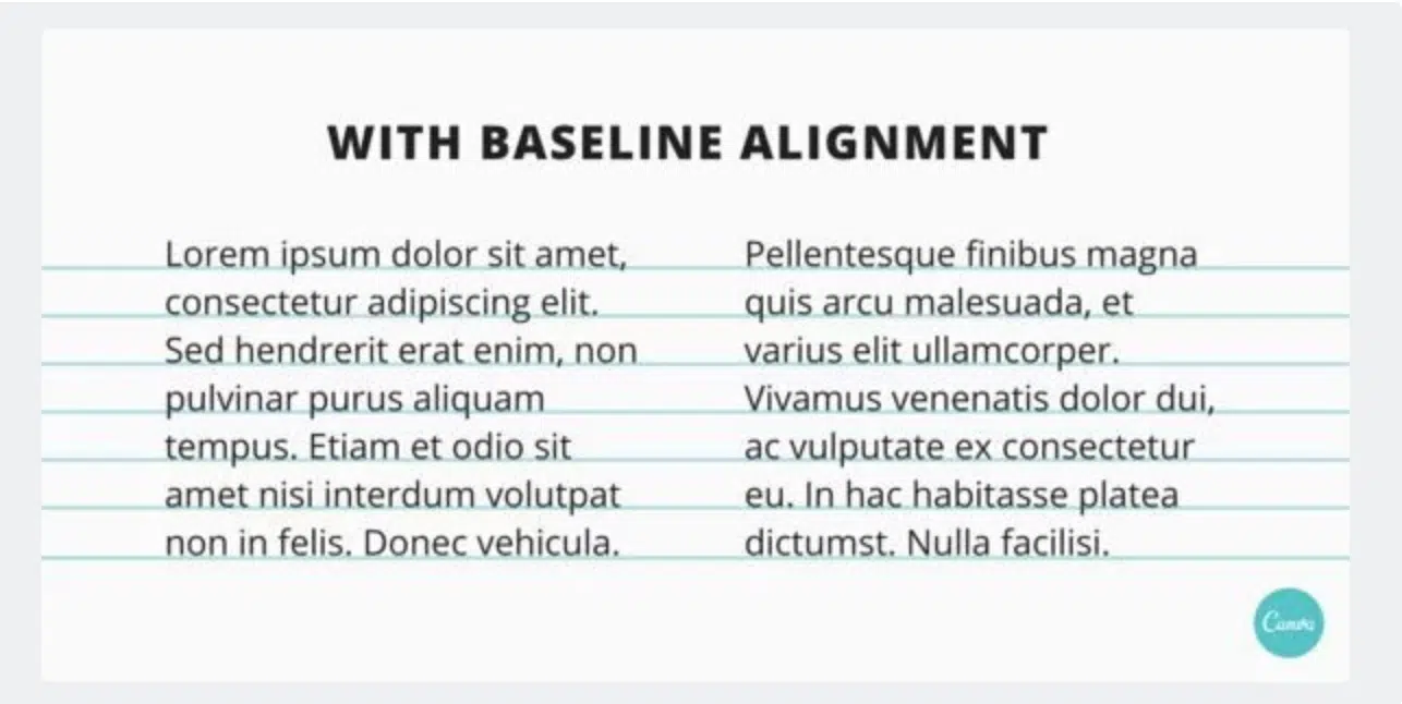
If you are working with text-heavy content, it is better to have a grid system in place. This will help to enhance the readability and legibility of the content. Baseline grids are essential when designing the body copy. The type sits on a narrow horizontal line that runs across the page similar to ruled lines of a notebook. If you don’t align your copy, the viewer will easily notice that your designs appear to be more cluttered and messy.
4. Grid System Makes Easy Collaboration
As mentioned earlier, grids help establish the structure of a design. So someone else had to revise a design that you have worked on, they would easily be able to do so just by looking at the way you have set up the layout. By keeping your grids functional and clear, you will easily be able to collaborate on the project with other designers.
4. Grid Systems Help Create Balanced Compositions
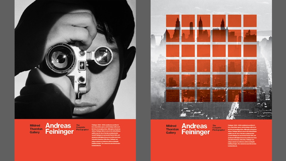
Grids help create symmetrical layouts. When you begin with elements that are symmetrical, it is easy to evaluate different elements in your design and how one can impact the other. If you look at the example above, you will how the designer has placed a transparent grid system on a faded black and white image of the skyline. While the grids appear to be symmetrical, the image behind is not but doesn’t overpower or distract the user.
5. Grids and Flexibility
Grids are highly flexible. They usually adapt to changing designs and you can choose as many columns as you like when creating a grid. If you look at the below example, you will see the difference between a one column grid and a 13 column grid layout.
You can also break the grid for extra impact. Sticking to the tried and tested rules of a grid system will help you create a beautiful and symmetrical layout but for an eye-catching design that is slightly out of the ordinary, sometimes it helps your break the grid layout. Here is an effective design layout that demonstrates the above.
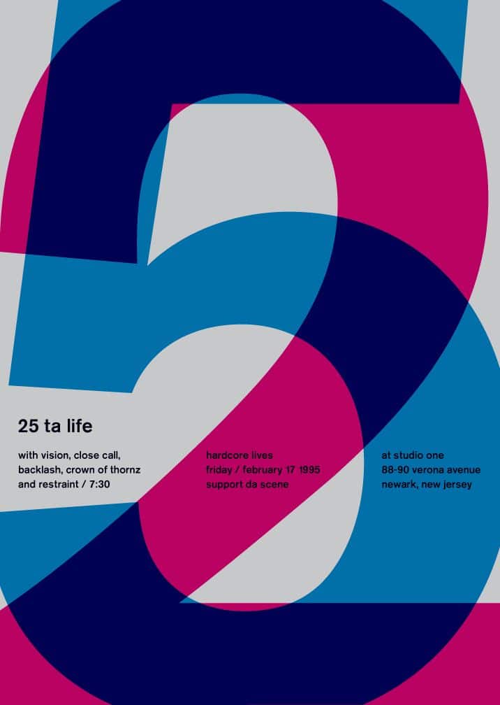
Grids can also help you go diagonal. One of the versatility of a grid system is that you can work just as effectively on a diagonal axis. Here is a great example 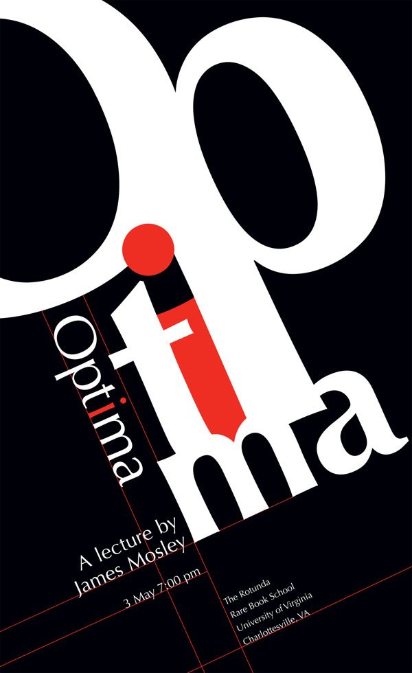
Conclusion:
You can’t really argue with the different uses of having a grid system in place. You probably have a better understanding of what a grid is by now and how they can be applied to your designs. The more layouts you create with a grid system the better you will get at using them. In basic terms, they are lines (vertical and horizontal) that run across the surface of a page. It takes practice to use them effectively.
Awesome post… Thanks for sharing!