Logos are the most efficient way to leave a lasting impression on the audience’s mind. This is why you must leave a good impression on your audience by creating a good logo. It helps communicate your business identity to a great extent. If you are a new business whose products and services haven’t reach the majority of your target audience yet, you primarily rely on visual elements like the logo design to create an impression about your brand and planning marketing campaigns. Logos are the identity of a brand that a brand uses throughout its range of products and activities. This makes logos the face of a company. One of the primary purposes of creating a logo is for creating a perception and image of the brand that is different from the existing alternatives available in the market, and to do it the right way. This is why keeping up with the latest logo design trends is an essential element of logo design, to ensure your logo doesn’t get obsolete and is well perceived by today’s visitors.
Here, we discuss 15 such logo design trends to follow this year that can help you create a unique, appealing and valuable logo.
1. Use of Flexible Logos:
The concept of one logo for all purposes doesn’t work anymore. Earlier logos used to have one design that used to be carried out without replacement for years. This practice isn’t practical in today’s time. The business owners usually change their mission or vision, or communication lines a little to suit the popular trend of that time. Hence they want the flexibility of their logo to be able to do the same. Any logo that you design should be able to mould itself into different variations for different occasions. This flexibility of logo design helps the business connect to their clients by creating a more personalized experience and relation.
2. Emphasize on Color:
If you study the colour theory, you’ll know that each colour denotes and evokes certain emotions, feelings and perception in the audience’s mind. This is very important to understand as by using the right colours for the right purpose, you can create a long-lasting, impactful effect on your target audience’s mind. The right colours help create a storyline for the audience to follow and also gives them a visual hierarchy to ensure the overall viewing experience is easy and yet efficient. You don’t need much expertise in colour theory to understand red often invokes passion, desire and vigour and so on for other colours. The right colour palette also plays a crucial role as you need to carefully chose colours that complement each other and the overall brand identity as well.
3. Experiment with Abstract Logos:
Minimalism is still a trend that cannot be forsaken or ignored. It helps designers create a message with minimal elements and without much clutter that often gets difficult to organize with many elements. Minimum elements ensure that the brand message is delivered quickly and efficiently to the audience. With the ideology of removing more and more elements, designers realize they can move towards abstract designs as well as abstract concepts make the designs more effective. Minimalism gives just enough support to create an anchor without taking a toll on imagination.
4. Use of Responsive Logos:
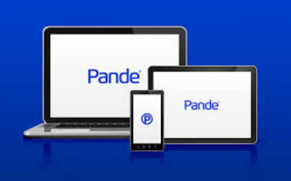
Designers are turning towards using responsive logos quite often these days. Digitalization has spread rapidly everywhere, which has made businesses turn to develop solutions for smart gadgets and devices such as smartphones. People generally browse through the internet, shop and interact with different websites using their phones on the move. Thereby any logo that fails to respond to the requirement of the tiny space of mobile phones is obsolete and of less value in modern times. Thereby responsive design in logos is not just a trend but a need for the hour. Logos are less embellished, so when they appear on smaller screens, they can retain readability and simplicity, and when viewed on a larger screen, they can display more details. Responsive logo design isn’t just based on the size of the logo, or the compatibility. Designers are finding new ways to make logos look visually different as per the requirement of the fed data. For instance, opening a Gmail personal account shows the normal Gmail symbol; however, opening a Gmail business account tweaks the logo a little. Hence static logos are getting obsolete.
5. Keep it Simple:
 In the designing field, designers at times tend to go overboard with various complex processes or thoughts to create something unique. The issue with this is that they miss the main focus objective of creating the logo, to make a brand identity. The KISS concept refers to Keep It Simple Stupid, which is a concept that is prevalent in the designing world and refuses to fade away. It helps communicate the business idea and message clearly and crisply. For instance, Uber used a logo that had directional hints in the typography is used for its logo, which changed to a simple text logo with a simple logo, against a black wall drop with no extra elements. This reflects modern design styles and is very refreshing to look at.
6. The Personal Element:
While you may want to follow minimalistic principles or simplicity at the core of your design guideline, don’t hesitate to break from a few of these rules to incorporate your style in the logo design. This will help your logo look natural and original. You could, however, make sure that the design principle you’re breaking of the style you follow, and the individual element somehow complement each other and doesn’t go totally against each other. By doing this, you are creating authenticity for your brand. If you have a very authentic design that you don’t want to lose out on, and want your audience to know you by stick to it and optimize it according to the new trends, while still retaining its rustic and original aesthetics. Using custom fonts is a great way of achieving this as it would be differently associated with your business only.
7. Passing the Test of Time:
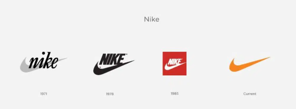
While we are discussing the ongoing trends of the logo design in great detail, it is important also to realize that there are very few logos that successfully stand the test of time. The trend is called a trend for a reason, and it might keep changing now and then. Logos have a higher shelf life as to establishing a brands identity as compared to website designs, business cards and more. as they can be reworked easily without making much impact. A logo, however, can’t be updated now and then because it needs to stay long enough for people to associate your brand with it. Using classic design logos are a safer bet to withstand the test of time then trendy logos, and this practice might be helpful for products that don’t need much revamping on their logo now and then, like a healthcare app. For instance, the Cocola typography logo is still relevant through the test of time while Pepsi, on the other hand, keeps revamping its design that uses both logo and text.
8. Playful Logos:
It is important to stand the test of time, that’s true. However, it shouldn’t limit the possibility of creativity and innovation. Using some fun, playful elements in design makes your logo more vibrant and more impactful for the audience. Particularly in the fashion industry, toys industry and other such fields, the element of playfulness and fun in designing logos is very relevant. Many fashion brands have already changed their logo to fit these criteria realizing its potential and impact. Brand collaboration for creating a playful twist on both their logos for a specialized project is trending right now. The interesting mix of two brand identities coming together without heavy emphasis on the individual but a visual treat of something new attracts an audience to know more about both the brands. It helps target the pool of the collaborating brands for new target audience and benefits both the brands mutually.
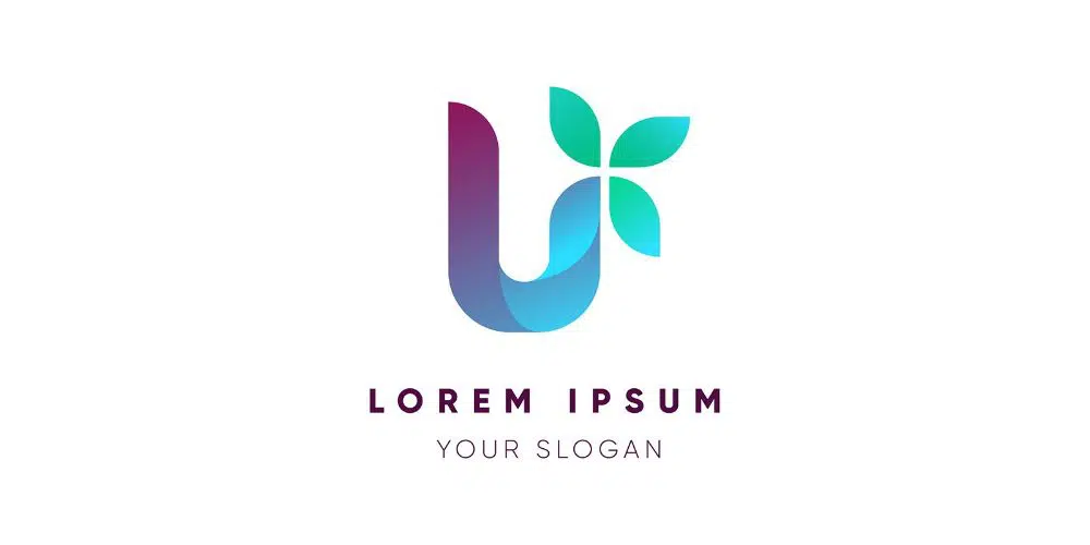
9. Using elements like Gradients:
The trend of adding gradients is relatively new but has the potential to stay an important trend in the coming years. By using a gradient, you allow the logo design to have a further depth to a client’s brand’s personality. Popular brands that follow this practice are Mozilla Firefox that uses the different shades of orange on the slop of the fox. Disney plus also effectively use gradient colours. Gradient colours help create a more immersive experience that flat colours that look two dimensional and flat at times.
10. Using Hand Drawn, Hand Written or Handmade:
The trend of using such logos helps connect the brand with customers on a much more intimate level. Though it’s a little difficult translating handmade design to digital, it is worth the extra effort for truly creating a logo design that stands out from the rest of the logos out there. Besides, there are enough advancements to ease the process by using tools like light pens, scanners, vector tracing and other design practices. It provides a sense of authenticity, familiarity and warmth to the audience. They don’t feel overwhelmed by the art of the logo but a sense of simplicity that makes them feel rather confident about themselves that something they are so familiar with is a design practice for such a good brand. These design practices work best for logos of cafes, shops, restaurants and more. The aesthetic makes the brand feel grounded and gives each audience personal attention. The typography or the handwriting also plays an important in deciding if the hand-drawn, written or made logo looks pleasing or not.
11. Using Negative Space:
It is a recent trend that seems to anchor its relevance for a reasonable time. The negative space should be used to create a sense of mystery and providing something more to the audience then meets the eye, to invoke a sense of curiosity in them to learn more about the brand. This style of designing is prevalent on social media sites and followed by many big brands as well. This practice in logos helps create a brilliant, witty and clever logo that boosts up the user engagement. It gives the audience space to think about the unmentioned; hence, it has a high recall value.
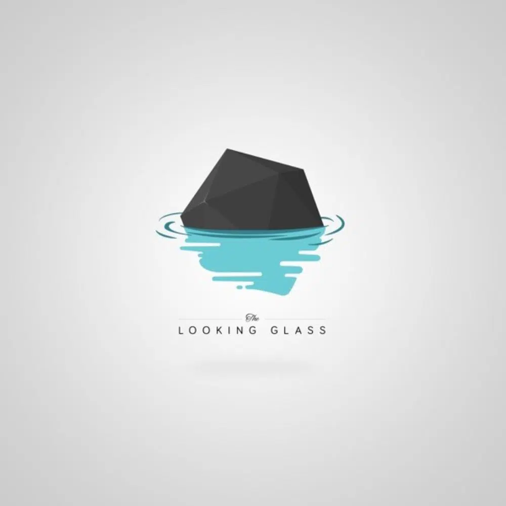
12. Old is Gold:
![]()
While we discover new trends of logo design, one aspect of the design can’t be forsaken. That is, using vintage design practices. The reason this style still prevails and mostly keep prevailing throughout the years is that it drives nostalgia in the customer’s mind. Nostalgia is a strong emotion that can easily influence an audience to engage, interact and remember more thoroughly about the brand that drives them there. It portrays a sense of royalty, trust and also authenticity.
13. Using the New Age Geometry:
Geometric shapes in the world of design are often discarded as cold, authoritarian and too mathematical. However, there is a new trend that is defying this perception of geometry shapes and using vibrant colours and friendlier compositions. New Age geometry is using geometric logos with a mix of vibrant, colourful palates. The ideology is to design a clean, minimal, yet strong design pattern. Use of shapes like circles, triangles and rectangles together with a regal colour palette to design shapes and structures are a very trending design practice these days. Playing and manipulating the thickness of different shapes also helps create contrast and add clarity to the design with contrast.
14. Visual Tricks:
Designers are toying with ideas of creating a sense of illusion of a logo design as three-dimensional objects. The idea is to give the logo a sense of depth and trick the eye of the audience. By doing this, the logo design becomes more immersive and engaging for the audience. It is a practice that is not common yet, hence picking it up and ideating it to complement your brand could easily help you stand out. Other visual tricks of overlapping are also trending design practices today, where you again create a sense of extra dimension on a flat surface allowing the audience to work their brains as to how you achieved that and hence creating a sense of curiosity and appreciation for your work.
15. Using GIFs:
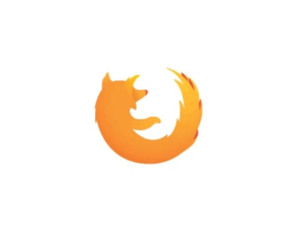
GIF stands for Graphics Interchange Format that has been a common trend for social media posts to catch the audience’s attention. It maximizes on grabbing the attention and allows easy comprehension of the concept without substantial texts and descriptors. This practice in the logo can help include certain animations on them that are always fresh to look at and interactive as well, which adds more depth to the logo at an economical price. Mozilla Firefox beautifully makes use of this and have animated their logo for the audience to see.
Here we conclude the 15 Logo designs trends to follow this year for an effective and relevant logo that helps you stand out from the rest of the competition and improvise your engagement with the target audience.