The structure of your website’s navigation or the navigation style you use often plays a key role. It determines how user-friendly your website will be. Follow navigation design best practices in order to get the best results. Thus, you can ensure that visitors will be able to easily navigate through your website.
Large, complex websites can still present navigational challenges. Yet, by following these 5 best practices you can be relaxed. Your website users should find their experience pleasing and profitable.
5 best practices you need to keep in mind:
Best Practice Number 1: Incorporate a navigation feature that helps a visitor reach her main goal
Does your visitor want to see what’s new, what’s on special, or what’s changed? Show the latest news and updates up front and highlight them as such.
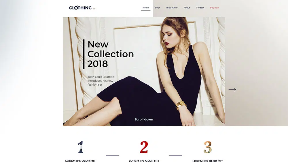
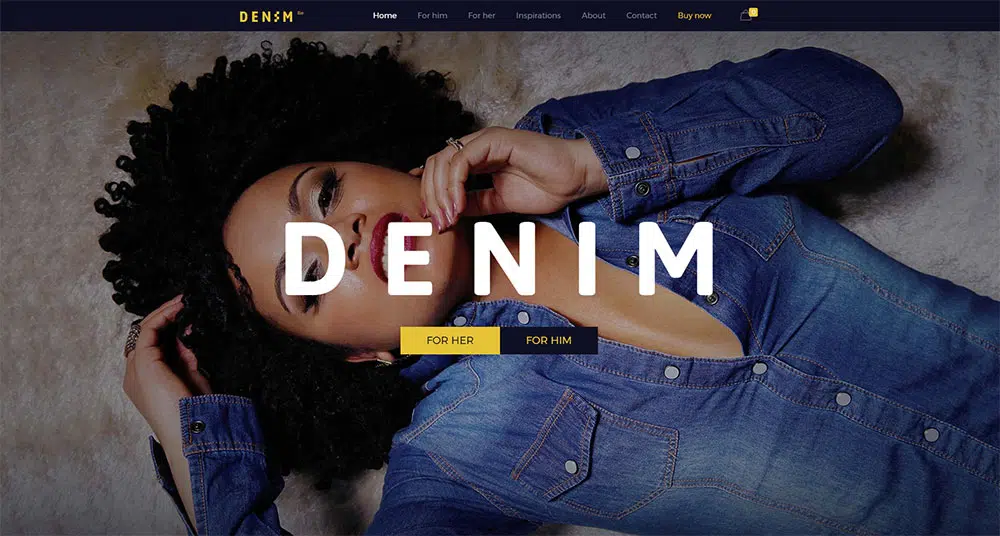
For example, your clothing store might be introducing a selection of seasonal outfits. In this case, a search bar at the top of the page, or CTAs placed in strategic locations will help. These can direct her to the information she seeks.
The visitors will look for specific information about a subject that peaks their interest. What you have to do is make sure they don’t lose their way on your website before they get to that information.
Put a search bar at the top left of the page or sprinkle crystal-clear CTAs on the page. They should direct the visitors towards the information they are looking for.
Best Practice Number 2: Do these 3 things to keep visitors from losing their way
A Current Locator has been a website navigation gold standard for years. Complex eCommerce websites can tend to take on the characteristics of a maze. This is especially when navigation is based on megamenus. They are pointing the way to dozens of different products or product categories.
The fix is a simple one.
It’s a matter of showing the user
- Where he or she is now
- Where he or she was before
- Where he or she could go next
Using a contrasting color to highlight a user’s present location on the website can be helpful. A map is of limited use when you don’t know where you are.
Making a mini-map of the user’s journey on the page is another good approach.
And, it’s always a smart idea to keep a fixed menu on top of the page; one that highlights the section being visited.
Best Practice Number 3: Stick to using standard icons and lingo
When it comes to navigation people much prefer familiar items. So they don’t have to stop and think about how to get to where they want to go next.
Hamburger menu? Highly appropriate much of the time.
How about a colorful menu resembling a Rubik’s cube with random clickable areas? NO! A sure way to get a visitor lost!
A bold logo that takes you to the Homepage when you click it? YES.
An animated logo that warps you into another dimension? NO! Besides not being at all helpful, visitors will generally find it irritating. Save the fun and games for elsewhere (maybe your Fun and Games section).
Best Practice Number 4: Keep the number of menu items to 7 or less
Countless studies have shown that 7 is somewhat of a magic number. This is especially applicable to the cases when if you need to remember things. Less is fine, more is not so good. Keeping your menu nice and clean (and to the point) not only makes it user-friendly, but it’s also good for ranking.
Limit your list to the most important things for the user. Place the most important thing at the top, and the second most-important at the bottom.
Best Practice Number 5: Choose your menu type in accordance with the amount of content on the website
If another web designer uses menu type X, and you think it looks cool, don’t mindlessly use the type X for your own website. It will be guaranteed to work only if your website is structurally a close copy
Most likely, the amount of content on your website is markedly different from the other site’s. You would be better served by using menu type Y.
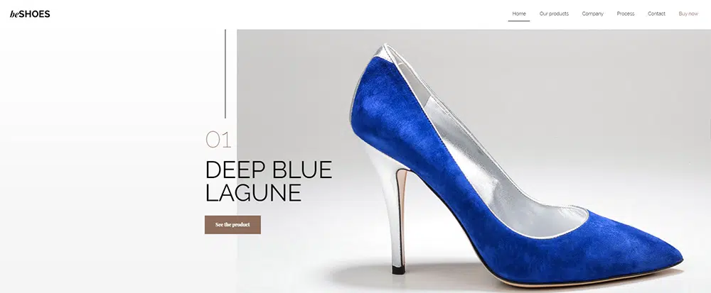
The amount of content is one of the key drivers in selecting a proper menu structure. If your shoe store features one or two brands or styles of shoes, a single navigation bar will usually work best.
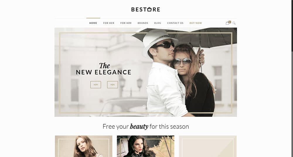
Your shop might sell a wide variety of brands, clothing types, and accessories for men and women of all ages. In this case, you’ll be best served by either a vertical collapsible menu or a carefully-structured megamenu.
Try this Simple Be Theme Solution – BeTheme
Five best practices shouldn’t be all that difficult to remember and follow. But if you’re interested in taking a shortcut, using pre-built websites is a great alternative. Using them will save you a great deal of time and effort as well.
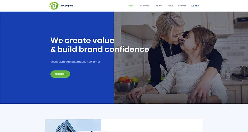
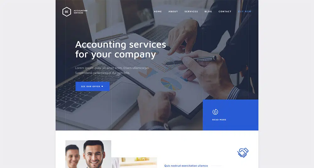
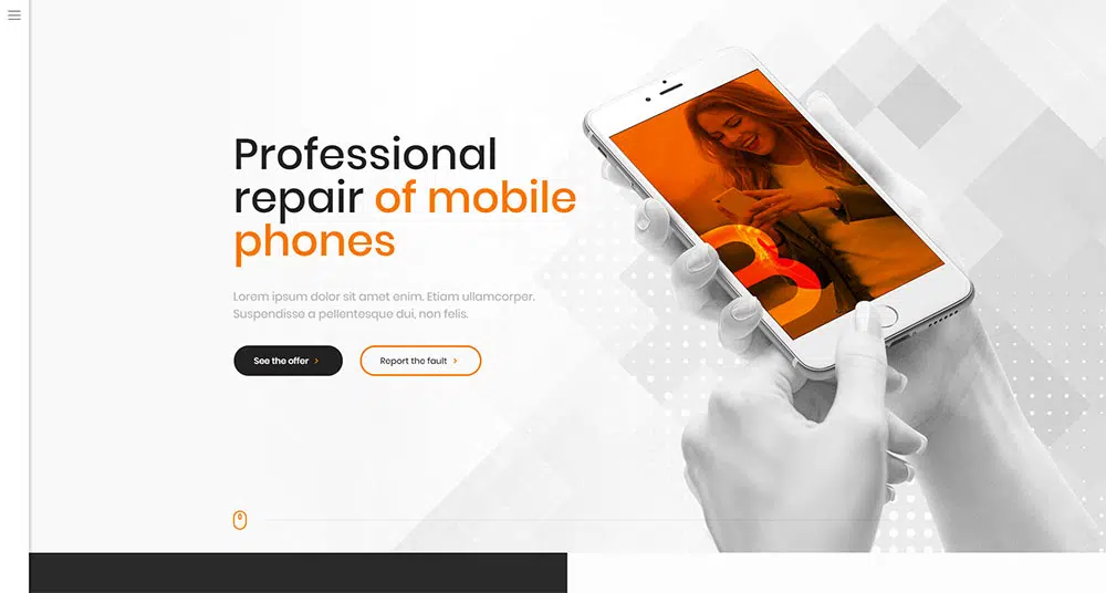
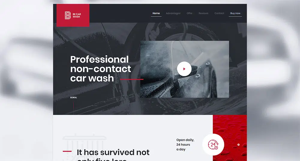
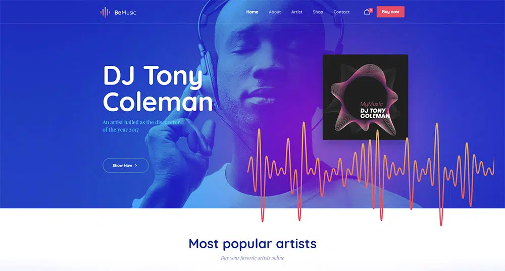
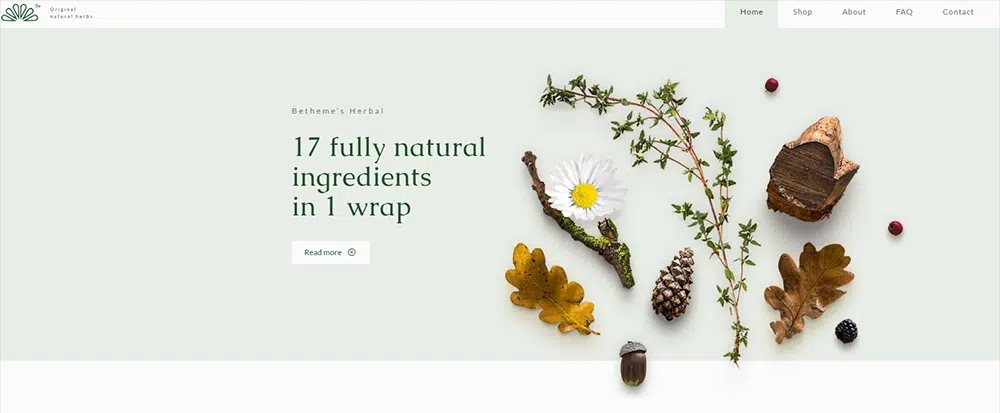
BeTheme’s selection of 320+ pre-built WordPress websites is categorized by industry. Each design is aligned with specific user expectations and navigation patterns.
Summary
The best practices we’ve covered address:
- Directing visitors towards the main goal they seek on every page
- Always letting visitors know where they are at, where they have been, and where they should go
- Using standard icons and lingo that users will find familiar and easy to understand
- Limiting menu items to seven so as not to overwhelm your visitors
- Taking the amount of content on the website into account when choosing a menu type
- Using pre-built websites to make website navigation as easy as possible.