We found some of the worst client comments turned into posters and decided to share them with you too and laugh together! These are part of the collection of funny Clients from Hell quotes you guys enjoyed so much. These cool posters were made by some really talented designers. You can check them in full size by clicking the photo or link for each poster.
Want more fun? Here’s our list of funny clients from Hell quotes and stories which we gathered from designers all over the world. Hope you’ll enjoy both the comments and the awesome graphics of these posters! Here they are!
Don’t forget to let us know, in the comment section below, which one of these worst client comments are your favorite! Or, do you know any other clients from hell quotes? Share them with us so we can laugh together! 🙂
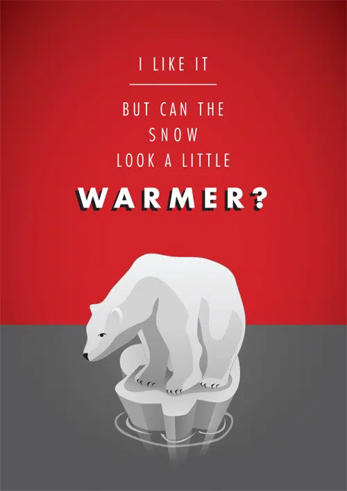
Polar bear
“I like it…but can the snow look a little warmer?”
This poster has a really great minimalist style with a limited color palette and it illustrates a really funny situation.
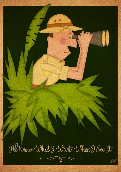
When I see it
“I’ll know what I want when I’ll see it.”
Here we have a great cartoonish poster that illustrates a quote that some of us might have heard a lot in their freelancing career. The nice typography really stands out on the dark background,
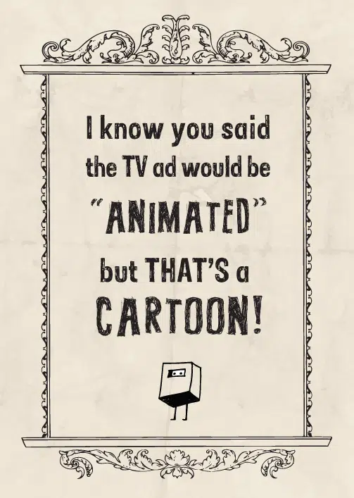
Animated TV ad
“I know you said the TV ad would be “ANIMATED”, but that’s a CARTOON!”
This is a very simple and elegant poster that simply illustrates a quote from a client. This is a very funny but annoying situation some illustrators might find themselves in.
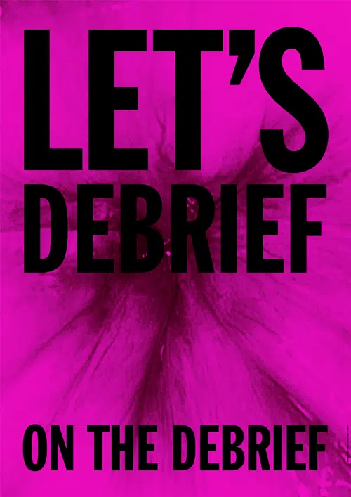
Stone twins
“Let’s debrief on the debrief!”
Here we have a very nice example of a colorful, vibrant poster that makes great use of this quote.
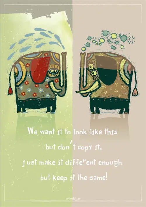
Fitzer
“We want it to look like this but don’t copy it, just make it different enough but keep it the same.”
Some of you might recognize this type of mentality from your own clients. This cute poster illustration fits it just great!
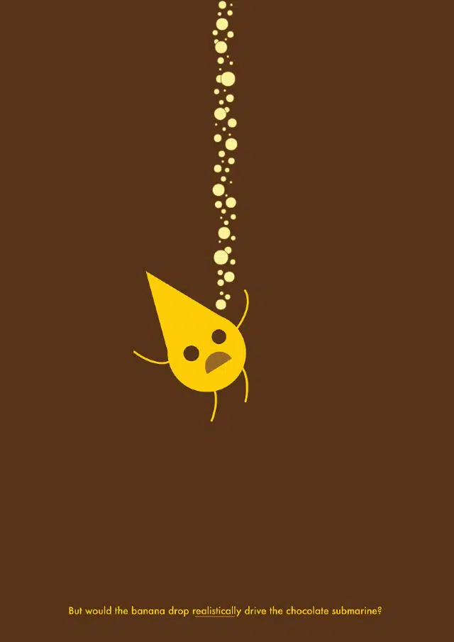
Banana
“But would the banana drop realistically drive the chocolate submarine?”
When taken out of contents, some sentences and explanations might sound very funny and ridiculous!
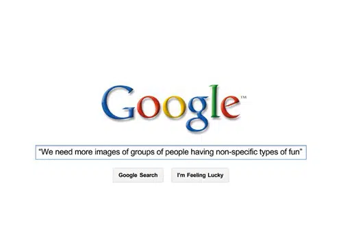
Non-specific
“We need more images of groups of people having non-specific types of fun.”
Here we have another great example of how to properly illustrate a funny quote that puts the creative person in an awkward position.
Redxmas
“We feel that red just isn’t right for Christmas.”
Here we have a hilarious quote from a client put to good use in a very nice and classy poster design.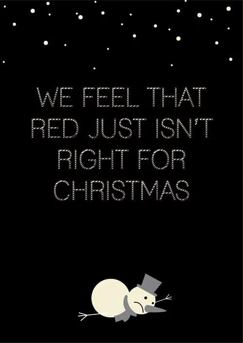
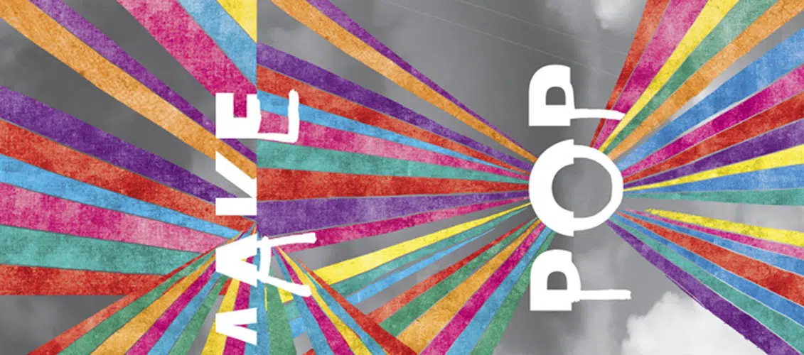
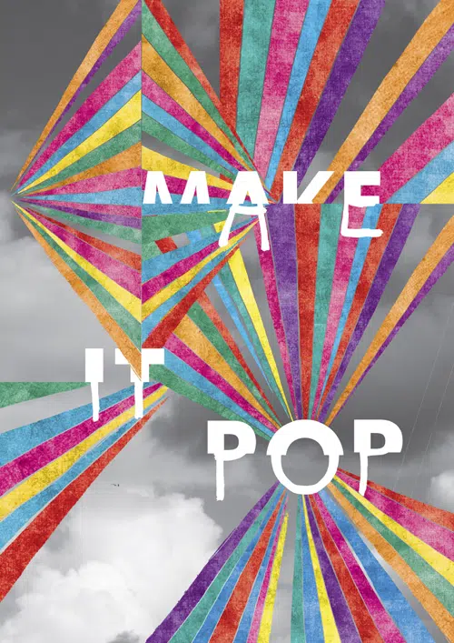
Pop
“Make it pop!”
How many times have you heard this sentence before? This time you can see it in a poster that really ‘pops’!
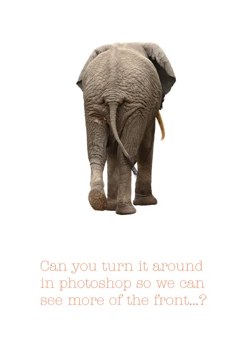
Elephant
“Can you turn it around in Photoshop so we can see more of the front?”
Now this is a quote that many Photographers might have already heard at least a couple of times!
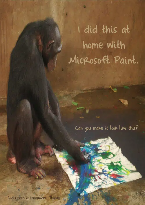
Monkey
“I did this at home with Microsoft Paint. Can you make it like this?”
Here we have another funny example of a rather annoying situation that many of us might find themselves in. Sometimes the clients think they know best and this image perfectly shows this situation!
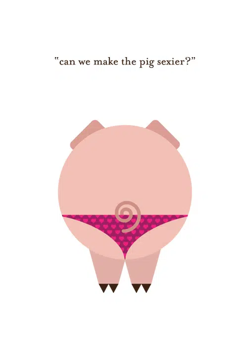
Sexy pig
“Can we make the pig sexier?”
Another great example of how hilarious some things can sounds when taken out of context!
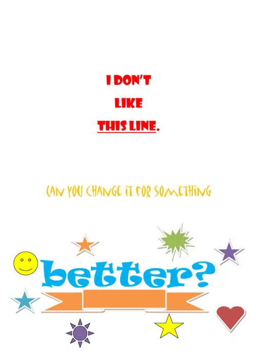
 This line
“I don’t like this line. Can you change it for something better?”
This is a very simple and colorful poster that ironically shows a common problem our clients have: useless details.
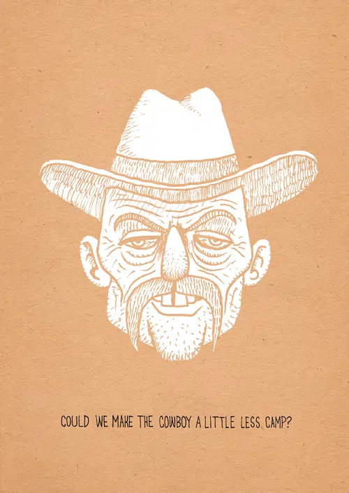
Cowboy
“Could we make the cowboy a little less camp?”
This is a gorgeous illustration poster that makes the best of this very specific and funny quote.
Actual logo
“Could you do an actual LOGO instead of a font?”
There we go again. Another example of a sentence most logo designers might have heard at least a dozen of times already.
![]()
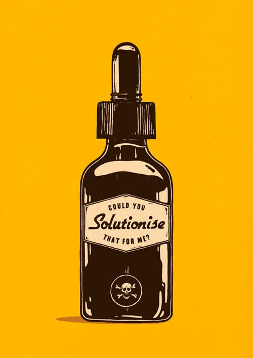
Solutionise
“Could you solutionise that for me?”
This simple and colorful poster has a very nice idea of how to make the best of misused words.
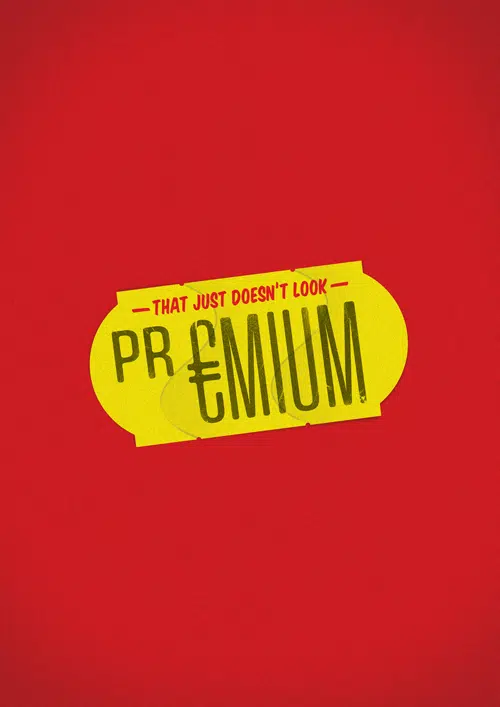
Premium
“That just doesn’t look premium!”
Here we have another example of a vibrant poster with nice contrast that manages to send a message in a very minimalist way.
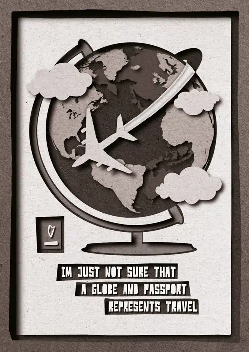
Travel
“I’m just not sure a globe and a passport represents travel.”
Does this quote need any more explanations? Sometimes designers can be stuck in awkward situations like this one!
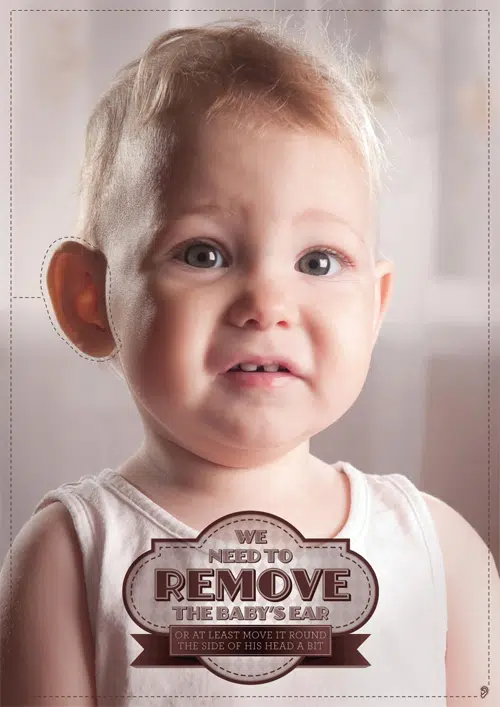
Babies ear
“We need to remove the baby’s ear, or at least move it round the side of his head a bit.”
Another hilarious quote from a very difficult client.
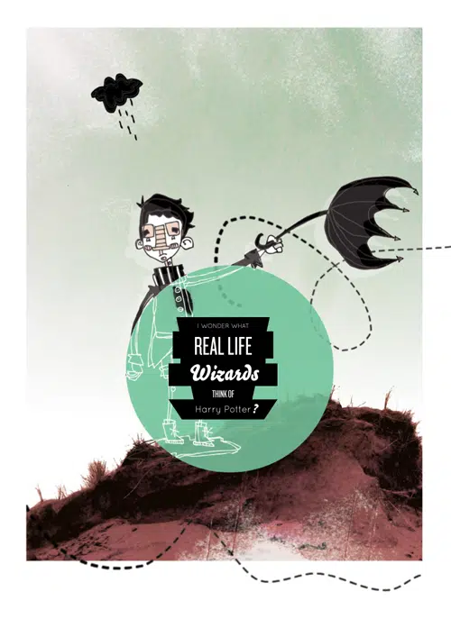
Harry Potter
“I wonder what real life wizards think of, Harry Potter?”
This poster has a very nice cartoonish design that fits best this hilarious quote that was taken out of context.
Could you be a little less creative.
I once had a client ask me to change a font in a breakfast-related ad to something more “early”…..
Haha
Wow…this would be funnier if it didn’t bring back memories…
But still, real damn funny!
Those are just classic! And the graffics just make it better.
That was frikking hilarious. The funny thing is I have had some of those comments from clients.
I once had a potential client ask me to redesign his website only to say he wanted it to look intentionally unprofessional. How do you respond to comments like these?
Funny 🙂
Thank you