A few months ago, I wrote a post titled 30 Creative Adverts For Your Inspiration. This time I have taken it to the next level and compiled a showcase of creative text used in advertising. Some ads here must have had much thought put into creating them. Which ones do you like best?
Although some of these ads are not very current, there are still a lot of older unique, and creative typography designs in ads that we can learn from. I believe these are inspiring and can stimulate your creativity.
If you know of any other adverts that use creative text, please feel free to drop in a comment for us and our readers to see.
SignCafe Magazine Cover Design
This is a magazine cover design for SignCafe. The fluffy, extra-rounded text effect looks great. By the way, it says “creative director”, it took me a few seconds to figure that out.
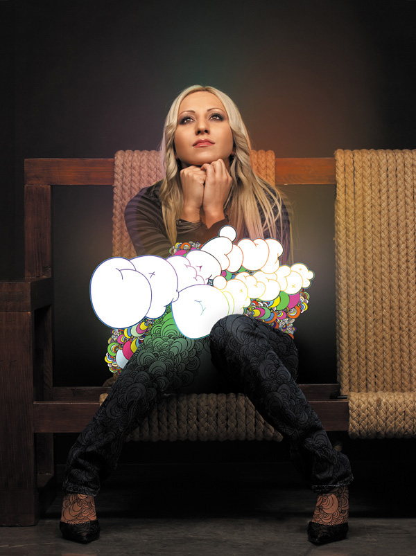
Brighton Language School

I love text effects like this one. This is a super creative text effect, made in Photoshop, of course. The concept is amazing and it was created for Brighton Language School.
BMW X3
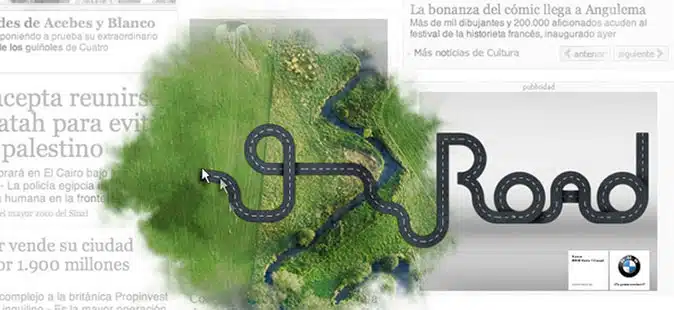
This is a fantastic advert for BMW. The road text actually looks like a road. Clever!
Emmi caffélatte: Drink different

This whole ad design has some really cool elements. The vector graphics blend beautifully with the ice cubes in the corners.
Noodles & Company

This ad is all about typography. The different shapes and sizes of the fonts chosen may look a bit hard to read, but considering this ad is for instant noodles, it’s pretty clever! Think about how instant noodles look. Got it?!
HSBC

A car made of cool typography! You can’t go wrong with a creative concept like this one.
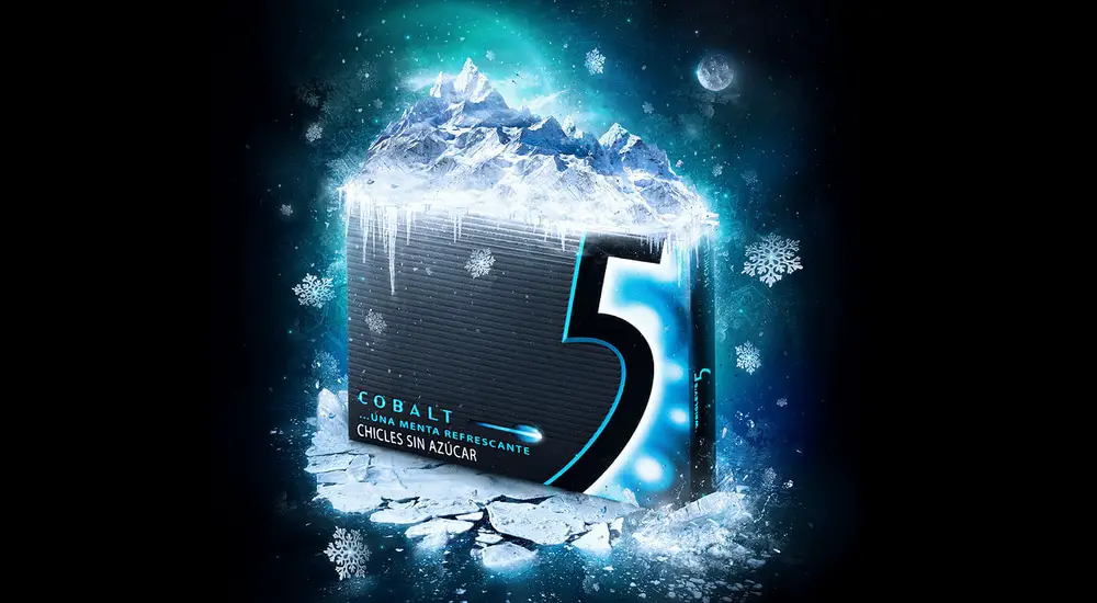
Cobalt Ice 5
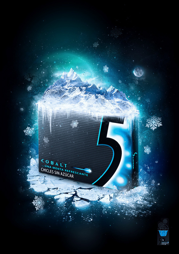
The Five Chewing Gum ads are always amazing, whether we are talking about the TV ones or the print ads. This one gives you the chills!
Ojus Digestive Tablets

This is a fun advert for Ojus Digestive Tablets. Fun and simple!
Into1
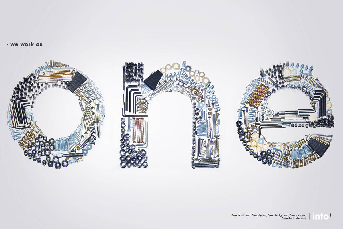
This is an amazing advert for Into1. The one word is made out of different metallic objects. Looks great!
The Prevention Plan
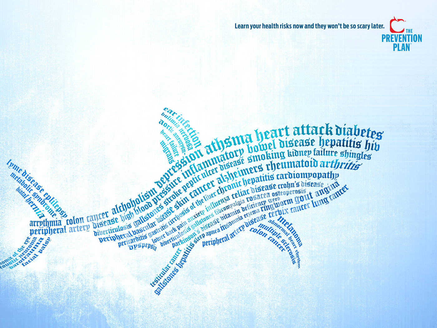
Shark made out of cool typography! As in the example before, with the car, you can never go wrong with a concept like this one. It looks great and catches your attention!
Vodafone
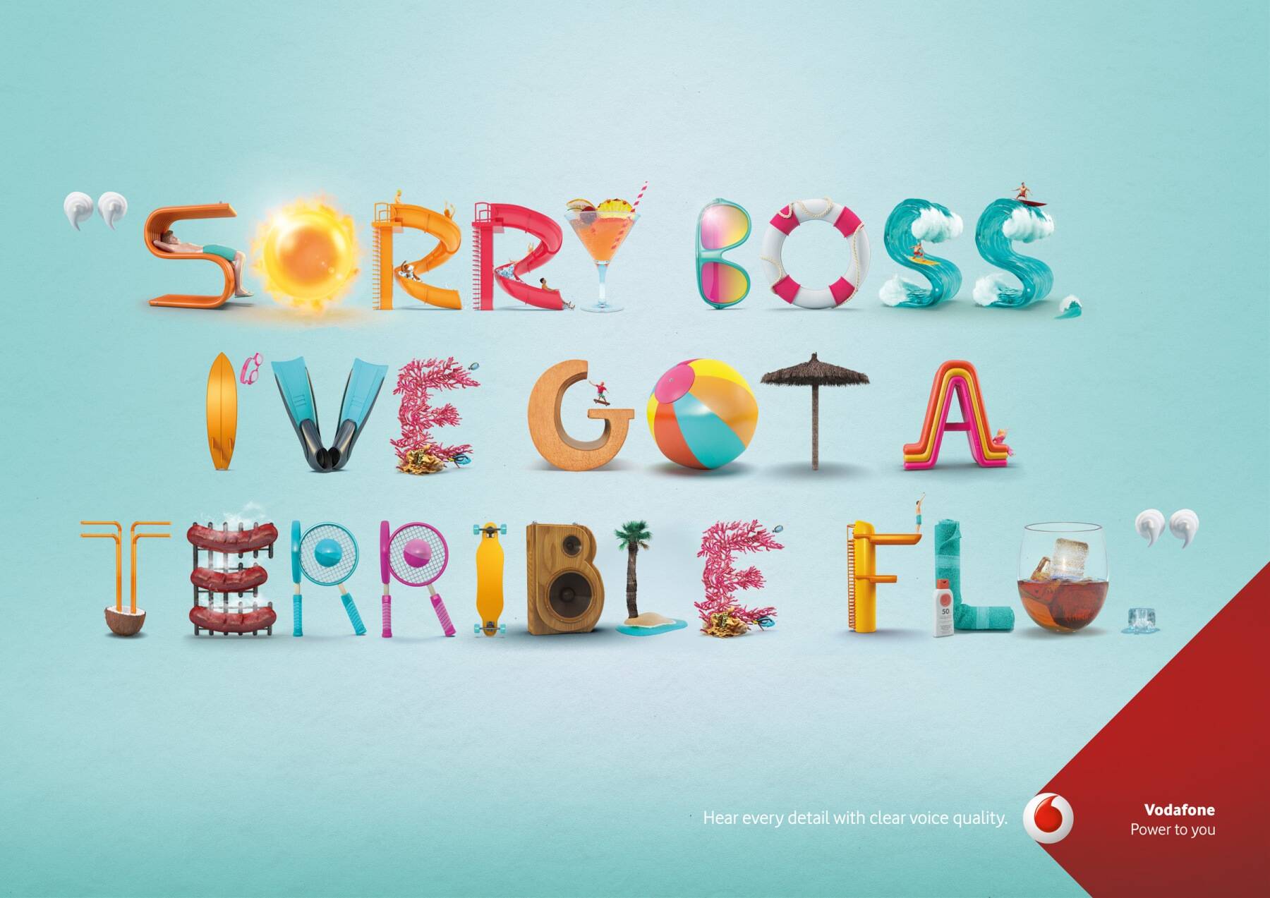
Vodafone’s ads are always clever and this is one of them.
Wall Street Journal
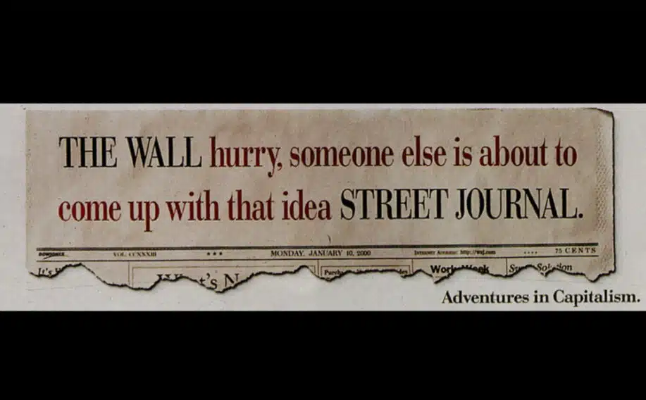
This is a very smart ad concept for Wall Street Journal. It captures your attention and forces you to read it, but at the same time, the brand name is the larger bold typeface for quick identification.
Internet.org by Facebook
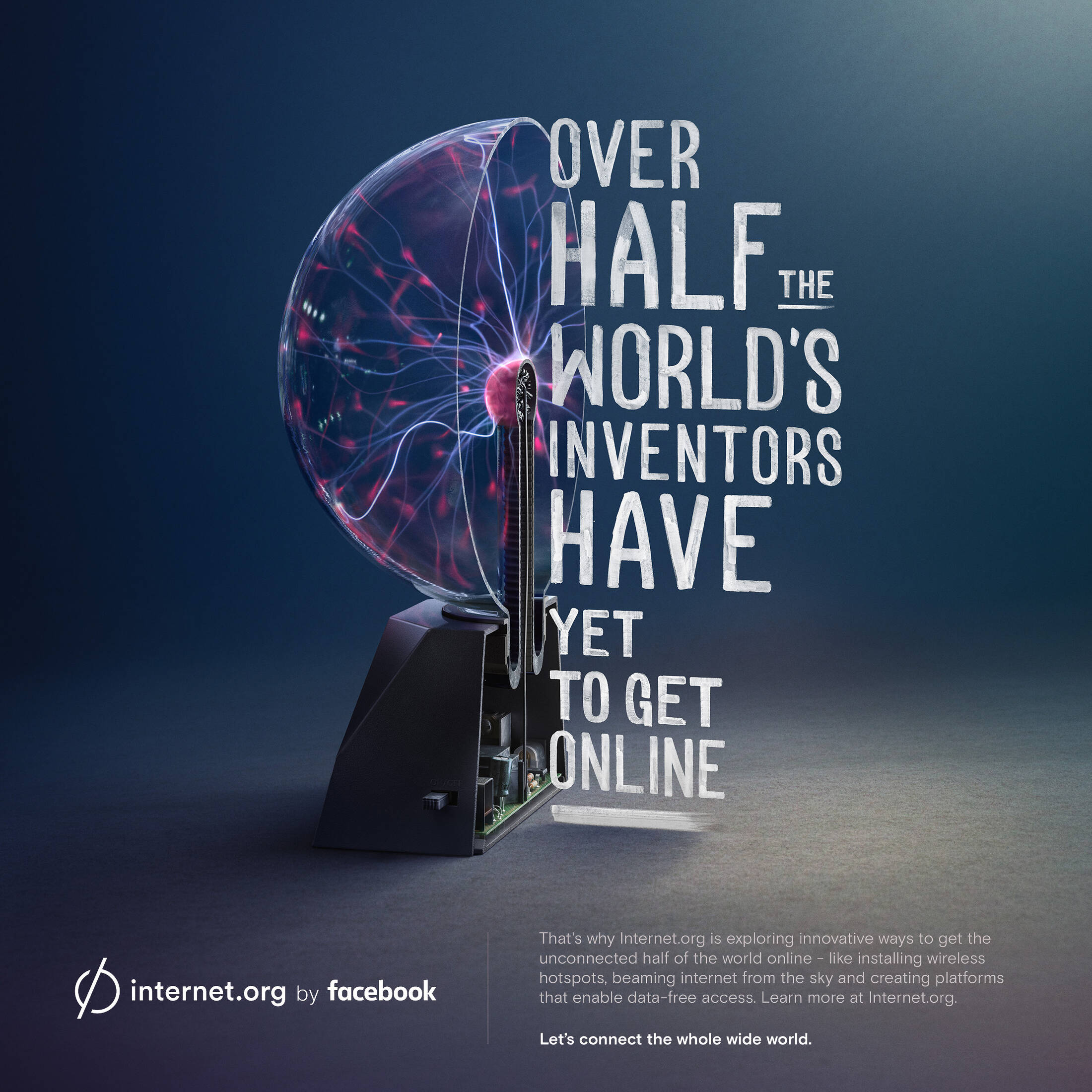
This is a very creative and clever ad by Facebook for Internet.org. The font used here is a distressed or grunge-style font. Unique advertising concepts are some of the best!
Progressive

Progressive Insurance has become a household name in recent years and no doubt it’s due to clever advertising like this movie poster-style ad. The font here is a retro 60s and 70s style uppercase in 3D.
Toyota

This is a cool Toyota car advertisement with the fun factor! The bolt and metal typography fits perfectly with the word Dependability.
Tiger
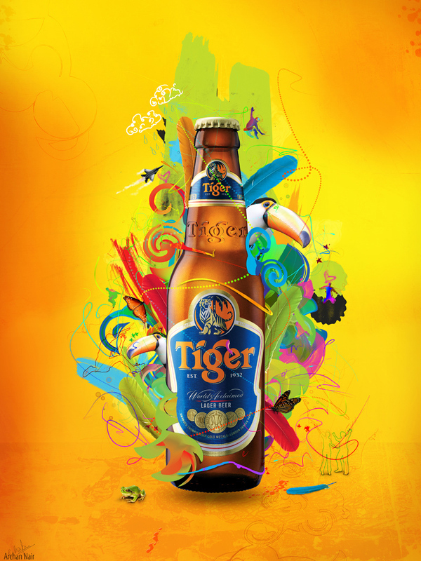
Colorful vector illustrations are frequently used in beverage commercials. This particular one looks great and it was created for Tiger beer.
2Go Activewear

This ad creatively uses the main image of the person running and created large text from it. They used a glitch effect for the entire image.
Great collection that stimulate hundreds of new ideas. I specially liked HSBC and Brighton Language School adds.
Thanks for sharing.
sooooooo
goooood
found this post via twitter, really cool ways of using text and very creative 🙂
Its a great site and have very useful resources. Also helpful in getting new ideas. thnx.
All de best.
Hi there,
This is the first time i’ve come across your blog. I really like this article, there’s some cool stuff to be found.
I’ll be sure to check back soon!
Nice site you have too!
I love the Brighton Language School type example it has a very nice transition from bare tree to full greenery.
Really really happy to see the Tiger brand (beer) being featured here! Because im from Singapore too!
And our company designed a limited edition version of their anniversary a few years back!
Kudos!
And if im not wrong, Tiger Beer is marketed as a high end drink in the West while it’s a mass consumer drink here. 🙂
Yes, you are right. Can we possibly see the limited edition version you designed?
Nice showcase, I like the last one though. Only because it’s sometime I thought I’d never get to in a weird way. Like where the gradient behind the text is expanded, I always felt it was a stupid idea somehow, but since they’ve used it with creativity I feel overwhelmed now :D. Thanks.
nice share.. i really liked it 😉
The measurement tools used in the study were based on the existing literature. Advertising creative factors such ad sound, color, text..
Great find of typography usage in Advertisements. Sometimes Advertising doesn’t have the best typography sometimes because they lean more towards imagery and copy but it is a breath of fresh air when type is used to their advantage.
Very nice collection. Thanks for sharing. Very inspiring