More than 4% of the population is colorblind, and different variations of visual impairments can affect usability and readability of your website. Color accessibility provides sufficient contrast between the foreground and the background and makes sure the navigation and interactive elements are identifiable. Accessibility concerns range from anything to navigation, text properties, audio, feedback, and color. So, you should consider designing your website that is accessible to all, no matter how your users see colors. The top concern of color and accessibility is contrast. There are plenty of accessibility tools that can provide understandable website design. Here are 12 color accessibility tools to help you enhance your website design.
1. Color Safe:
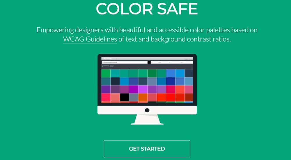
Color safe was designed by Adrian Rapp and Donielle Berg (Salesforce UX Engineer). It is a web application that helps designers to choose color combinations that meet WCAG 2.0 guidelines created for people with different visual capabilities. You need to enter the Hex code for the font family, text size, font weight, background color, and WCAG standard. The tool will generate a palette of options for your text color. The created palette can be arranged by general color groups and selections that can be previewed at the top of the screen. The tool uses a ratio-based formula to generate palette and determine color combinations. If you don’t select the WCAG standard, the tool uses AA level guidelines. However, if ’you’re designing a website for a government or a company, you would require AAA specifications. You can select AAA specifications in the WCAG dropdown menu, and the colors generated will comply.
2. Contrast Checker:
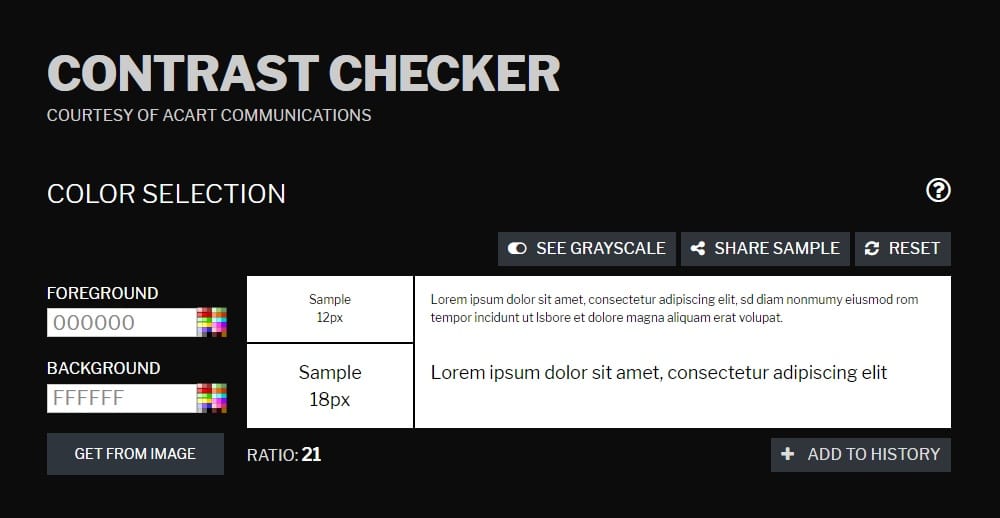
Contrast checker allows you to choose a color for foreground and background on the screen and get an immediate sample for 12pt and 18pt. The sample is then checked against different WCAG visual standards such as AA, AAA, AA 18pt, AAA 18pt, colors (pass or fail), and color difference number. They have provided an option to flip between color and grayscale instantly. Along with this, you can even share the samples of your checks and reset it. Contrast checker also displays the ratio of the foreground and background color. One unique feature included in this tool is the ability to extract colors from images. So if you have a shade in mind from an image, you can easily upload it for selecting the foreground or background color. You can even save the sample as a PDF for future reference. They also provide an option to add your checks to history so that you can compare them easily.
3. Contrast Grid:
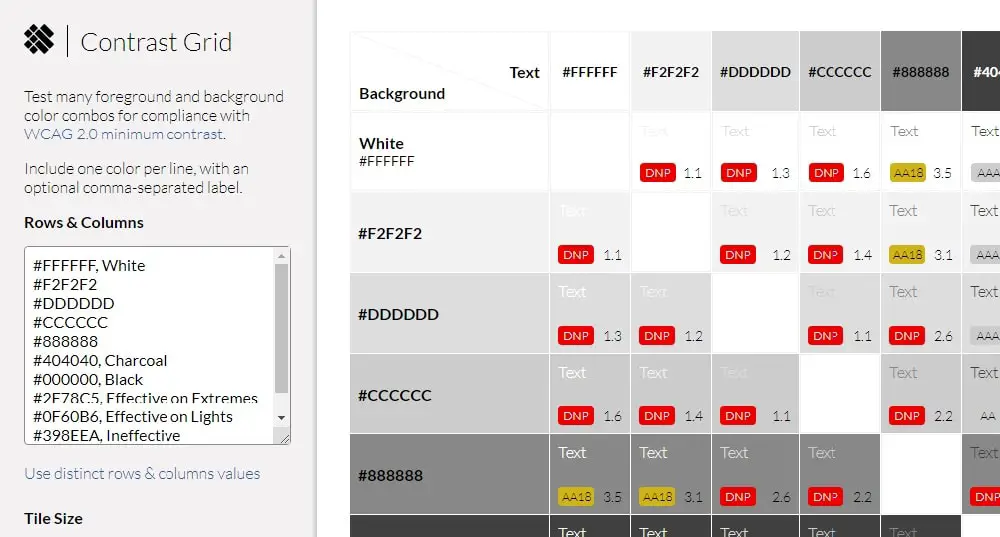
Contrast Grid helps you test background and foreground combinations for compliance according to WCAG 2.0 standards. They have displayed a sample of different color combinations using blue, black, and white. You can enter Hex values to create and compare your color combinations. The grid-display they provide is excellent for selecting colors for your website design. The grid also displays whether the color combination passes or fails according to the WCAG standard and in what conditions. You can select the tile size from small (80 x 80), medium (100 x 100) and large (150 x 150). They have made saving the file easy by allowing the users to save the grid in HTML and CSS format for future reference. You can even share the grid on a social media platform. Overall this tool is great to design a website that allows people with slight to extreme vision problems to go through your website.
4. Colors:
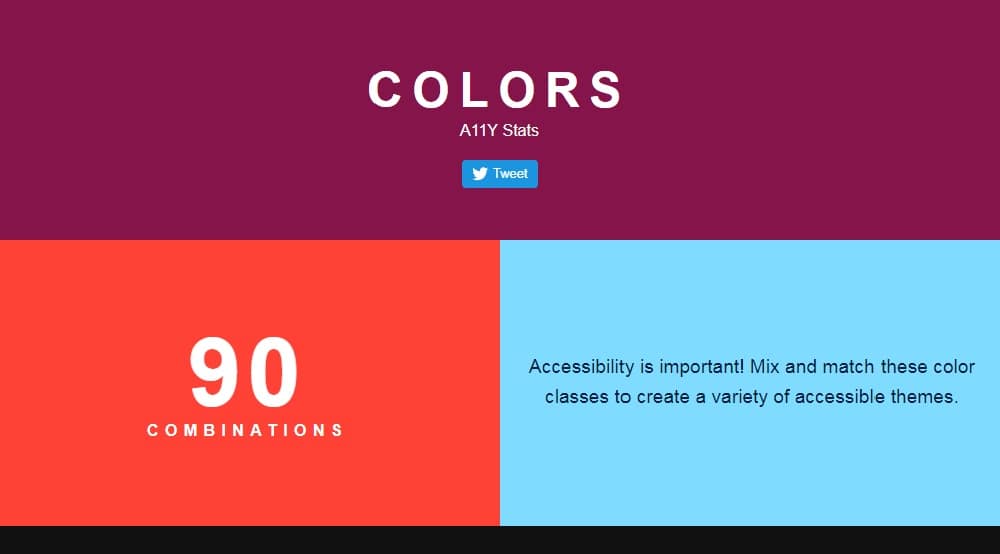
Colors are created by MRMRS. It is a simple tool for designing a website that is accessible to all. They have 90 pre-made color combinations for designing an accessible website. Colors have a different style on their website. They have included information about WCAG, contrast ratio, and size guide. The color contrast ratio ranges from 3 to 19, and the combinations come in three distinct sizes. The WCAG standard included in these combinations are AA, AAA, AA large, and AAA large. The combinations include all primary colors like white, black, pink, green, blue, etc. for foreground as well as the background color. You can share if you like some color combinations. However, if you want to create your combinations, it is not possible to do it with this tool. So you shouldn’t use this color contrast tool if you want to customize your color combinations. But if you want some inspiration, this tool has a lot to offer.
5. Color Review:
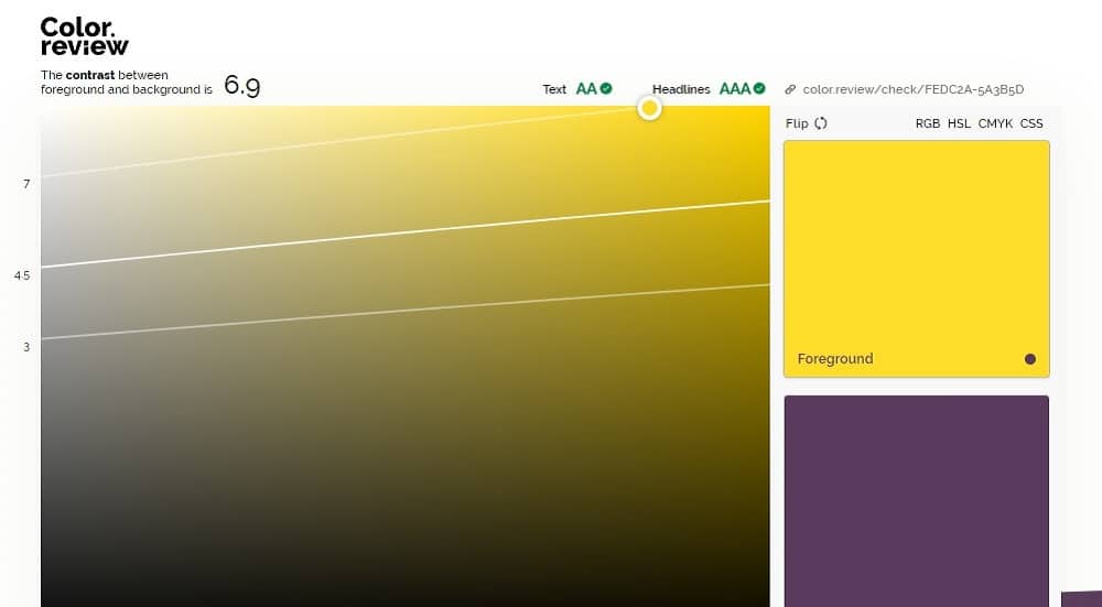
Color review is an excellent tool for selecting colors to design a website that meets WCAG standards. They have created a great bar to choose colors for foreground and background. They have an option to display RGB, HSL, CMYK, and CSS values for each color. You can even flip the color between background and foreground and see the result as your scroll. The sample explains about the accessibility and colors so that you can understand what people with visual problems go through and how to solve it. They have provided a feature on the top to display contrast ratio as well. The text and headline are checked against a series of WCAG standards to determine the readability. You can even change the background color randomly to see how difficult reading is with the wrong colors. You can get the app for android, iPhone, Win, and OS X.
6. Stark:
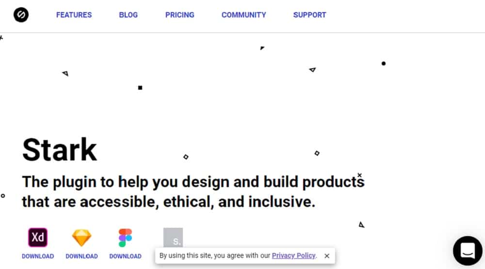
Stark is an Adobe XD and Sketch plugin. It is an excellent tool for helping you design a website that is ethical, accessible, and inclusive. Stark includes a contrast checker that ensures your visuals, typography, and colors work well together, providing legibility, contrast, and readability. They also have colorblind simulation to simulate various forms of colorblindness by previewing your work and suggesting adjustments if needed. Stark is soon launching a feature wherein you can select from a range of contrast-friendly color combinations that are in the same family if your colors don’t pass the WCAG checks. Along with this, they are also planning to launch different export options, including PNG, JPG, @1, @2, and @3 extensions. They have three pricing plans, such as basics, pro plan, and team plan. The free basic version covers most of the necessary features. However, if you want something advanced, you can go for a pro plan that costs $20 per year.
7. Colorable:
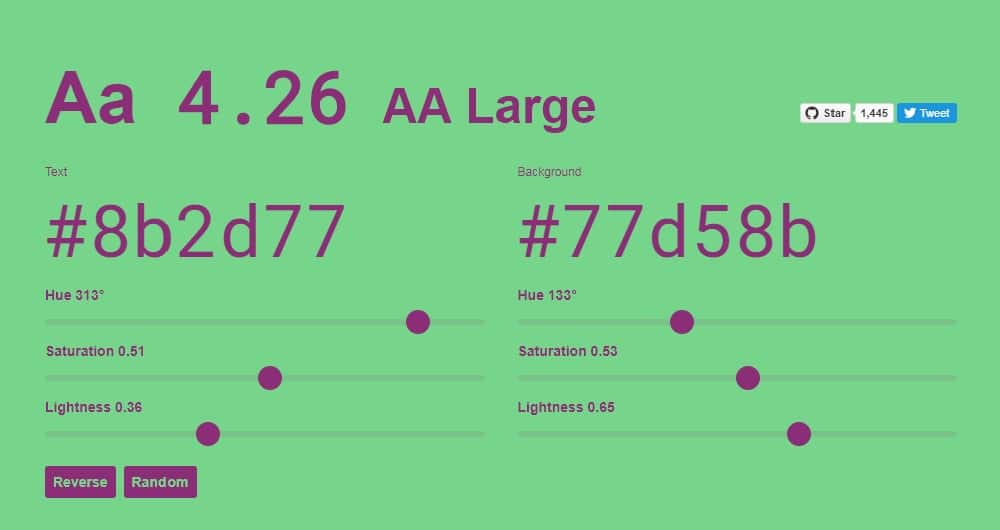
Colorable checks contrast of color combinations using the difference in luminance so that each color distinguishable. You can change the color of text and background to test different color combinations for the website’s accessibility. The colors are represented in Hex value so that you can use them anywhere you want. The tool allows you to adjust different properties such as hue, saturation, and lightness of the colors. The result is immediately displayed on the main homepage itself. The site has different text sizes so you can understand how the website will look like with different combinations. Along with this, the tool checks for WCAG standard and displays if the combinations pass them. They have included an option to reverse colors for text and background. You can randomly choose combinations if you are confused about what works. They have also provided an opportunity to share your creativity. Overall the site is easy to use and solves the problem.
8. Color Oracle:
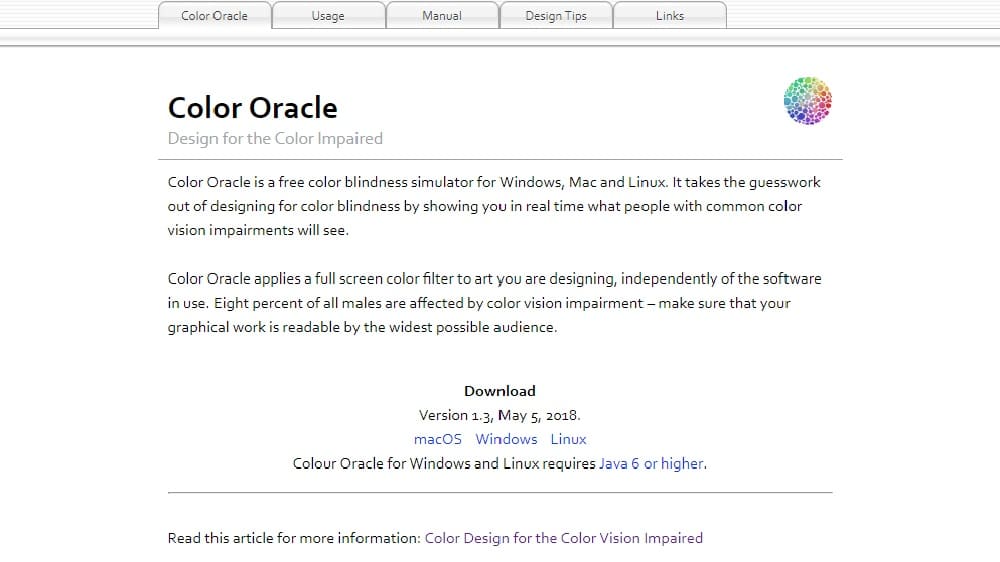
Color oracle is designed by Berny Jenny and tested by Nathaniel Vaughn Kelso. It is a colorblindness simulator to improve colors on your website. They analyze your work and show you in real-time how people with color vision impairments see the website. Color oracle occupies full screen and applies the filter to the art you are working on, without getting interrupted by the software you are using. They are the first ones to display the effects of different visual problems like deuteranopia, protanopia, and tritanopia. They have different filters to choose the colors for foreground and background. Color oracle uses the best algorithm to provide these functions. However, a highly saturated color is sometimes hard to simulate with the current version of the color oracle. The app is available for iOS, Windows, and Linux. Color oracle is a free application that makes it great for designing an accessible website.
9. Contrast Ratio:
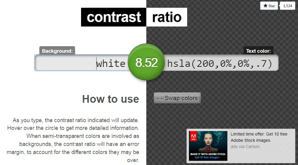
Contrast ratio is designed by Lea Verou that allows you to test different color combinations. The contrast ratio even displays the contrast number of the combination. If you hover over the circle, you can get more details about the standard that color combination passes. The tool accepts all formats for selecting colors including HSL, Hex, RGB, and more. If you have semi-transparent colors, the contrast ratio will show an error margin, to account for the various colors they may be over. They have different text sizes and font styles in the normal and bold format to demonstrate how readable the color combinations are. You can even swap the colors of background and foreground to understand what works. They have a hidden feature where if you press the up and down functions when over a number inside the functional color box and the numbers with increase or decrease.
10. Color Contrast Analyzer:
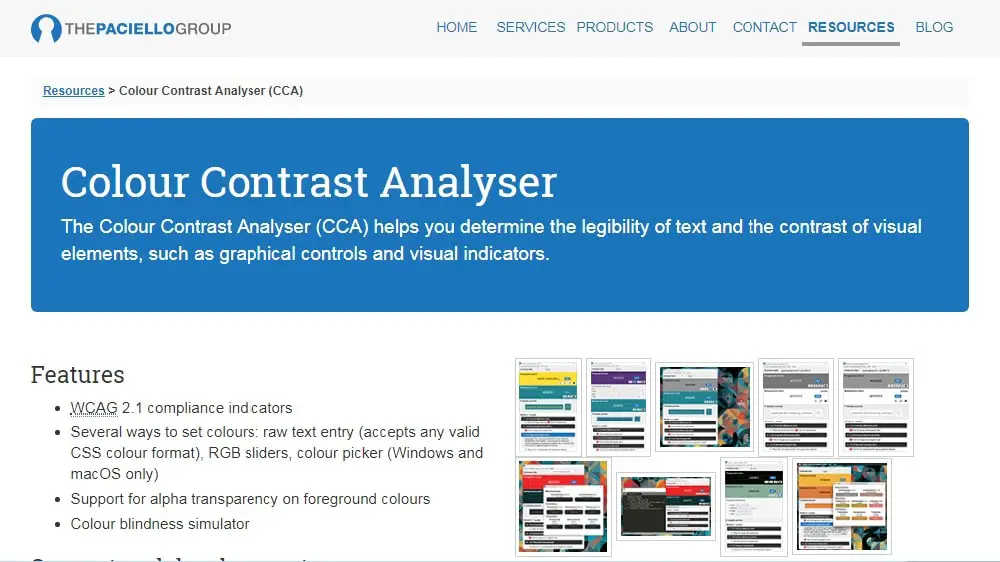
Color contrast analyzer allows you to determine the legibility of foreground and contrast of visual elements like visual indicators and graphic controls. You can select colors for text and background by pulling RGB sliders, color pickers (Windows and iOS only), and raw text entry (any CSS color format is accepted). They have different filters to increase or decrease colors. Color contrast analyzer allows you to set color combinations to use the luminosity or brightness/color algorithms that check and preview all the selected colors against different types of color blindness. They use WCAG 2.1 standards to test different color combinations and displays different color ratios. The tool supports alpha transparency on text colors, along with giving detailed information about all visual impairments. Color contrast analyzer is a neat application that does everything except analyzing a web page. The app is available to download for Mac OS X and Windows.
11. Cloudflare:
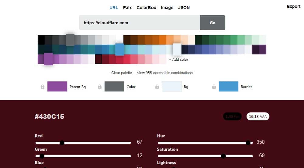
Cloudflare includes all features to make your website accessible. You can select colors using the grid or adjust it using RGB value, hue, saturation, and lightness. You can see if your color combinations meet the WCAG standard in the sample itself. As you scroll through the website, you will find a feature to play different color combinations (a mix of 4 colors), and you can favorite the ones you like. The good thing about the slide show is that it includes different icons as well as texts in various sizes to help you understand which combinations work. You can select the border thickness and border padding for the sample as well. They have 920 pre-made available combinations you can choose from. They have displayed different visual impairments with the percentage of people suffering through it at the end of the homepage. You can select various vision problems to see real-time how they see different colors.
12. Tanaguru Contrast Finder:
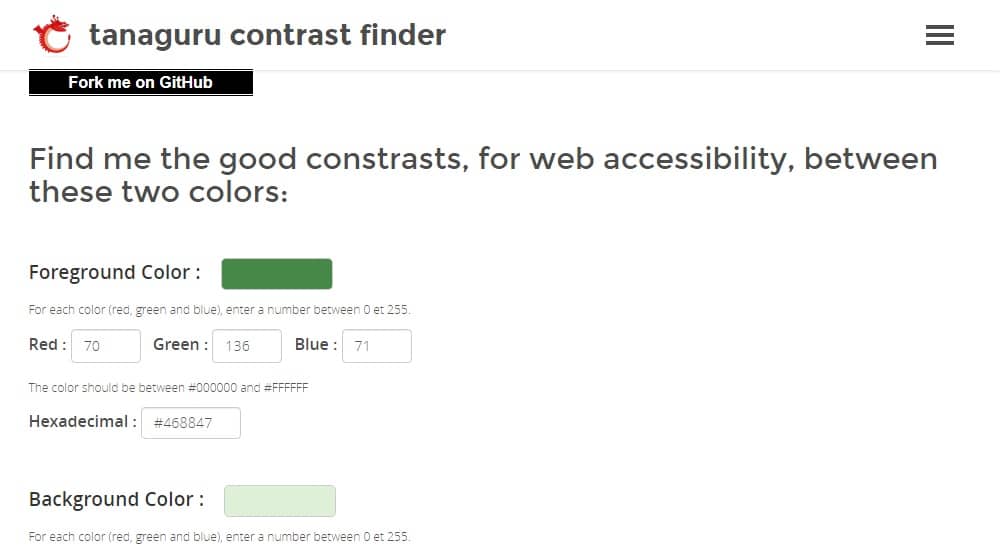
Tanaguru Contrast Finder allows you to choose the contrast that improves the accessibility of your website. This tool helps you choose colors based on hex value as well as RGB value while showing the shade in small boxes. You can increase or decrease values using the arrows inside the numbers to choose different shades around the same family. You can select the minimum ratio from 3, 4.5, and 7 for your text and background. If you want to keep one value (foreground or background) constant and change the other, they have given the “component to edit” section for this function. You can play around with colors by choosing “valid colors around initial value” or “range of valid colors.” The result you get once you submit all the values are shown creatively. The sample consists of different text sizes along with bold and normal format to help the user understand more.
While designing a website, accessibility is essential. Even if you don’t have any visual impairment, sometimes it is good to step back and think from other people’s perspectives who suffer from such issues. So it best to consider accessibility and use these tools to improve the design of your website.