In typography, sans serif refers to a style that does not have small projecting features, or serifs, at the end of the strokes. This typeface goes by several names, including sans-serif, san serif, sans, or gothic. Gothic is a somewhat outmoded term, but you will still see it from time to time in font names like Century Gothic or Trade Gothic.
The term comes from the French sans, “without”, and the Dutch word for line, schreef. In printed documents, sans serif fonts are most often used in headings, even when a serif font is used in the body text.
While both font types are used on the web, sans serif has become more prevalent in body text, and in headers as well, due to readability considerations. On older computing systems that featured interlaced screens or lower resolution displays, serif fonts would not always display correctly. The little knobs or dashes would tend to disappear or become distorted.
Serif vs. Sans Serif for Use on the Web
Today’s computers and web hardware systems do a better job of displaying serif fonts, even on small devices; but the use of sans serif for body text is still the preference of most designers. No matter which font type or style a designer may elect to use, there is always the challenge of how it will display on one device vs. another.
Since a designer has no control over which device type a user will choose, the only real alternative is to work with fonts that are not only attractive and readable, but are likely to display correctly on most, and hopefully all, delivery mechanisms; whether they are tablets, PCs, or smart phones.
As a designer, you are faced with having to please “everyone”. Responsive design is one solution, but even that may not provide the best “typographic experience” on some devices. Consequently, you have to anticipate user choices as you design.
Fortunately, many who specialize in font design take this issue into account, and they design web fonts not only for their artistic appeal or uniqueness, but so they can also be dynamically downloaded to ensure the text will display correctly, from device to device. When the font you select displays as it should do, it may be because whoever designed it, did so with optimal digital performance in mind.
A good example of a font type that has been designed with digital performance in mind, is the E-text font. E-text fonts are specifically designed to maintain their readability, clarity, and sharpness when displayed on small screens. This applies to serif fonts as well as sans serif fonts, so the use of sans serif fonts is no an automatic choice.
Which should you use? It boils down to one thing – readability, and the best way to ensure readability is to test for it. A good approach is to select several font candidates and test each one on every platform or device you can think of.
Once you’ve picked the best typeface and type size, a viewer can still override your settings. You can’t control things at the other end; but as a designer, you still need to do your research and do the best you can at trying to please everyone!
Informal San Serifs – a Myth
Sans serif fonts are by their very nature somewhat formal. There are no curves, squiggles, or twists to hint at fun and entertainment. Sans serif font can however, be used in a way that is less formal, and even relaxing. The secret lies not so much in which sans serif font is used, but the way in which it is used. Sans serif has a strong tendency to take on the characteristics of other typefaces. Pair sans serif with an old style font gives it a more classic feel; pair it with ornate script and it may feel more feminine or relaxing.
The following sans serif fonts should give you some ideas on how these font styles could best be put to use, whether in print or on the web. Feel free to download any that happen to strike your fancy.
We’ll start not with serif or sans serif, but a style somewhat in between – slab serif.
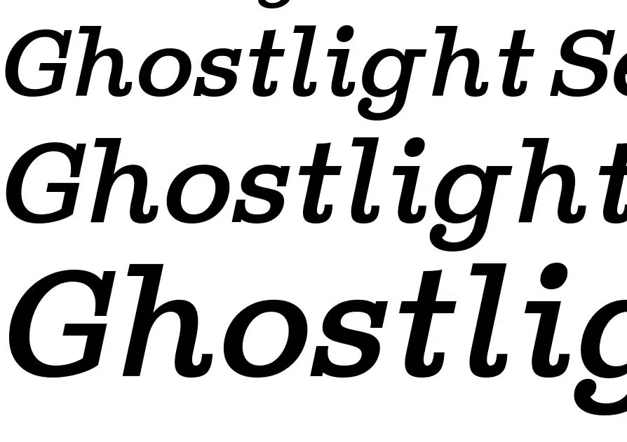
Ghostlight is a family of slab serif fonts. The inspiration for these fonts came from two classic typefaces, Clarendon and Egizio. Ghostlight comes in 5 different weights, plus a very attractive italic. It is an excellent choice for both display contexts and in text.
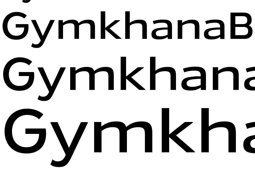
This elementary sans serif font comes in 6 weights and italics. GymkhanaBk’s large x-height and generous width makes it easy to read on any screen size. In OpenType savvy applications, you have access to old-style numerals, monospaced numerals and old-style tabular numerals, along with a host of math and monetary symbols and combining diacritical marks.
The Gymkhana font family supports most Latin-based languages, together with Greek, Cyrillic, Vietnamese, and Pan-Nigerian languages. A desktop license for Gymkhana Book can be yours for free.
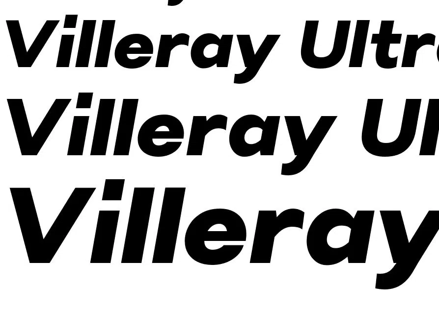
Villeray was designed with maximum versatility in mind. This sans serif font boasts 11 weights, together with an italic and a charming rounded edition. Villeray also comes with a large variety of alternates, most in stylistic sets, so you can work with a huge array of different styles if you wish.
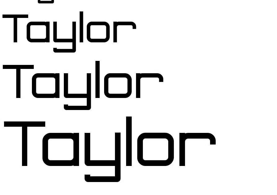
Taylor is beautiful, clear, and highly readable. This sans serif font was created by Mbafonts. It is an excellent choice for a headline, and it is an ideal font for many design applications, both digital and print.
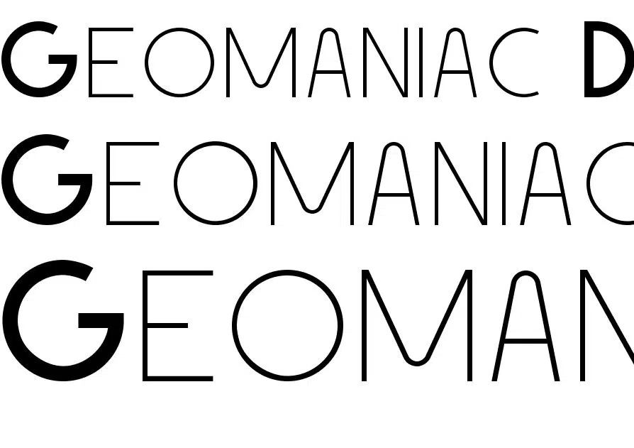
Don’t let the name scare you. This simple, geometric typeface with a retro look was inspired by the Bauhaus movement in the 1920s. This is a free demo version of Geomaniac. It comes in caps-only and in 2 weights. The standard version has 4 weights and includes 130 characters.
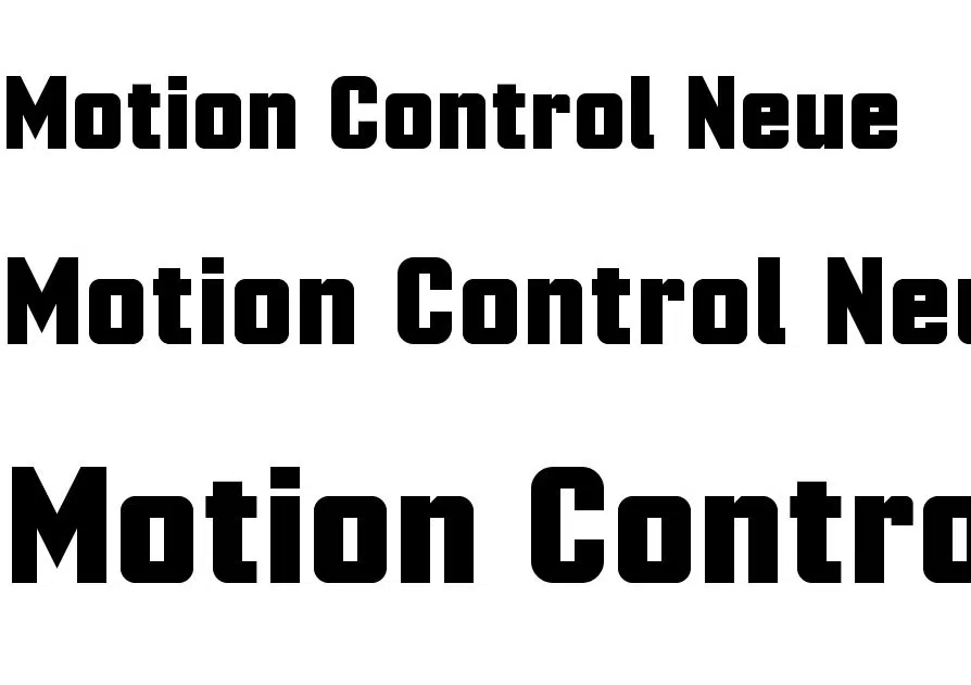
This is a revamped version of the Motion Control. The original free font version contained a number of letterform and spacing mistakes and inconsistencies. The Motion Control Neue version has been tweaked to make it look better. It features four obliqueness levels and impressive multilingual capabilities (Greek, Cyrllic, Hebrewm Thai, and Latin Extended A support). The new version also contains OpenType alternate letterforms.
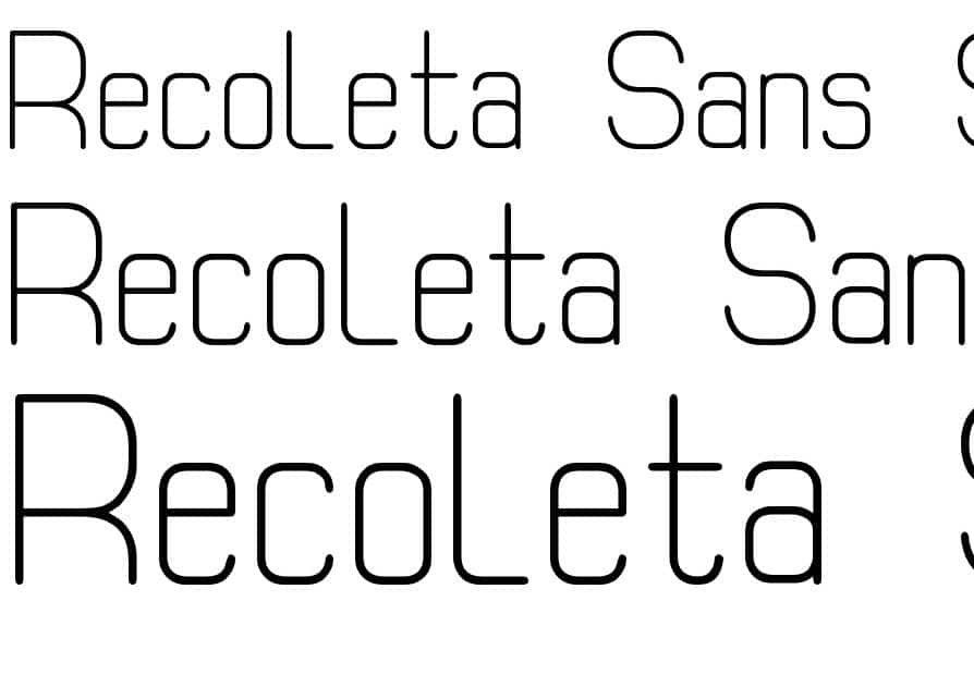
Recoleta Sans is an original design of southype. It is free for your personal use, and for non-profit uses like charitable campaigns, school newsletters and other non-profit educational uses, and independent YouTube videos.
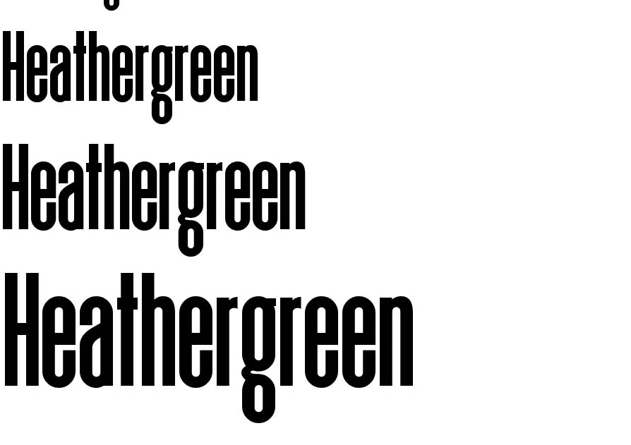
Heathergreen is a close relative of the Deutschlander font. It is about 20% taller. It is designed to fill body text or accompany titles, or anywhere there is a need to take up more vertical space. Heathergreen includes basic/ extended Latin, Greek, and Cyrillic, and other European language accents and diacritics. OpenType features include ordinals, small caps, stylistic sets, ligatures and alternates; a highly versatile sans serif font.
Other Sans Serif Fonts to download:
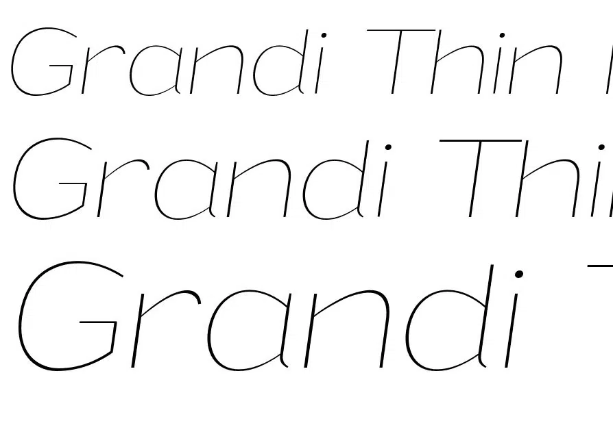
Grandi PERSONAL USE Thin Italic