Humans are visually driven. The visual stimuli guide us in almost everything that we do. Successful brands across the world have a strong association of a distinct color scheme in their brand identity. Hence, establishing a solid brand identity is highly essential for any business. It is a vital component in building trust and developing the comfort level with the consumers. It is also critical in the creation of the brand advocates in the target audience. Speaking of the brand, one of the most crucial elements is its logo. The color scheme must be aligned with the brand and the logo, as it aides in consumers’ understanding of your business. It is also something which has to be in absolute alignment and synchronization, as it is associated with the brand identity. Over 90% of the snap purchase decisions are based on the color schemes and its perception. Opting for the right website color scheme is very crucial for creating a lasting impression. After all, according to the research, color increases brand recognition by almost 80%. When developing and designing a website, it is imperative to consider the selection of colors carefully, as different colors send different messages to the consumers. Here’s how to crack this and get the perfect color scheme.
1. Understanding Color Psychology:
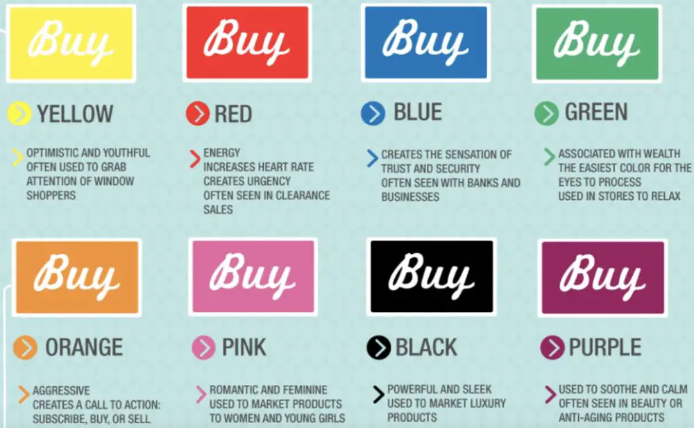
You need to familiarize yourself with the color psychology before attempting to compile the color palette. Each and every color resonates with the people in a different way. Different colors invoke mixed emotions in the people. However, this can vary depending upon the demographics. Based on the product, analyze the target audience- the personality and emotions. Ask yourself the question, that what is it you wish to invoke among the target audience. Accordingly, choose the best suited primary color for your website color scheme. For example, if the brand is related to finances, it is best to opt for the color Blue, as it translates into trust and dependability. Similarly, if you are dealing with a brand which is an organic food company, the color Green would be the best- as it is associated with health and nature.
2. Go Safe with Sector Knowledge:
![]()
Understand the sector and the niche of the client. Color Psychology is critical to the brand and its identity. Each color and shade has a different psychological impact on the minds of the consumers. Various industries prefer different colous, based on the product or service they are offering. Through this, they try to evoke a certain set of emotions and create industry-related associations. Here is the study which analyzed 520 logos, with a range of industries, to identify which sectors favoured which color. The findings showcase the top 20 brands in each sector and their dominant colors.
3. Competition Analysis:
You can always take a note or two from the competitors in the industry. Check out their websites, and study the logo, branding, and the colors used. Observe the similarities in the usage of colors, and analyze it. This analysis would also give you a very fair idea of the tones used in the industry. You have two choices then- either you go with the flow, and use the conventional color scheme, which fits the bill, or you go in the opposite direction, and differentiate the brand. Either way, you need to ensure that the brand message and the story are conveyed and perceived in the way they are supposed to be.
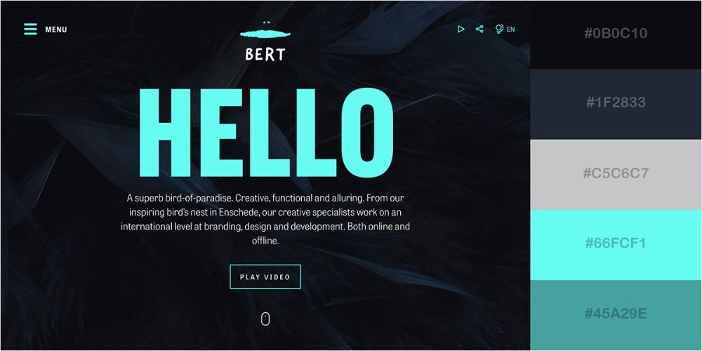
4. Fix your Primary Color:
![]()
This primary or dominant color is the brand color. The brand and the website would be associated with this primary color by the consumers. This color would be particularly helpful in bringing out a certain set of emotions or feelings when consumers or potential consumers arrive on your website. This is the color which you would want your target audience to remember when they think of the brand. If the logo is already in place, ensure that your primary color is one of the colors used in the logo, preferably the primary one. Use this dominant color in the right places, instead of just inserting it everywhere. The color should make the content and the website ‘pop’, and should be used to highlight the features or details where you want your audience to focus.
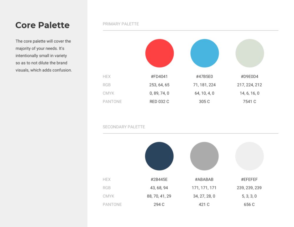
5. Fix the Number of Colors:
Using just one color accompanied by the negative space is just too bland and boring. Determine the set of colors you wish to use. Make your design more interesting and visually appealing by using accent colors. Through this, you can highlight various features of your website, like the buttons, quotes, or tabs. Color mixing and matching can be very tricky, especially without the understanding of the color theory. Hence, it is best to consult the ‘Color Wheel’. Go for either Analogous Colors or Complementary Colors. To further streamline the process, you can also use tools like Colorspire. Through tools like this, you can have a clear idea of how your color scheme would look like on the website. Ideally, you should have 3 colors, and follow a 60-30-10 rule.
6. Use of Neutral & Secondary Colors:

Matching the secondary colors with the primary colors can be a great struggle sometimes. However, there are a lot of free tools available out there, which can make your work easier. Colorspace and various other color palette generators are available, which can see you through the confusion. You just need to enter the hex code, and you will have multiple options. Specific designs do require the use of secondary colors- especially for the websites which are filled with content, landing pages, products, downloadable assets, and so on. At the same time, you will also need to use neutral colors, to create a contrast for the important elements. The most common neutral colors are white, grey and black. It is always a good thing to have a light / neutral color and a dark color for different cases.
7. Color Placement:
Now comes the critical question as well as the area of interest- how does one go on applying the website color scheme ideally?
Primary colors usually go to the ‘hotspot’ of the web pages. Use these bold and vibrant colors to compel the visitors to ‘take the action’. They should be used to attract maximum attention and clicks. CTA buttons or tabs and other important on-page elements are required to be highlighted with the primary colors.
Secondary colors are generally used to highlight the information which is less critical in nature. This includes the subheadings, secondary buttons, as well as active menu items, FAQs, testimonials, and other supportive content. Neutral colors can usually be used for the text as well as the background, but they are quite useful in the vibrant and colorful sections of the website. The neutral colors would also help the website tone down, and aid in the refocusing of the eye.
8. Letting Go of Preferences:
Everyone is entitled to opinion and choices. Everyone has their own set of favourite colors, which can lead to one having preferences and biases as well, towards specific colors. Several brands get swayed with these biases and preferences while opting for the color palette in the website design. It is important to note, that it is usually not aligned with the color psychology. It is undoubtedly tempting to opt for the favourite color, but analyze the sector and the target audience. If the brand is intended for a female demographic and the product range comprises of cosmetics, it may be a great idea to go for the pink tones or shades, irrespective of the personal preferences or biases.
9. Compare Nearby Schemes:

It is not a compulsion to commit to the very first color scheme that you create. This can be very limiting to your work as well as creativity. It is advisable to have 3-4 options of different color schemes. Based on this, you can have a better sense of the overall look and feel of the website. This comparison will also be helpful in the planning of the layouts of the website. You can also get the opinion of your clients as well as colleagues or team members, and have a better understanding of what works and what does not. After this, you can narrow it down until the point you can zero in on the color scheme which fits the website requirements perfectly.
10. Revise and Brainstorm:
Once you have finished the process of the selection of the color scheme, it is necessary to put it to the test one more time. You need to analyze the fact that whether this color scheme would work in other formats or not. Put your chosen color scheme to the test in different scenarios. Visualize how it would appear in print or a merchandise range. You can also research a bit more to identify the effect it would have on the visitors. The color schemes are not that hard to get by, with plenty of the tools available on the Internet. These tools are of great help in finalizing the color schemes, and they are also free to use. It is highly possible that you may have to go through this process repeatedly until you figure out the right color scheme, which works the best and fits right in all the scenarios and formats. In either case, you will end up with the alternate options, in case the client or employer rejects the best one, or it does not work well.
11. Color Guidelines:
It is important to remember that the color scheme is not a ‘painting’ of sorts. Yes, the website rests on the fact that the design must be appealing enough to have sales conversions, and is dynamic. However, the design is secondary to the content. Remember- the purpose of having a color scheme is to highlight the website content and the various functions. The design and color scheme must not overpower the content of the website. The color scheme and content must be aligned, and the color scheme must be in the background- pushing the content into the foreground. The colors used can either be in sync with the industry conventions or something different- either way, it must be contrasting in nature, preferably. An only a limited number of colors should be used, so as to make the website look appealing and not too loud. You can take the color quiz, in case you are in a fix. Demographics and the target audience must also be in the primary consideration when deciding the color palette for the website.
Coming up with a workable, function, and an appealing scheme which just fits perfectly can be tough. However, you do not need to be exceptionally experienced and highly skilled to do it. You can still crack this, even if you are relatively new. Make the good use of the tools available on the Internet, if and when you get stuck or are confused about the colors. However, it is very important for every designer to understand color psychology and the theory, before beginning the actual work. You must know the emotions and feelings involved with every color, and the response the consumers have specific colors. It is also necessary to have a primary and working understanding of the color wheel and the 60-30-10 theory. With ample experimentation and several trial and error attempts, you can have the optimal color scheme for the website. This color scheme would be a vital element in brand recognition and recall value. An effective website color scheme is responsible for creating an emotional connection with visitors. It can contribute to a lower bounce rate, which would lead to more time being spent on the site, in turn, giving a higher conversion rate. Hence, the color scheme can have a generous impact on the brand and the business of your client or employer.