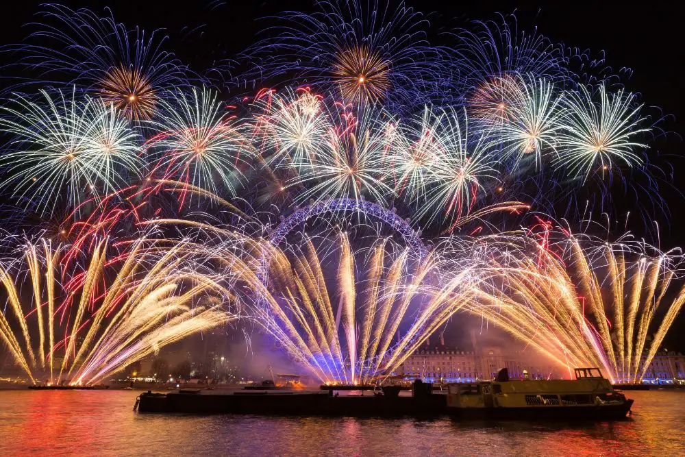
5th of November is celebrated as the official bonfire night or firework night – as some people may say. Also known as the Guy Fawkes Night, this celebration primarily belongs to the culture of the United Kingdom. While this festival brings fire and light along with it, it has been celebrated around the culture in numerous ways.
The arrival of Bonfire Night is a sign of inspiration amongst designers and illustration artists too. A lot of forms can be derived to design your logos, website banners, vector arts, and branding collaterals.
The fire has always had the most radiant of colors. Orange, red and yellow – a combination of complementary colors, that doesn’t fail to awe anybody. For years, artists and designers have illustrated fire and designed using the qualities of it, but very few have nailed the right use of it.
Here are some inspirational work and art that could help you set a starting point for yourself and your artwork.
1. Charles Street Community:
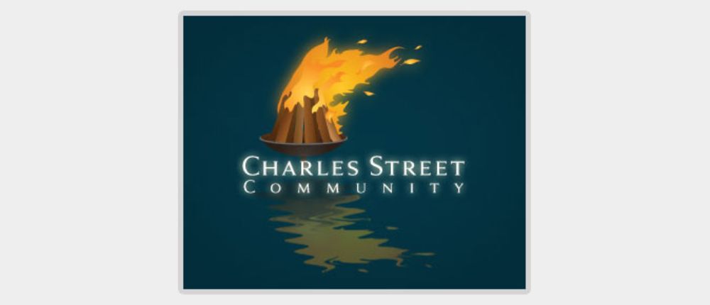
Charles Street community is a company in Providence that is very well known for its WaterFire displays – basically, an array of fire on the river water. This logo does absolute justice to the company’s ideology. It is a small bonfire floating on a water body. You can see a clear reflection in the water – a glance of how their displays might look. The colors of the composition are well-chosen, with dark hues at the back and orange and red fire. A glowing sans serif font holds the company’s name in all-caps, which draws attention to the logo immediately.
2. FireWater Solutions:
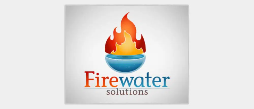
Designed for a client, this logo is a direct representation of the company’s name. A bold red and orange fire sitting comfortably on the curvature of a water droplet base The colors are chosen complementary to each other and denote the concept of the brand very well. The designer decided to use the ITC Stone Sans font for its name, while the colors of the logo encapture slight gradient effects.
3. Anime – Datte Atashi no Hero:
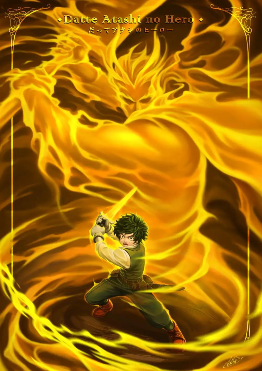
Anime is one of the most expressive forms of graphics and animation ever to have been created. It is a powerful medium of art and is gaining growing popularity among pop culture. Datte Atashi No Hero – meaning ‘Cause you’re my hero,’ is one such artwork that is expressive as well as uses the fire element very carefully. Using beautiful strokes, the central character has been replicated in the form of fire in the background. Very carefully, the artist has played with dark and light parts of the fire to create another character in the background.
4. Fire Photography:
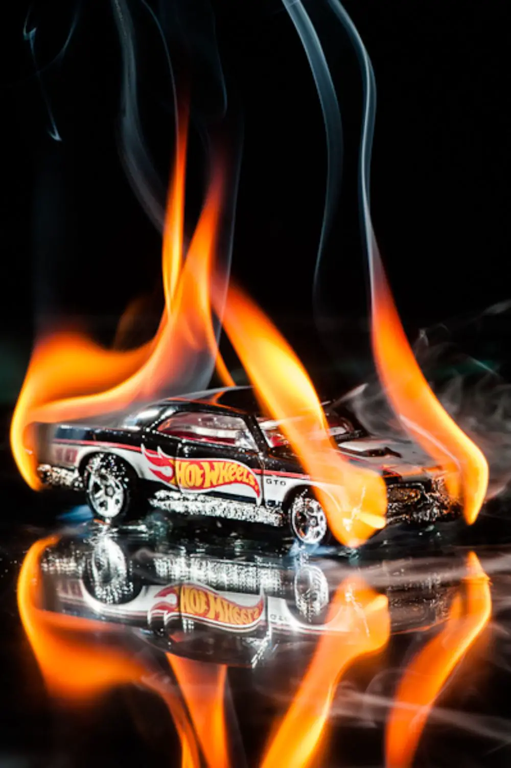
Fire is an excellent element for graphics, but for years, it has also sparked the interest of photographers. It has often been used as a dynamic and fierce element wherever a photographer has wished to add a little drama. As in this frame, you can easily see that the fire adds a little something to the ‘Hot Wheels’ brand toy car. It accentuates the concept of hot wheels and also portrays the car of blazing speed.
5. Spice It Up!
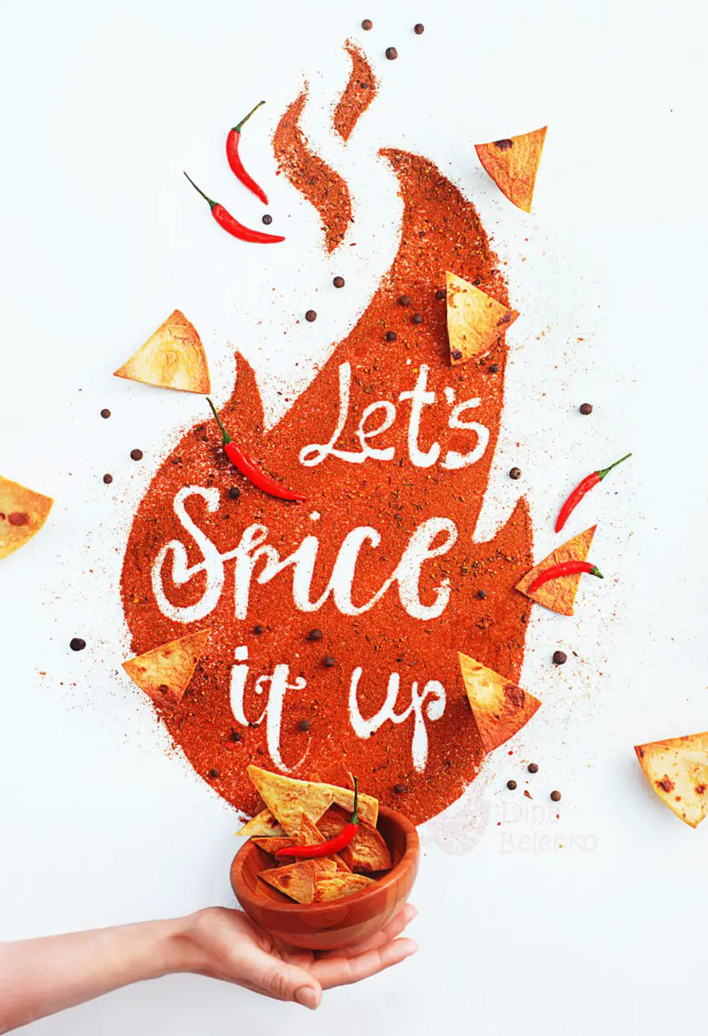
This could be merely a stock image, but the use of chili powder to form a vast fire motif is quite smart. It brings an emphasis on the ‘spicy’ fact, which is also another good connotation of the word fire. Fire doesn’t always have to portray hot flames – it could also be food! And what’s more? This graphic is perfect for a Bonfire Night due to the choice of food too.
6. Minas Gerais:
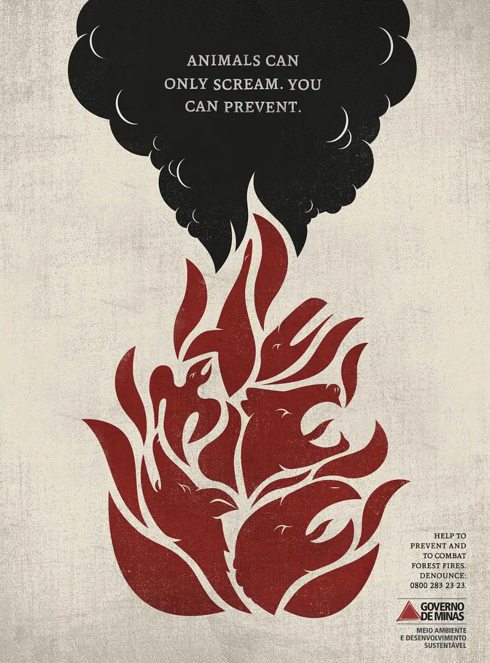
This is a beautiful poster design that rightfully emphasizes on the forest fires. With a tagline that reads, ‘Animals can only scream. You can prevent.’ this poster is an excellent example of a figure-in-ground style of graphic design. You can see the shouting animals amidst the fire motif, and that itself is a huge statement. Designed for Minas Gerais – a non-profit organization – this print design was created by Lapisraro, Brazil, within the public interest.
7. The Fortress of Fire:
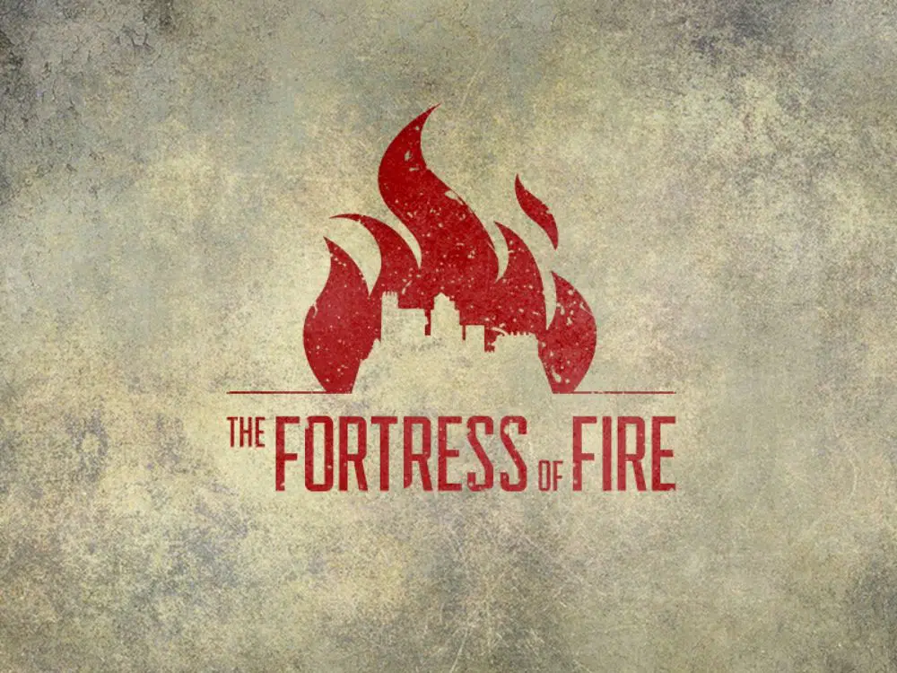
Created by Jim Basio, this graphic was developed for his friend’s upcoming novel named The Fortress of Fire. Once again, a marvelous example of figure-in-ground, this graphic showcases a fortress within the fire motif. The color selection and the rustic background give it a slightly vintage feel, which only goes with the potential storyline’s vibe. However, one of the highlights is also the selection of font – sans serif all-caps font – with decorative edges that balances the space and color.
8. Burnt Out:
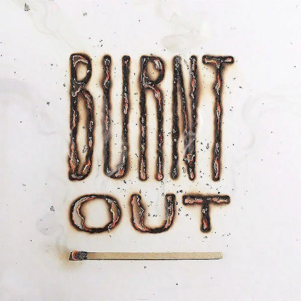
As far as Bonfire night inspirations go, this one is just an effect that can give you the feels. Who says that flames can only showcase fire? In this graphic, just the burnt-out impact gives you the feeling of light – aftermath of it, that conveys the message loud and clear – Fire was here. A beautiful effect can be used in numerous ways, be it to decorate your parties or even for liquor/smoke brands.
9. Fire Camp 16:
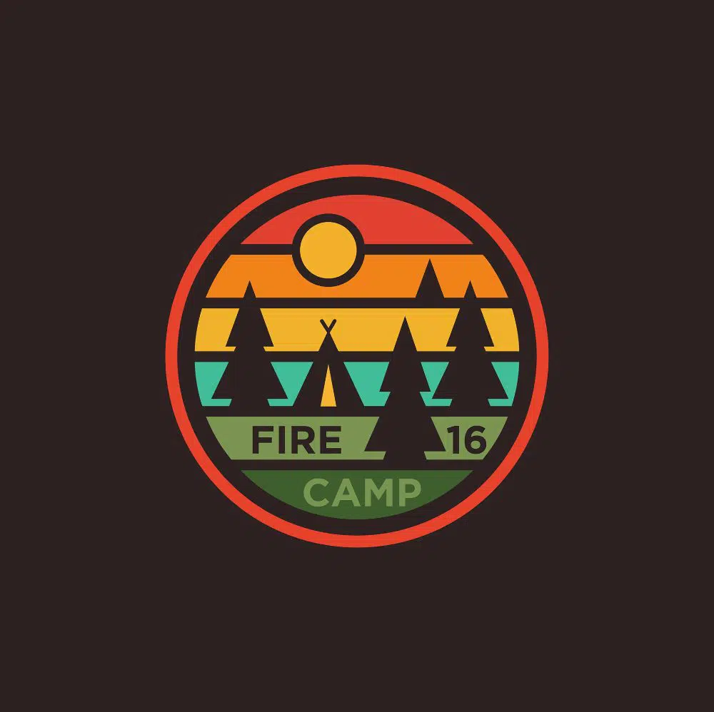
Fire Camp 16 is a graphic badge created by Dawar Mir, who has smartly made a logo for a camp. Taking inspiration from the colors of fire, he had graded the colors of the sky, with an evident campfire scene with simple line and shape elements. These camp elements include pine trees, a tent, and the moon. The logo also incorporates the name of the campsite in bold sans serif font. The artist has also made a red ring around the final logo to neutralize and balance the design.
10. Logo Rebrand:
![]()
This logo is super chic and sophisticated. With a clean design, the edges are smoothly done, and the curves are neatly measured. Created by Steffan Schafer, the logo can be used as branding for any telecommunication, technology, or digital company and will work correctly for it. It is a minimal design, with just two shades of red and a slight gradient effect that can do wonders. In graphic design, less is indeed more, and you should always follow this rule.
11. Pyrocks:
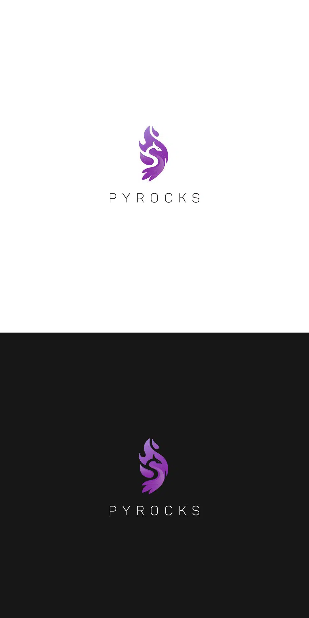
A beautiful combination of an abstract mythical character, the Phoenix, and fire, this logo is sharp, clean, and to the point. It also won a Logo Design Contest, with its minimal and neatly measured curves. Standing firm in purple – which is a cool color – the form of the logo still conveys the idea of fire. The name of the brand/company only achieves the whole purpose of sending the design of the logo in a better manner.
12. Living God Church:
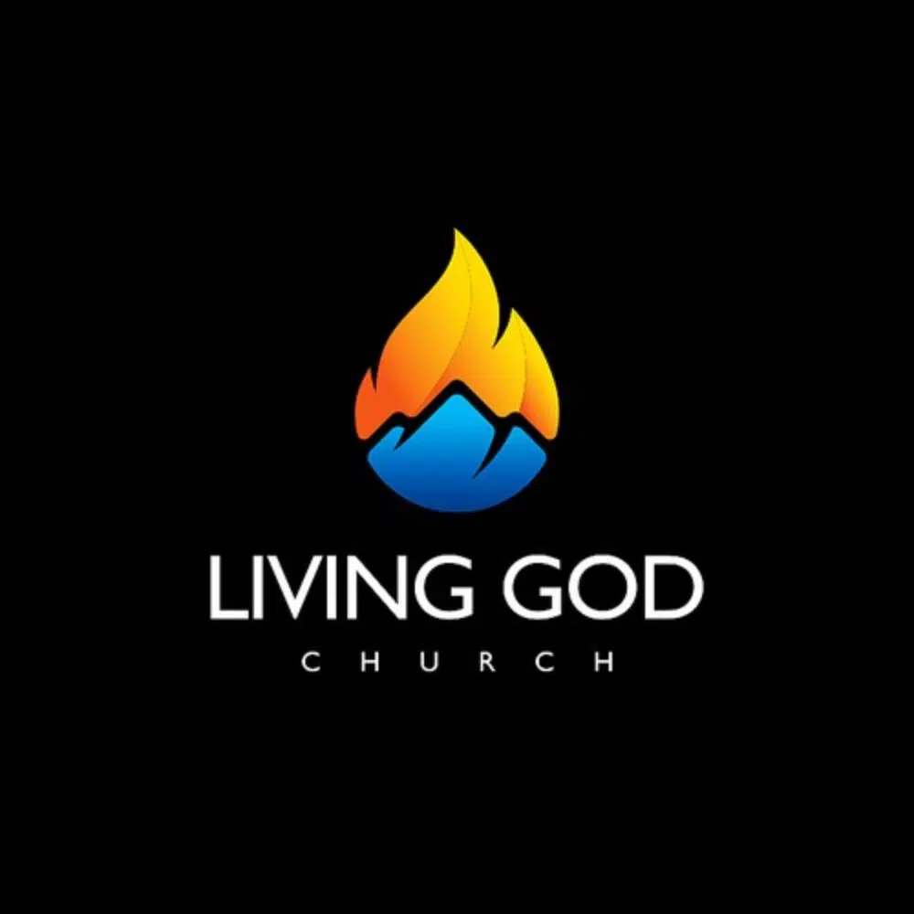
Living God Church is an organization that focuses on changing the lives of people through religious beliefs. This logo holds value over the ministry/church concept as it shows a contrast between the hot and cold. They also help develop people into effective leaders. This logo is a combination of all the ideas of the brand merged with the two dominant forms of nature – water and fire. If you look carefully, you can also see that the low opacity clouds in the background also adds an extra element that brings about a slight heavenly feel to the whole design. Another Logo Design Contest winner, this graphic has a strong statement to make.
13. Graphic Fire:
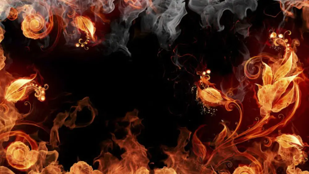
For all those fire lovers, this graphic can most certainly make it to the background of your desktop. A combination of flowers, fire, and smoke; this background graphic is healthy and beautiful. It seems to be easy, but this graphic must’ve taken a lot of effort, given its minute detailing as well as the perfect choice of elements. The critical component used is the gradient of colors to create the fire flames.
With the perfect choice of colors, it is also available in multiple desktop and phone sizes to download.
14. Phoenix:
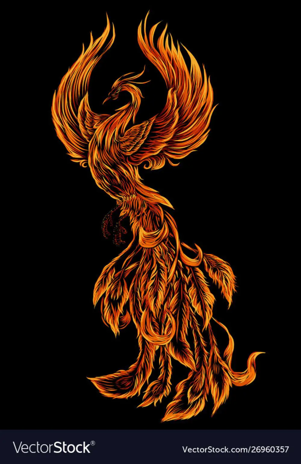
Often, Phoenix is associated with fire due to its rare quality of rising from the flames. It is a sign of strength, freedom as well as a way to portray good over evil. Many artists have used Phoenix as an element in their stories, arts, and illustrations. Just like that, this is one graphic that makes the use of this mythical creature very effectively. The form, colors, and strokes are very well sketched, and the effect of fire pops out of the strokes. It is a minimal design, and yet speaks volumes. The highlight of the model is the intricacy and detailing of the artwork, which only makes it more realistic, aesthetic, and unique.
15. Birthright BBQ Fest:
Designed by Josh Abel, this logo is super fun and a very different derivation of the word ‘ fire.’ Playing with positive and negative space, Josh shows a lit matchstick. The lit part has a beautiful texture of white spots all over the fire, which gives it a slightly 3D look. However, the best part is the form of the light – it is just like the match has just been sparked. This graphic was designed for Four Corners Brewery. Hence it has a slightly rustic look as well.
16. Flame:
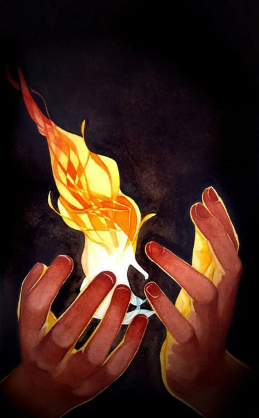
This artwork has a slight hand-drawn effect to it. It has a more conceptual appeal, as it encaptures fire burning in the palms. It has an empowering effect, with an underlying vintage quality due to the colors and strokes. It is a very high quality, well-done piece of art, in a sense, it can directly be used for creating the print design. The colors used to depict the fire also reflect upon the palms of the beholder, and each of these details has been painted very carefully by the artist.
17. The Moon and The Bonfires:
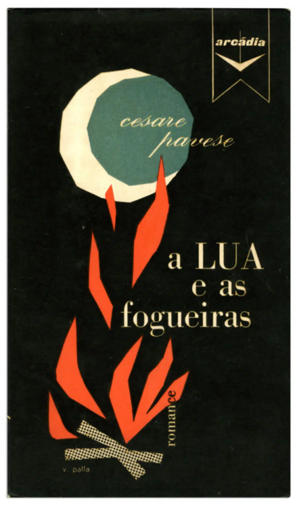
The Moon and The Bonfires is a romance novel by Caesar Pavese. Victor Palla did the cover design of the book. It is a beautiful design, much like a collage work put together. Quite literally, it captures the moon and a bonfire sitting comfortably in each other’s company. It has a vintage, rustic feel, and it makes you want to pick up the book and read through it immediately. The design is simple, unique, and stands out from the rest of the books of a similar genre.
18. Sun:
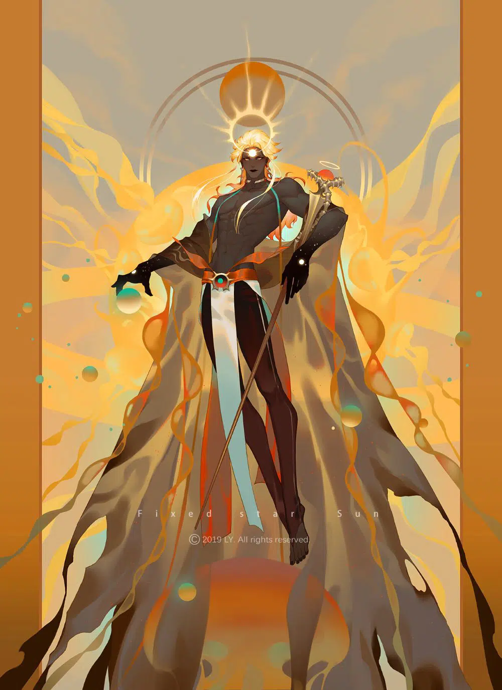
This particular project was some freelancer’s work, which stood out. Much like an anime character, this specific artwork is the representation of Sun in human form. Hence, the style is wrapped in robes of flames with a fiery sun on his forehead. The detailing and color choices are magnificent, and together, they make the artwork believable. It is safe to say that this is a conceptual artwork with a lot of thought processes, hands-on skills, and a smart imagination.
It is safe to conclude that fire is a versatile form of nature that can be channeled into art and design. Not only has light been used by poets and writers as metaphors for feelings, but designers have been using this motif for a long time now. As discussed in these examples, the fire has been used for photography, illustrations, paintings, graphics, prints, branding, and more things that one could imagine.
Right from colors of fire to its form, flames as well as its nature, it can be used in any way possible. As far as inspiration is concerned, you can tap into the many qualities of fires and bonfires and use them creatively in your artworks to add mystery and drama. Guess what else could make a bonfire night special? A tub of popcorn and some beautiful guitar music beside the ocean!
the “Shibas Guidance” is unbeatable.. omg.