Are you one of those designers struggling with fleeting attention spans?
What we mean when we say ‘attention spans’ is the lapse of time in which a user is able to focus on one task without getting distracted.
In the worst case, a user will be distracted from checking your product’s information or even buying it. Therefore, it is essential for you to develop skills that will grab and keep users’ attention on your website for as long as you need it.
Ideally, every designer dreams of users scrolling carefully through his or her content and flowing towards action with no second thought on their minds (sign-ups, purchases, etc). The bittersweet truth is that customers are not here to buy.
To make them do it, you have to provide interesting and engaging content that can change customers’ minds. You want your prospects to browse your site and to follow the flow towards an action (signup, purchase).
Average attention spans on websites
For how long can you keep a user on your website?
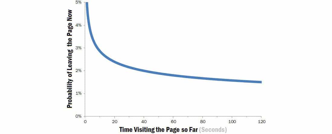
Obviously, it depends on you, but if you need a general answer, it’s not going to take long.
According to statistics, attention spans last less than one minute.
Considering user habits, they would ‘sneak’ on the site between their activities and they’ll practically be able to check just a quarter of it (not even that much). Therefore, unless you are very straightforward and unambiguous, you can hardly convey whatever message to them.
Let’s summarize: Users have a few seconds to spend on your site, but you can still share information with them and defeat the negative Weibull distribution (if you provide clean and catchy content).
How to grab a visitor’s attention in 30 seconds?
First of all, learn to be thankful that visitors with such limited time opened your website.
Reward them with exclusive content that will conquest them before they’ve decided to click ‘Back’ and not to return ever again. Within designers’ circles, this is known as the ’30 second attention-grabbing rule’, even if they are usually referring to shorter time-lapse.

Second of all, think about why you’re actually present in the online world (both through a website and a blog). Do you want to use an online presence to enhance your business?
Do you expect more people to be familiar with your work? There could be many reasons to ‘dive inside these waters’, but the goals will certainly not be achieved without people willing to give you their time.
Here is where the 30-second rule takes over.
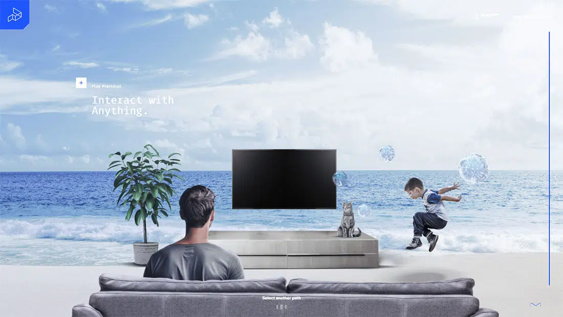
According to many studies, 30 seconds is enough to take over customers’ attention, before they leave to do something more important. A good website header design is a must. Why? This is what the visitor sees first.
Have in mind that there is a competition – you need to be the first to grab attention! Your second and most difficult obstacle will be to steal users’ time and to make them stay even when they can’t do it. Just look at how popular web apps are handling this issue. They don’t waste any viewport real estate.
Rely on the best content you have
We are afraid there is no other choice but to push your best info upfront. To start with, users arrived with a goal and they have to achieve it exactly.
They may be on the hunt for your key information, so make sure you expose it in the right place, in the right manner.
Think like the visitor: What is he/she looking for?
Personal choices. We thought about purchasing a new device and our entire attention focused on it. We see it everywhere around us, even if we didn’t use to notice it before. The effect is also known as priming.
Our name. We have no dearer name than ours, and it always rings a bell when we hear it.
Feelings. If something is able to wake up our feeling, it already has our full attention.
Here come some tips on designing websites that catch your visitors’ attention:
Readability is essential
You probably know this from personal experience – there is no way that large, faceless textual blocks are going to keep you on board.
Go on and read your text – if it requires even the smallest amount of effort, users will move away and they will look for ‘cleaner’ information.
While we’re still dealing with textual content, you might think about dividing it into small paragraphs or using bullets, numbering, and descriptive subheadings.
As you already know, people scan instead of reading, and you need to make it easy for them to pick the piece they were looking for. If you manage to tailor your content in a format that matches online behavior habits, consider you’ve won against the 30-second rule.
Novelty is evergreen
According to some neuroscientists, novelty enhances the transmission of information. It is because our brains strive towards it and it sometimes transforms into a basic need.
Novelty stands for the new and the unknown, which requires at the very least our attention to try to recognize it. Then, we take our time to observe it and to try to understand it, and once that is done, we start looking for another novelty.
Your task is not simply to produce perfectly engaging novelties, but to produce as many of them as you possibly can!
Novelty is especially important when you are dealing with heavy textual content – your users have positive previous experiences tied to your work and it might be enough for them to see that you’re introducing new pieces and that you care about that website.
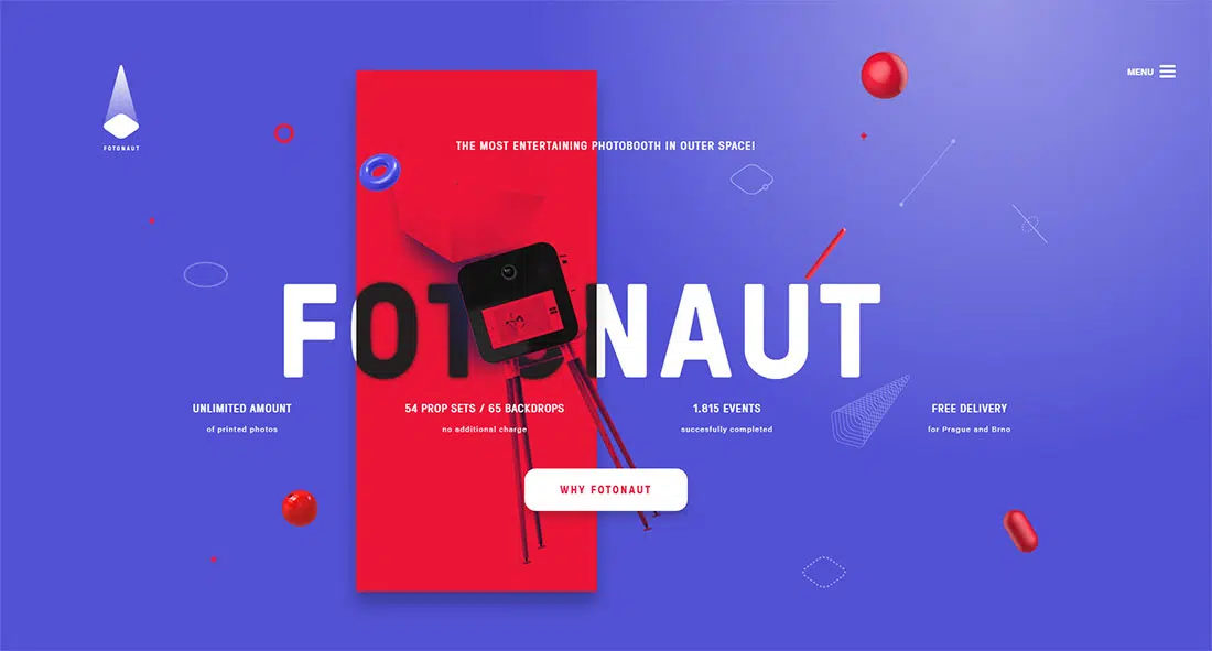
Stand out from the crowd
There are too many cookie-cutter templates and data-feeds for you to afford the luxury of hiding inside the crowd.
Didn’t you want to be noticed?
Employ some beautiful appearances, especially on the website homepage, and cut content in short, relevant messages.
Avoid syndicated and content mills. Your task is to stay innovative and to build some recognizable style for your brand.
Use something interesting. Maybe a hero slider presenting your offers. Why not?
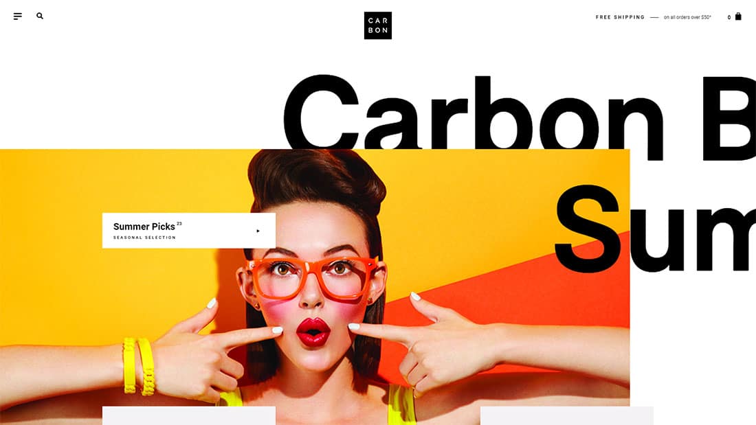
Don’t be afraid to use contrast
It is proven – things that blend within each other are often ignored; while contrasting items are noticed.
It can be any contrast you want contrasting the environment; contrasting the previous items of a kind, or even contrasting your personal taste. Under whatever form it appears, contrast attracts attention.
The old, decisive part of our brain is always on the hunt for contrast, which helps us make imperative decisions and to calculate results.
Take sales as an example – how often do you see a vendor’s offer comparing old and new (significantly cheaper) prices?
Yes, it happens quite often. What is necessary is the transformation of any kind: financial, aesthetic, statistical, physical, etc.
Our old brain is also a powerful signaler for disruptions and modifications – it will certainly react when risky turns safe; with becomes without; or fast switches to slow. You probably already concluded that neutrality and dull contrast is not going to bring you results.
Use the benefits of contrast and employ it in the service of your product. For instance, if you are selling an efficient vacuum cleaner, compare it to cleaners that don’t have the same power. It is the closest to the attention you can get.
In terms of colors, if you have a red website, use green, or blue for CTAs or elements that you want to draw attention to.
Multimedia is the future
Fortunately or not, today’s users avoid long and explanatory articles, and they like for things to be served in front of them.
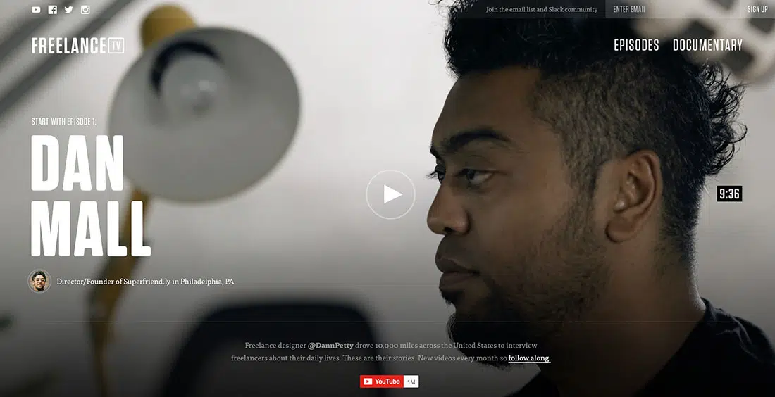
Multimedia certainly knows how to do this – it replicates interesting stories in videos; it presents factual information on images, and it actually grabs attention. Who doesn’t adore a short, funny video?
As we mentioned previously, novelty deserves attention, so be free to use multimedia in an extraordinary, experimental manner. At the end of the day, you might have special stories and cool storytellers to share with your audience. Weird or not, uniqueness sells.
Alternatively, you can create web infographics thanks to SVG and CSS3. In there, you can show various charts and data in an interactive way to entertain the visitors.
Credibility comes first
You might have ‘put your heart’ in the hands of your users to provide them the best experience, but you’re still the authority of your website and your content.

Earning attention is tightly connected to earning respect, so try to appear as professional as you can, especially if you’re into designing, online consulting, or basically anything that requires you to have expertise in the digital realm.
Give flawless feedback, minimize grammar and other mistakes, avoid ads and innovate your content. You should establish yourself as an authority on what you’re offering, writing about, or selling.
Credibility is your biggest advantage and your biggest risk – you earn it hard, but you lose it in a glance of the eye. That’s why credibility is naturally similar to attention, and why the success of your entire website may depend on it.