The word psychedelic comes from ”Psyche” and ”Delos,” which means “soul manifesting” or “mind-manifesting.” Psychedelic design gained its popularity back in the era of 1960s. The 1960s were a great period for hazy yet brilliant time for artistic fluorescence. We see psychedelic design often used even today for commercial work. However, the psychedelic design concept seems to be losing its original history that most people are forgetting about.
The history of psychedelic design is vast and widespread throughout the globe and time. It crossed thousands of borders and even dominated graphic arts for a decade between the 1960s and 1970s. You can say that the story of Psychedelic design goes back to 80 years ago. Let us have a look at the history of psychedelic design –
There are some striking characteristics of psychedelic design and art: amazing subject matter, spiral patterns, bright colors, kaleidoscopic and extreme details with groovy typography. All of these elements are present in several art movements that precede the Psychedelic Design like Art Nouveau, Vienna Secession as well as Surrealism. There is no coincidence to this; these moments were highly influential when the psychedelic generation studied art.
1. Pyschelic Design and Art Nouveau:
1. What is Art Nouveau?
During the late 1800s, new technology in terms of electrical power, telephones, and cars revolutionized the way the world works and how it looks. Some people, especially artists, living through this technological revolution, were not necessarily fond of all these new developments. This led to a conflict that led to the emergence of a new global artistic movement referred to as Art Nouveau. Art Nouveau is a French term that literally means “new art.” The idea and inspiration behind this movement were to make art that would reflect city life’s vibrancy. To do so, they started using flat, decorative patterns, organic and plant motifs, and feminine figures. It would often be stylized with fluid abstract forms. The movement created a visual language that would then be used almost everywhere – from architecture to paintings, textiles, and many other fields.
The ideology of Art Nouveau dictated that aesthetics and utility should go hand in hand. They also believed that no object was too mundane to be designed as beautiful. Even advertisements for something as basic as biscuits and champagne would be illustrated beautifully. The idea was to create advertisements as beautiful as possible while also making them informative.
2. Contrast and similarity of Art Nouveau and Psychedelic Design:
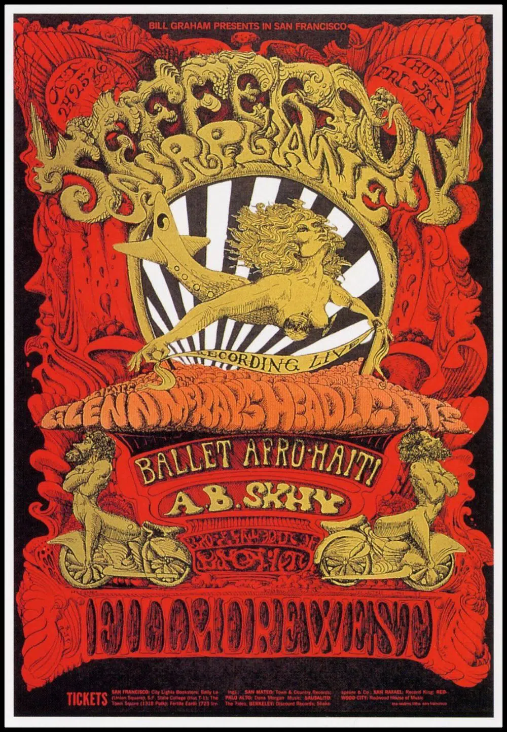
If we come back to the psychedelic era of the 1960s, it was also a time of cultural upheaval like the 1800s that inspired Art Nouveau. If we talk about the United States, the epicenter of this change was San Francisco. Hundreds and thousands of youngsters descended to San Francisco descended to the city for protests in forms of drum circles and concerts. There were many concerts back in the 1960s. Most of them would be dance concerts that would feature psychedelic bands like Jefferson Airplane and Grateful Dead. Also, there was one sure way of getting more people to come to your concert – creating a good poster. Back in the 1960s, these iconic bands were just starting out by playing back to back shows at important venues like the Avalon and Fillmore.
Hence, to advertise this new generation of hippie bands, venues were quick to understand that plain typeface and using grayscale photos weren’t going to be enough. Hence, venues started commissioning work from small group artists. These small group artists came up with a brand new formula for their concert posters. It had influences from various art movements like surrealism, comics, and Art Nouveau.
3. What did Psychedelic Design pick up on from Art Nouveau?
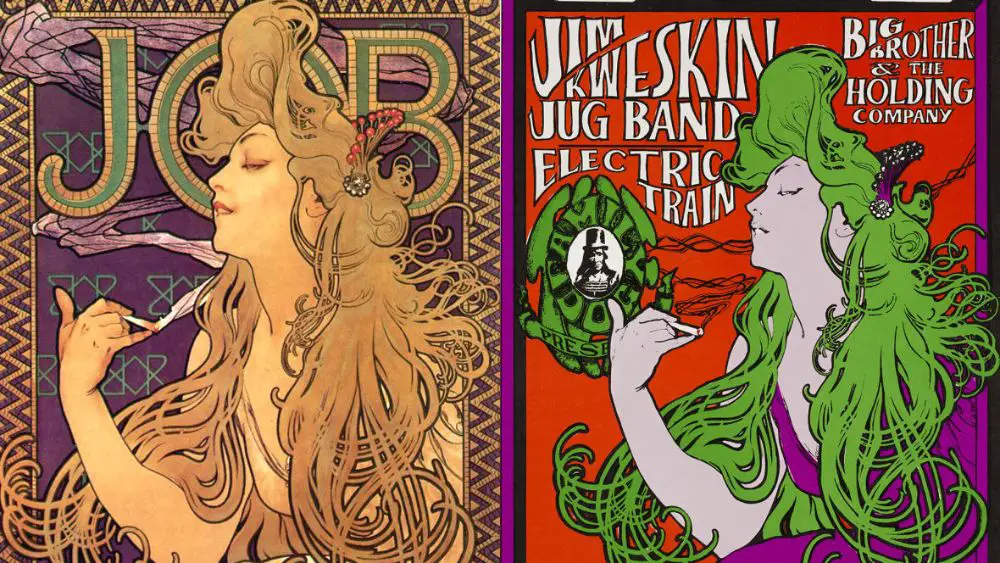
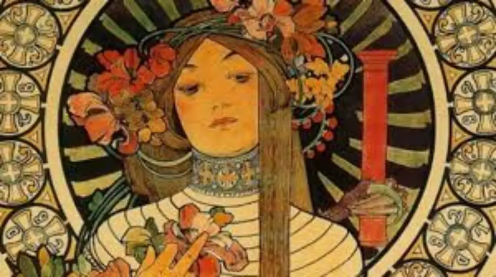
When the Art Nouveau movement reached the mid-1960s, it started facing some resurgence. Especially in textiles, dynamic floral designs seemed to be a natural fit that suited the hippie aesthetic. Based on the art pieces of Art Nouveau, some modern-day artists of the 1960s took some of the Art Nouveau samples that resonated with them and turned the dial upon them. Art Nouveau gained popularity for its feminine figures, most often nude and flowing hair and other such characteristics.
This was a style that resonated with the psychedelic designers, and they picked on it. Most of the psychedelic posters are designed in a way to be covered edge to edge with intrinsic detailed two-dimensional illustrations. You could see a lot of flowers and abstract curves in psychedelic design. Some of the psychedelic designers also used images pulled directly out of an Art Nouveau poster. However, they made radical changes to their color palette. As the music of Sans Francisco spread across the world, so did their aesthetics. The artists behind such psychedelic designs got their share of fame. The posters they made with the vibrating colors and winding lines captured the energy of the 1960s.
4. Characteristics of Psychedelic Design:
- The color palette: Art Nouveau designers used soft pastels, whereas Psychedelic artists preferred high-contrast and intense colors. It was said that these colors could make the viewer’s eye ”vibrate”, which is a term to define an LSD tripper’s visual experiences.
- Typography: Psychedelic Design has the most abrupt and innovative use of typography for its design. It makes use of fonts that are cloudy, curly, and barely legible. This concept of using such fonts started first on a 1902 poster designed by the Australian designer Alfred Roller. In the 60s, artists adapted this bold, dynamic typeface and pushed it to a new extreme. They would soften the lines and obscure its edges, which made it almost illegible. This design trend wanted the typography to be almost illegible on purpose. The purpose was to grab the audience’s attention long enough to figure out what the entire poster was trying to say.
2. Op Art and Pop Art Movement’s Influence:
1. Op Art:
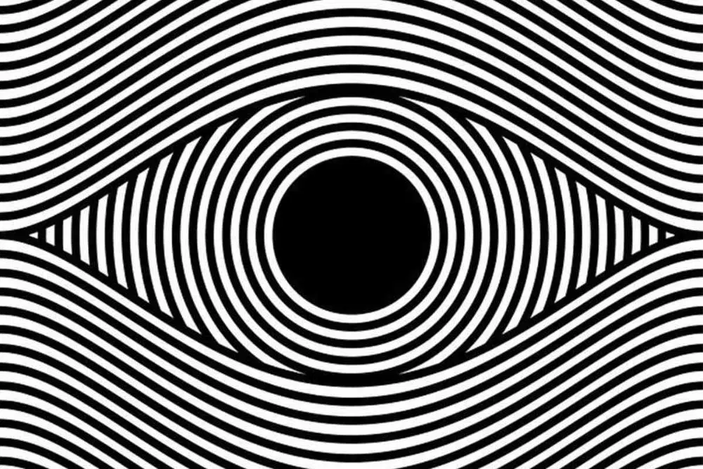
Op art is short for Optical Art. It is a style of abstraction that depends on geometric lines, shapes, and color juxtapositions that help create optical illusions for the viewers. This art movement also gained decent popularity during the 1960s. Such art usually featured grids, patterns, and effects like diminishing or curved objects. This movement was led by artists who were interested in understanding various perpetual effects.
Pop was a term that was an earlier associate with popular culture, rather than art. The objective of Pop art was to blur boundaries between high and low popular cultures. It was one of the major artistic movements for the United States of the 20th century. The term was first tossed in Britain during 1955. However, the Americans took the consumerist cause with far superior conviction and effect. Hence they have deemed the pioneers of the movement. Pop art and pop culture talk about mass media products that were evolving during the late 1950s and 1960s. It was an attempt to break down the barrier between traditional and contemporary culture.
2. Pop art:
Pop art also highlighted some of the popular culture elements as a protest against elitist art culture and the general seriousness around it. This marked the return of sharp paintwork and representational art. This led to the glorification of underappreciated objects and ordinary businesses. This was done to make art more relevant and meaningful for everyday people and increase the target audience’s potential pool. Both these movements naturally went hand in hand with psychedelic design, adding more visual elements to it.
Let us breakdown one of the most iconic psychedelic poster to better understand the psychedelic elements of this psychedelic design poster:
3. The Breakdown -The Man with Spiral Glasses:
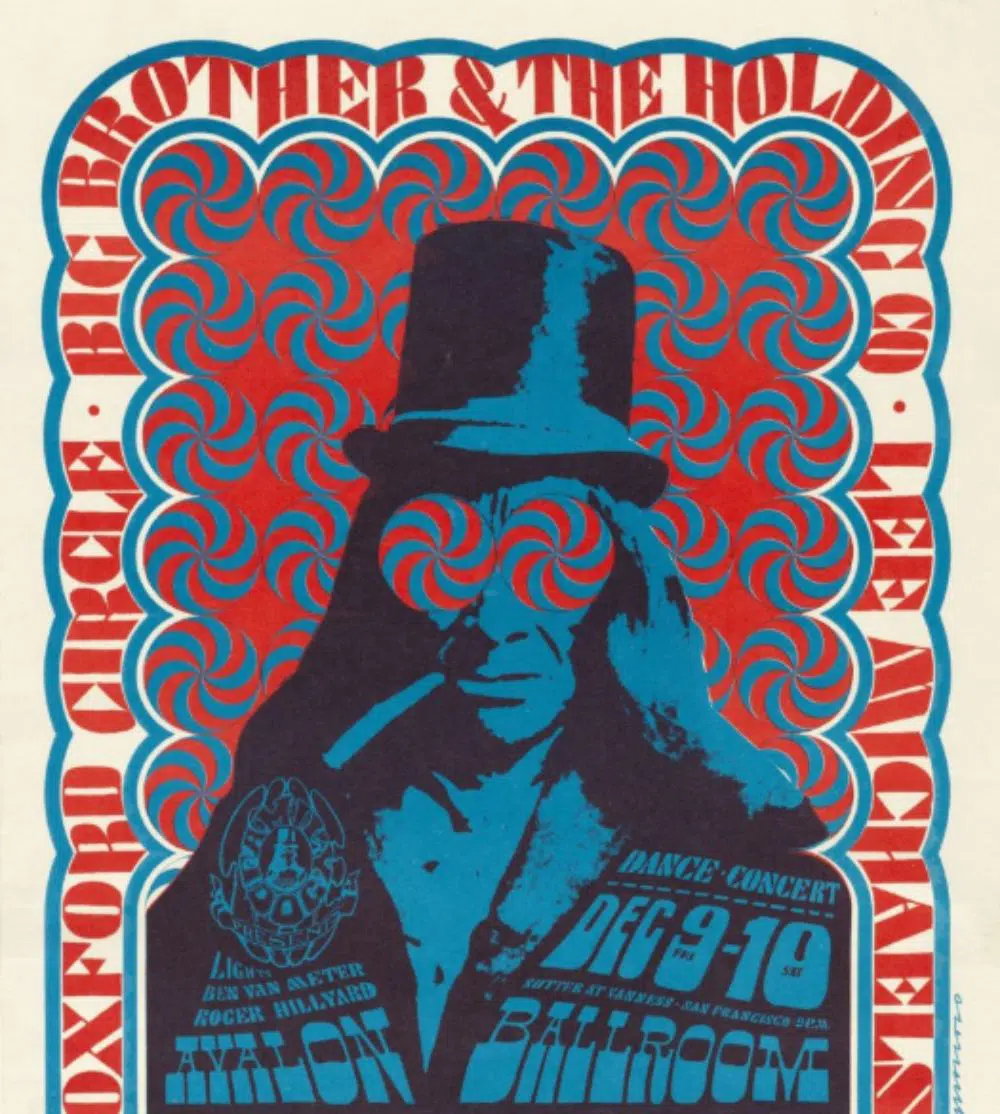
Victor Moscoso designed this poster. If you notice the above poster, it has certain clear elements from op and pop movement and other design elements that we have discussed so far that are unique to psychedelic designs. This image has circles with spirals inside those circles as background. There is a border around the image which also has text inside it. It also features a man with a top hat and long hair. There is also text on the man’s chest and shoulders. Such a poster can be used to reflect a dance concert. Moscoso mostly wanted the man to have a perception that he is someone who loves having fun.
He paired this fun-loving man with a bright background, which helps this poster stand out and appeal to the right target audience.
- Whitespace: He also kept whitespace between the circles on the outside of the background and the borders. This could be to keep the theme of circle geometry and further enhance the design by using illusions created by the spiral circles.
- Clustering: He has also used clustering to cluster the background, the man, and the text on the man in layers on top of each other and placed them in the center of the artwork. If you cluster these elements together, the poster seems busier when using a more overpowering image, true to true psychedelic design principles.
- Overlapping: Another important design element used in this poster is overlapping. The man is at the front of the background, and the text is on top of the man. The eyes can be looked at as spiral glasses that are meant to align perfectly with the patterned circles used in the background. This creates a visual illusion effect. The text on the man’s chest has important information regarding the concert. Hence Moscoso made it clear to keep it on the topmost layer of all other layers.
- Negative Space: If you notice, the space between circles of the background is filled with the same red color used in the circles. This is to make the image look busy and bright, enhancing the psychedelic design.
- Tone: This poster also uses very bright and vibrant red and blue colors. This helps the poster stand out from other posters. It is one of the most prominent design aspects of a psychedelic design.
Overall, Moscoso’s poster is a fantastic representation of what psychedelic visual design looks like. Especially the idea of creating an optical illusion through a background in more than one layer is a fantastic touch. It serves the purpose and looks enticing enough for anyone looking at the poster to want to do for a dance concert.
Conclusion:
This was the history and relevance of psychedelic design and everything it has to offer. Psychedelic design is generally considered an art style used by people who like being high on drugs and have a distorted sense of the world. This misconception is highly incorrect. It was a movement based on other important art movements like Art Nouveau, Surrealism, and others. It was for a cause and a form of protest against the industrial and technological age of the 1960s, to keep real art alive. You can incorporate psychedelic designs for your music posters, wall graffiti, and website design to make full use of the benefits of psychedelic design.
Hi! I’m looking for a website designer for my musical project, which has a spiritual/psychedelic/Bohemian vibe. I especially like #1, 2, and 3 – the Art Nouveau/Psychedelic designs. Wondering if you have any recommendations? Thank you!!
Hi Scotty – thanks for your question and for visiting our site. You have asked a really good question and the answer would be “it depends on a few factors”. To start, those factors would be price, timeframe, skill level, and type of site (e-commerce, blog, etc.) that you need to develop.
If you’re a DIY kind of person who has the ability to quickly navigate the web and applications, our best recommendation would be to use a website builder program (all-in-one) with a simple drag-and-drop interface like Wix, WebFlow, Weebly, and BigCommerce. You can check out each individually or see our blog post “
Hey:)
I really was looking for such an enlightening article about psychedelic design. Find this really good and would like to quote the info for a thesis. Is it possible for them to add the author’s name and date? That would be so great!
Thanks very much!
Hi Marlene – thank you for your kind words and for reading our blog. At this time our site theme is not set up (although we are in the middle of changing our theme) to post the information you would like for your thesis. This article was published by our staff writers on Aug 28, 2020. Hope that helps and have a great day.
Hey,
thank you very much for adding the date 🙂 Is it possible to also add the name of the staff writer? But really cool that you answered me so quickly!
Hi Marlene. The writer is Harsh Raval. Have a good day!
Did anyone else notice at the bottom of the #2 Jefferson Airplane poster the centaurs on motorcycles? Progressive Insurance uses this half-man/half-motorcycle character in their TV campaign.
“This design trend wanted the typography to be almost illegible on purpose. The purpose was to grab the audience’s attention long enough to figure out what the entire poster was trying to say.” Groovy! As a life long fan of the psychedelic era of rock, I always wondered why the posters were so difficult to read. I just assumed the designers were on drugs.
Thanks for a very informative article.