You might think that when it comes to web design, more intricate illustrations, brighter colors, and a lot of moving pictures equals more clicks and visitors spend more time on your website. This can sometimes be true, but is not always the case. Sometimes, less is more. Minimalist style is considered modern, and is necessary in a world that contains millions of cluttered and loud designs. Today, we will take a look at 15 minimalist web designs explaining why.
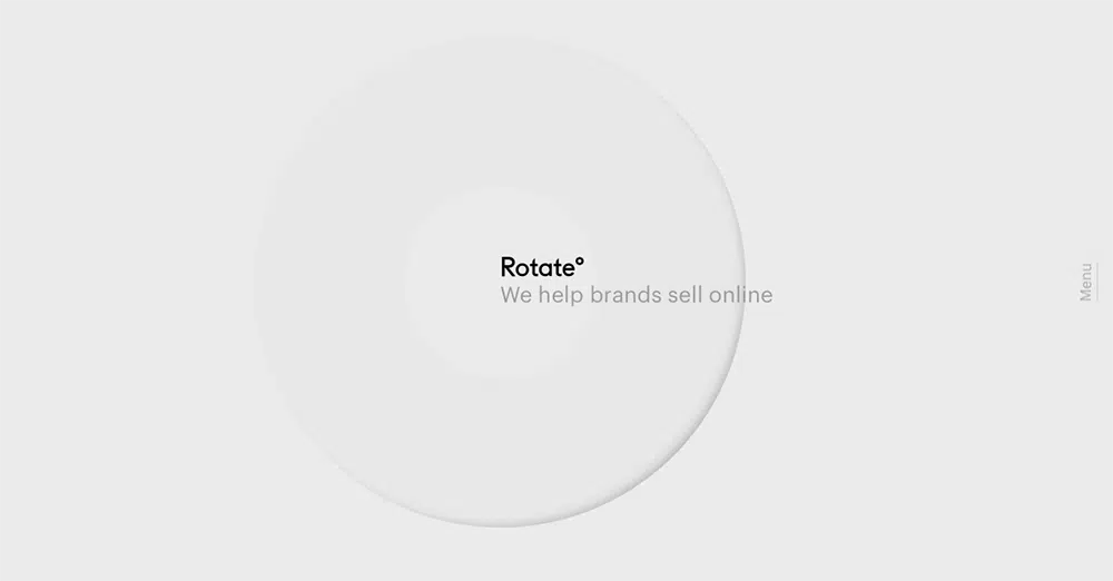
Studio Rotate
Studio Rotate is a design and marketing company that has a well designed website. This is because the design is so simple, yet when you hover your mouse over and click anything, there are engaging and interactive animations that provide the minimalism style, with a sophisticated web design.
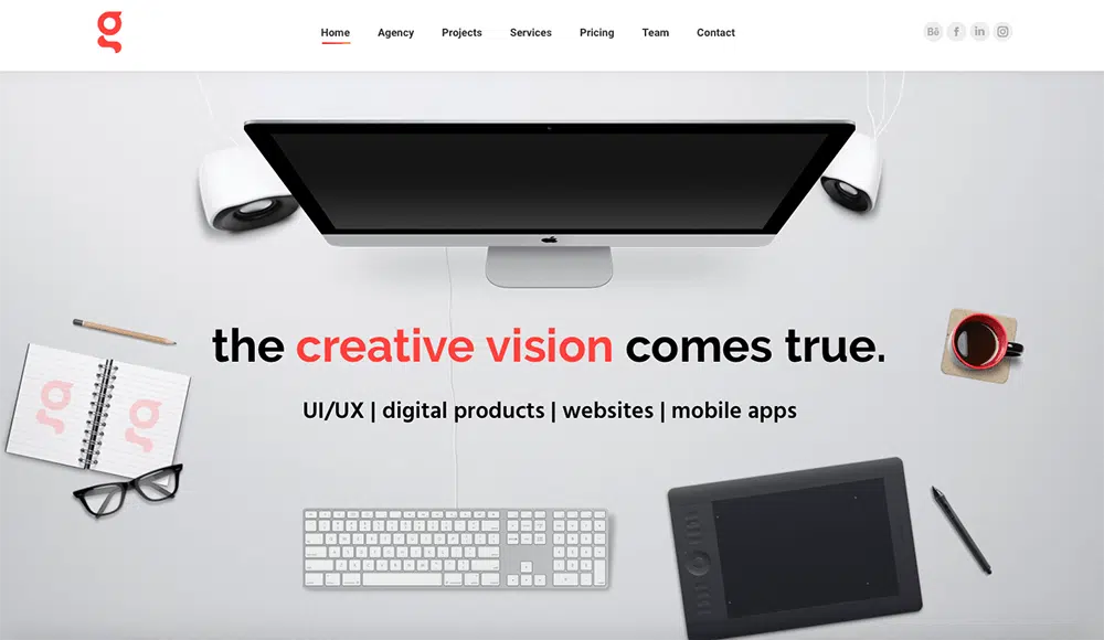
GSA Branding Agency
GSA is a branding agency that specializes in UI/UX designs, web and mobile app design, and marketing. Their vision centers around the fact that they want to stay grounded and true to the idea that brought about the entire company, thus allowing them to remain transparent in design and simplicity. With minimalist styles, this agency is able to clearly and efficiently show off their skills and services without loud colors and designs getting in the way.
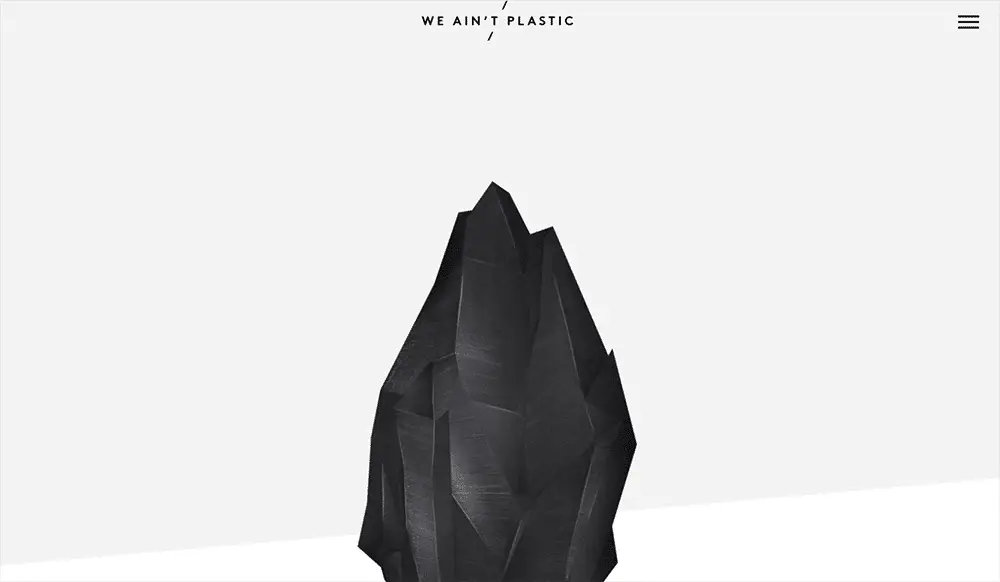
We Ain’t Plastic
This website centers around Berlin based creative technologist named Roland, who creates design work that makes a difference. His web design is minimalistic, yet informative, easy to navigate, and attractive. This is the definition of “less is more”.
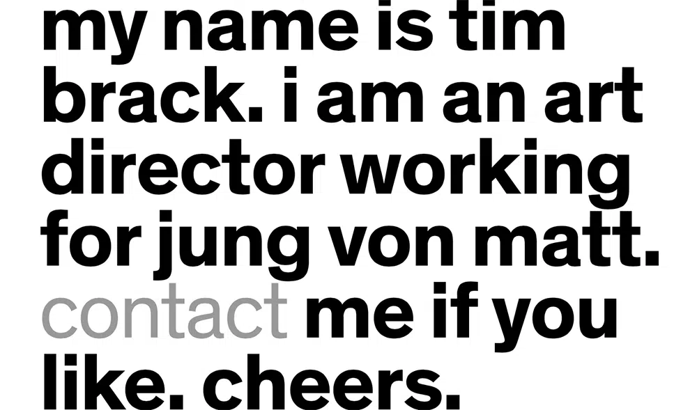
Tim Brack
This website acts as a way to get in contact with Art Director Tim Brack. Along with the use of white space and stark black text, the website is completely minimalistic. The entire website is made up of two pages, the image below being the first, and the next is simply another, shorter page of text for contacting. It is straight-forward, quick, painless, and easy.
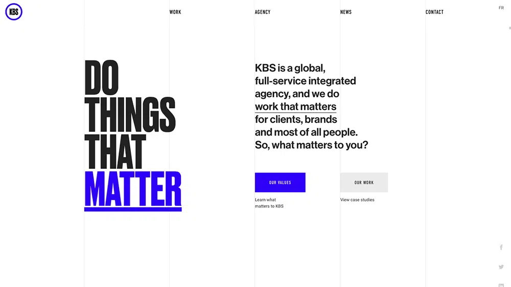
Do Things That Matter
KBS Agency is a branding agency that takes pride in producing work that matters in the big picture. They believe in teamwork, and the web design reflects this with short videos, small illustrated animations, and another example of using white space to their advantage. This minimalistic design brings more attention to their vision, “doing things that matter”.
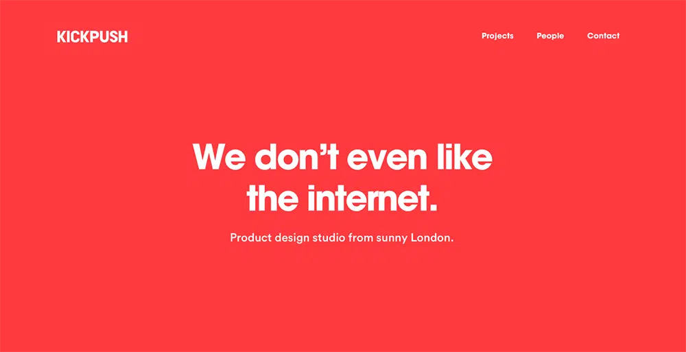
Kickpush
Finally, a website that admits hard truths. Kickpush is a product design company that doesn’t believe in politics or drama, and works hard to create designs for people that they believe in. Instead of using white space, this website featured a red background and white text, which still is considered minimalistic.
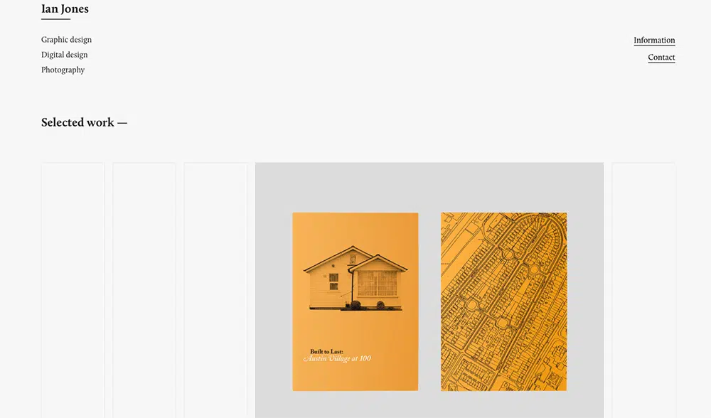
Ian Jones
This website acts as a portfolio and resume for graphic designer Ian Jones. On this web design, featured is his work and contact information, presented in a minimalist style, due to the colors and the ways in which the images are arranged.
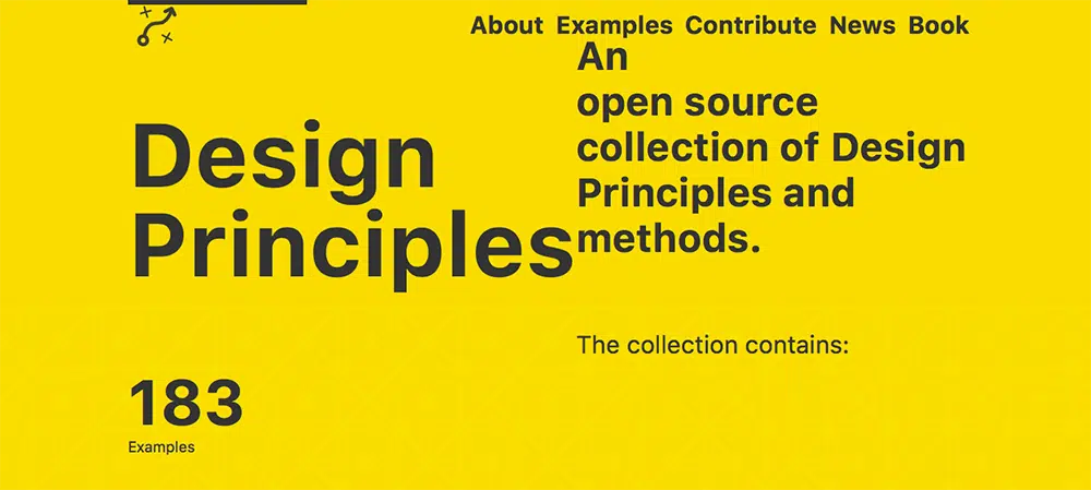
Design Principles
Another example of minimalist style without the use of white space. The featured yellow background juxtaposed with sleek black typography, brings attention to the text and emphasizes the main ideas of the website, which is to provide an open source of design and principles.
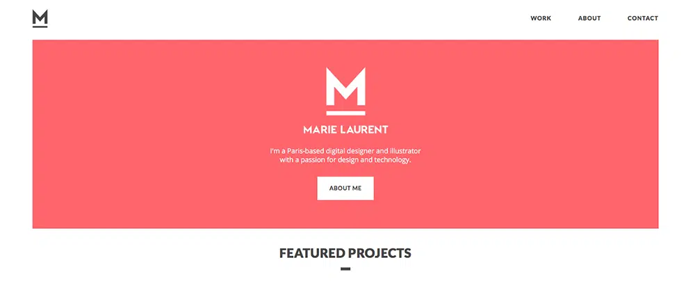
Marie Laurent
By using modern color choices and illustrations, Marie Laurent is an interactive and graphic designer that creates beautiful works of art digitally, and in the process produces minimalistic style work in both web design and graphic design.
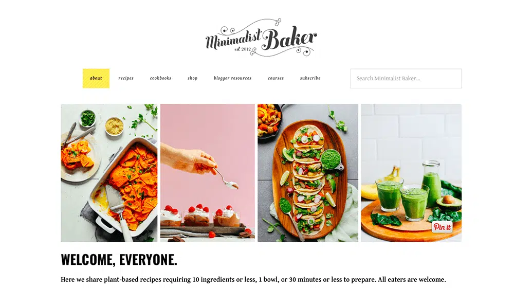
Minimalist Baker
This website literally has Minimalist in the title. With a minimalist web design, this plant-based recipe website is able to create a certain style while still maintaining a minimalist design overall. Even the recipes in this website are made to be simplistic, with as few ingredients as possible, without sacrificing flavor (much like the design).
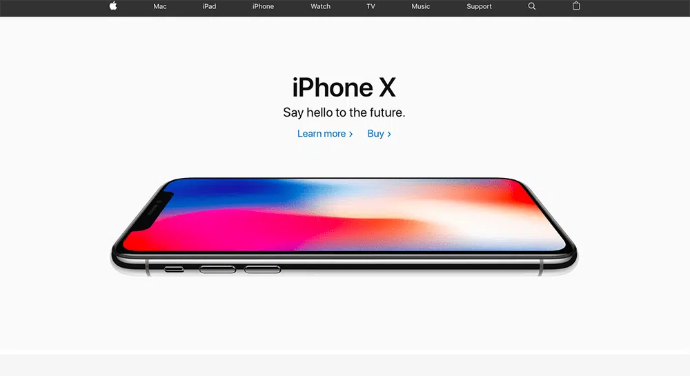
Apple
We all know it and love it. Simplicity is what gave Apple its’ success in the first place. They have changed immensely over the years, but one thing they have not changed is their minimalist style, especially when it comes to web design.
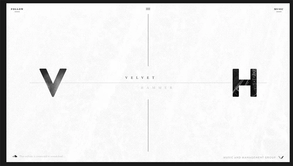
Velvet Hammer
This website is very minimalist, especially with the colors and the overall style. It is website owned by a music management company, that uses this black and white style to their advantage, creating an aesthetically pleasing and interesting web design.
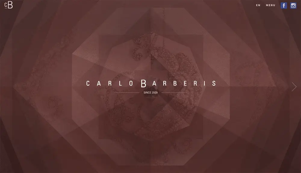
Carlo Barberis
This website is about Italian jewelry, and although the design is intricate, it is one design and minimal text that makes this web design minimalism style. The design in general was extremely visually appealing, which can sometimes be used to your advantage, rather than using white space.
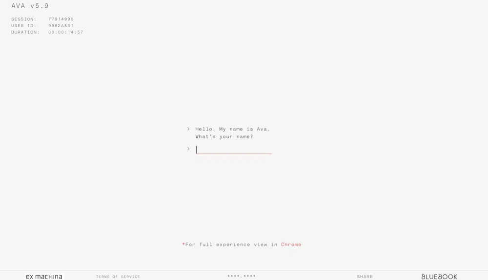
Ex Machina- Ava Sessions
Probably used as advertisement for the movie ex machina, this website has no distractions in terms of design or illustration. This interactive website allows you to talk to the AI robot from the movie Ex Machina, and the web design brings focus to the text alone, making it an interesting minimalist web design.
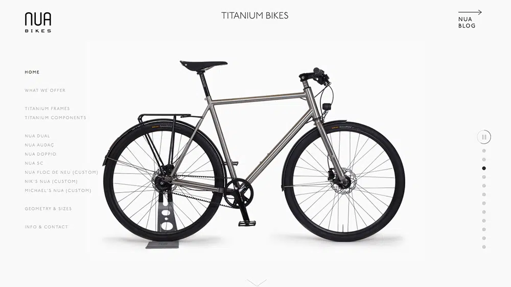
Nua Bikes
This company used minimalism web design to draw more attention to their products-bikes. The text, background, and lack thereof only push the images of their products to be more focused on by potential customers.