Fonts are always important, whether you need to write a formal letter, a CV, or any digital marketing post. You always have to pay extra attention to fonts as they have the capability to deliver a powerful message or distract the reader’s attention. There are some fonts that are just not so popular, and the main reason for that is because they are overused, plain ugly, unreadable or just not right for the message transmitted.
There are many uses for fonts – some fonts are used for headings, while others are used for tattoos. Whatever your use may be, it’s important to pick the right font.
This article will show you some of the fonts you might want to avoid and that’s why we prepared a list of 20 of the worst fonts you definitely need to dodge.
The main reason some fonts became so unpopular is that of the overuse. Fonts need to keep the readers interested so if you use a playful font for something pretty serious, then the readers lose their attention instantly. Or, if you’re using a day to day font which everyone can see everywhere, then you just lost the readers attention, especially when studies have shown that people spend a maximum of 6 minutes scanning a one paper document. So, whether you produce a marketing material, work in web design or graphic design, just pay attention to fonts and avoid using notoriously bad fonts. And just because you got some fonts for free, it doesn’t necessarily mean you need to use them.
Most important than anything, use a font that people can read. So, we hope the following list of 20 bad fonts will help you decide what fonts to use in the future.
Comic Sans
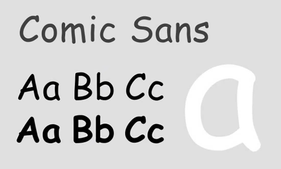
Comic Sans is a font considered by many to be a bad one, despite the fact that it is very popular and is used almost excessively in many materials. It is no longer taken seriously and is used especially for children’s party invitations, leaflets, and other bad marketing materials. Besides, Comic Sans simply denotes an amateur approach that can spoil the image of a company by using it in communication or advertising materials.
Bradley Hand
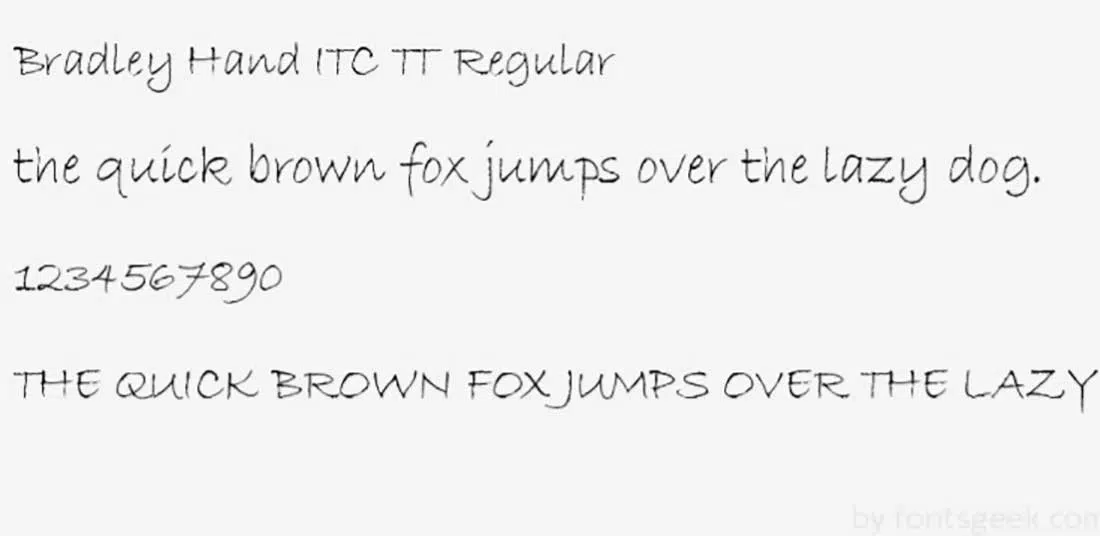
Bradley Hand is a font that simulates handwriting. Who would want that? Although it was designed to have some imperfections around the edges just to show as much as possible as real handwriting, this font is particularly problematic for printing.
Courier
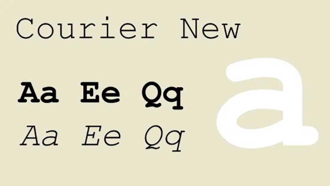
Courier is another overused both in marketing and design related materials. Although it was designed for easy reading, this font does not attract attention at all and is not suitable for titles or high-font texts.
Curlz
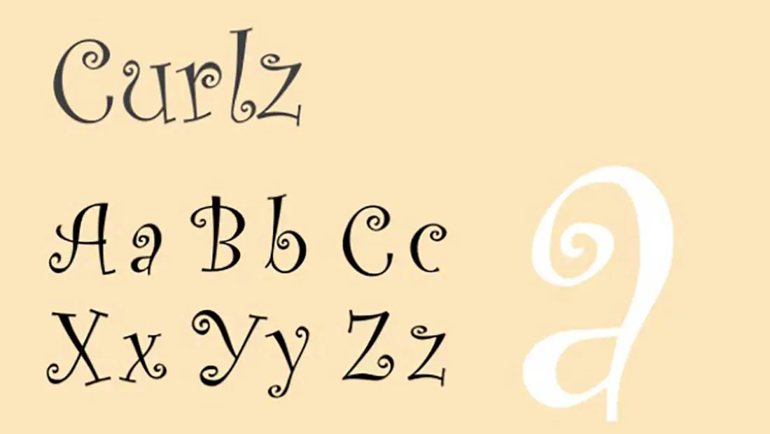
If you’re a girl up to 10 years old then surely you can and should use this font for the invitations you will send to your friends for your tea party. Otherwise, you have no reason to use this font. Curlz already has a negative reputation and if you plan to use it then surely the reader will associate it with the lack of maturity, regardless of the message.
Trajan Pro
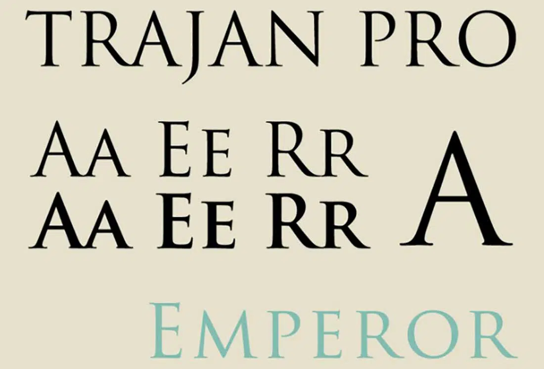
The Trajan font has a certain claim, but it is appropriate in some situations. The design of this font is inspired by the texts associated with the column of Trajan, a monument dedicated to the Roman Emperor of the same name. The font has only uppercase letters, making it difficult to read, especially for official documents such as CVs or reports.
Papyrus
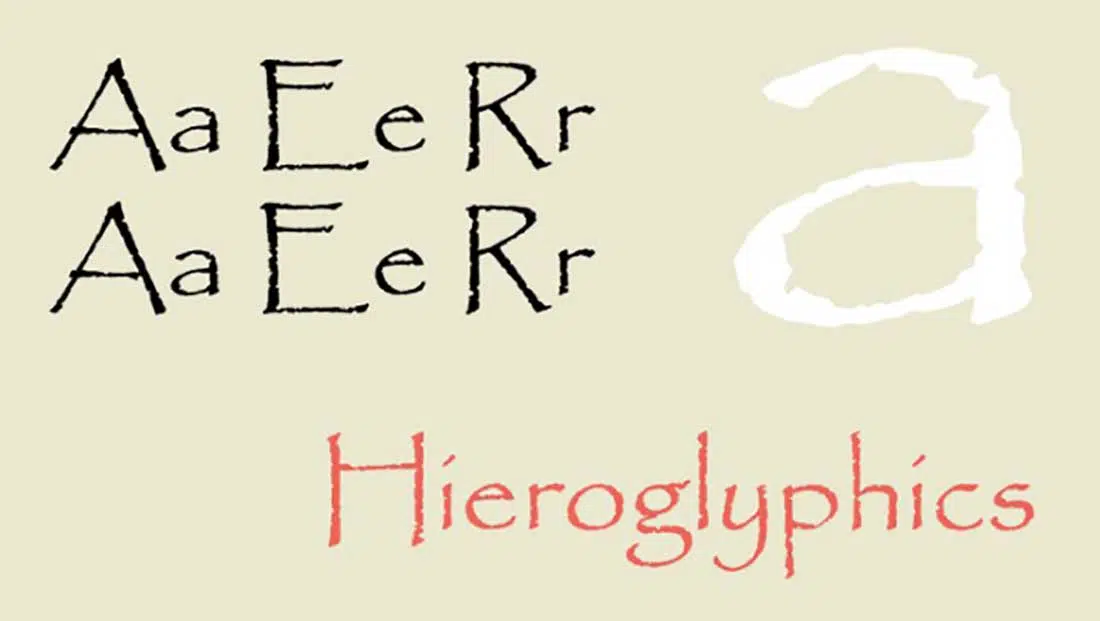
Papyrus is a font used more in marketing, different media publications and graphic design, and is still a very popular font, although it’s not too suitable for many of the materials on which it’s used.
Brush Script
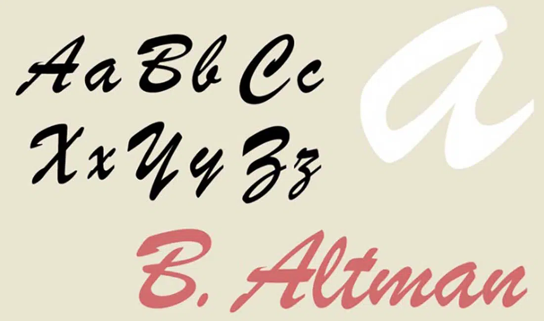
Brush Script is another font overused and it has some artistic and feminine look.
Vivaldi
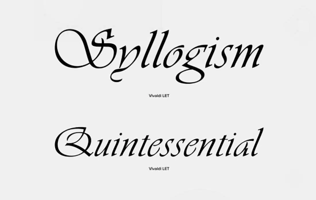
Just imagine when would you have to use a font like this. Maybe in a school paper, in a classical music related marketing material, flyers for a classical music event or in theaters. it’s a font with a certain prestige but wrongly used often.
Impact
The name says it all. If you’re planning to create a strong impact in your reader’s eyes, then Impact is a perfect choice. Although better suited to highlighting any titles or subtitles, Impact is again overused and impossible to read in many cases.
Century Gothic
Who hasn’t used Century Gothic at one point? Although it has a neat and modern look, this font is overused in many official documents like CVs and reports.
Futura
Futura is pretty similar to Century Gothic but it has more slightly wavy shapes and it’s not suited for any official documents.
Avenir
Avenir is another font overused in many marketing materials.
Didot
Didot is best suited for magazines and fashion related marketing materials but many use it for official documents.
Constantia
Constantia has rounded letterforms that make it look more friendly but yet again, it’s not that good if you plan on using it for official documents.
Calibri
Calibri is another popular and overused font that you see almost everywhere.
Lato
Lato is another font that is pretty popular and it was first created especially for corporate companies. It has a neutral look and you can download this from Google fonts.
Cambria
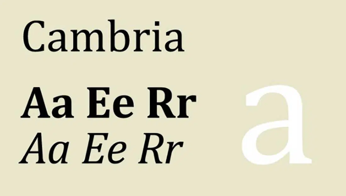
Cambria is a font you should avoid if you’re planning to write a resume or a school paper. Although is pretty popular, it’s not that easy to read and doesn’t seem serious.
Gill Sans
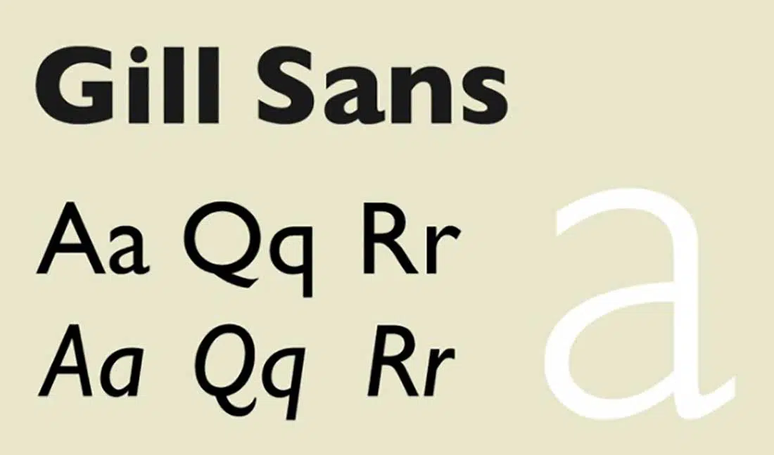
Gill Sans is a very old font thus, very popular. It has both a modern and classic look and was used in many marketing materials over the years.
Garamond
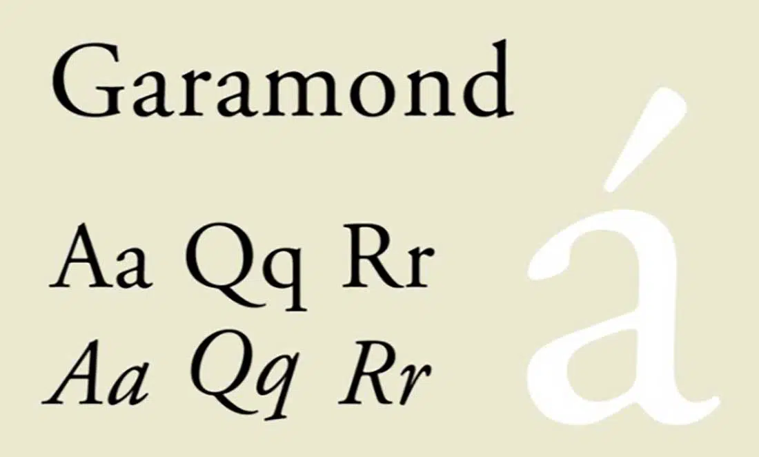
Garamond is a font best suited for publications, culinary blogs, and food-related materials. The shape of the letters just makes you think about French cuisine. You wouldn’t want that when using it for a blog article, official report or any other official papers.
Copperplate Gothic
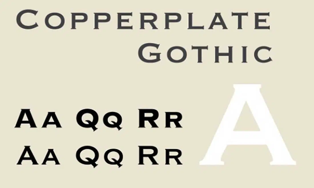
Copperplate Gothic is clearly a bad and old looking font. The design of this font has influences from both the Roman and the Victorian era and has only capital letters. The thin sheriff of this font can create some problems when printing embossments. Another negative aspect is that all the letters are similar in design and can be extremely hard to read. Make sure you won’t use this font when working on your resume.
You just listed all my favourite fonts 🙁
What fonts do you believe should be on this list?
Times New Roman should have been 1-20 on the list.
Just because a font is popular doesn’t make it ‘the worst font’
You forgot to add Helvetica and Bleeding Cowboys
I totaly disagree with this article
Do you have any fonts you believe should be on this list?
I like all the ones except Bradley Hand.
It’s good that we all can have different “opinions and perspectives”. Imagine how boring life would be if we didn’t. This post was written to bring awareness to fonts that are 1. Hard To Read, 2. Outdated. But again, it’s just a perspective and opinion. Thanks to all for the comments and input – Have a great day!