When you design a website, you do so with the aim of connecting with as many members of your target audience as possible. This connection needs to be more than just that they understand what you offer, you need to make an emotional impact on them. In this piece, we will take a look at some psychological pointers from web user studies that you should take into consideration as you set up and manage your website, whether through the help of an all-in-one website builder like Wix or using a stand-alone CMS or custom design.
- Text is still king
We are well into the era of video and image-based content, but the text hasn’t been relegated to the back burner completely. Web-users want to see videos and your quality images but they also still want to read quality content. You can get away with having a text-heavy website because users want comprehensive solutions to problems and search engines still rely on text heavily to rank websites.
We are used to reading about features and benefits, and so most web visitors expect you to detail your offering on your website. Give them what they expect and they will feel more comfortable.
- English speaking users start reading from the top left corner of the page
This is a habit borne out of years of reading offline. It is important to have important content, announcements, adverts, opt-in forms, etc. around this area. You need to design with psychological biases in mind.
- Readers are blind to your banners
Banners worked in the past, but not anymore. As web users, we have trained ourselves to ignore them. Even worse, studies suggest that banners can lead to you losing users; especially if said banners are flashing, colorful, and animated to attract attention.
Nobody likes being marketed to. There is a reason why Ad-blockers have become such big business. Find less antagonizing ways of spreading your marketing message on your site.
- Fancy fonts evoke a frown not a smile
When designing a website, there are lots of fonts options you can use. The average web user will ignore fancy fonts so why are there so many in popular use? To avoid alienating your users, use standard fonts or variations thereof. Your visitors have known them for years and are therefore more conversant with them. Don’t reinvent the wheel.
Using fancy fonts will require that your web visitors invest more of their psychological processing power/attention reading the content. Usability is all about making your visitors comfortable and making tasks easy for them.
- Lower sections of your website, below the fold, are scanned not read
Repeated studies have demonstrated that by the time users scroll down to the end on your website, they have already found what they are looking for or are on the verge of navigating away from the page. Any information you want to be assimilated should not be placed at the bottom of the page.
Having said that, experienced website users typically scroll the page immediately on entering the site and scan the titles for relevance. You want to evoke neural activations in order to generate interest. This means using keywords in titles and addressing the main reason that the user should stay on your page to delve deeper.
- 3-seconds is the maximum load time many will accept
Much has been said about the short attention span of the average web user. “If your site load speed is more than 3 seconds, you will likely have a high bounce rate,” says Brendan at Umbrellar.nz. “To avoid this, ensure proper on-page optimization and consider changing your web hosting plan to something more powerful.”
If you have issues with your web page load speed there are numerous tools to help you identify and solve the problem. As always, Google provides one of the best tools!
- The shorter the paragraph the better
Leading on from the “attention span” consideration above, visual fatigue is a problem for many online users. If you have large clumps of text on your pages, the average user will move on elsewhere to get the content they are looking for. Cut your content down into smaller paragraphs for simpler consumption, requiring less cognitive processing. For some, a clump of text will automatically trigger their exit from your site. Is that the kind of call to action you want?
- Lists and statistics are a good way to keep the user focused and convince them
Content in a list structure will get more views and interactions than content structured in blocks. The list structure is easy to follow and can be scanned. There is also a subconscious authority to lists. Lists overcome objections and add psychological weight to a piece.
Statistics are incredibly powerful in convincing website visitors. Even when the statistic doesn’t really have that much logical weight it still seems to aid with conversion. The mere fact you have included percentages or survey figures gives people confidence. That is not to say you should include meaningless statistics of course. Add some stats from industry-leading organizations that support your call to action where possible.
- Best ad views are achieved at the top and left of your page and between great content
Since we have already established that users start viewing a site from the top left, it is only natural that ads in these areas get the most engagement. When tapping into this, however, don’t use animated banners and avoid advert holders that look out of sync with the rest of the site. Additionally, if the content is compelling, you will get more views on ads in between. People read more slowly with such content and are therefore far more likely to get a good view of any ads placed in between them. They will be receptive to relevant ads.
- Big images get more views than small ones

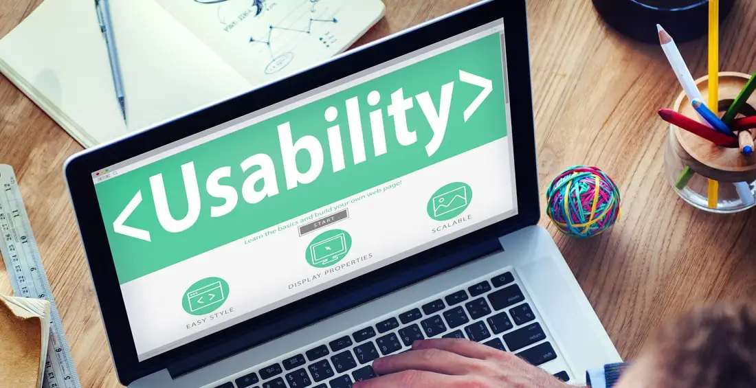
This is a no-brainer. Big images like the one you see above get more views than smaller images. However, you need to be careful not to use images that will hamper the overall performance of your site. Optimize larger images in Photoshop or with an image optimization program. We’ve made sure to compress our images as much as possible without sacrificing image quality.
- Headlines and subtitles grab attention
Most of your visitors will scan through content on your site. Using headlines before important paragraphs is a great way to draw attention to said paragraphs. The catchier you make your headline the better. Think about how you can evoke emotion. You need to appeal to the emotional brain. The old primitive brain classics of fear, sex, and power are often the best.
- White space is a positive
If you are among those web owners that would rather fill out the white space, think again. White space creates an airy feeling around a page. Think of the emotional differences between entering a neutral or white-colored enclosure and entering a dark-colored one. For users, the feeling on a site with adequate white space can be comparable to the feeling in a room painted white!
Our brains are built to think in terms of real-world environments rather than virtual environments. How would you feel entering a cluttered, dark room?
- Design your menus appropriately
Visitors spend a good amount of time using your menus and buttons- if they don’t bounce straight away anyway. It is therefore important for you to ensure that your menus are intuitive and properly designed. Avoid excessive layering of menus and keep things simple.
Categories should never take all the space at the top page menu. There should be space for your Home, About, and Contact-buttons up there regardless of what you do! Simple navigation blunders could lead to poor conversion and high bounce rates. Add contact details to your site to add credibility, especially if you are dealing with local customers.
- The human face of the company
As people, we want to connect with other people. By showing the human face of the company you can create emotional engagement. This can be done these days through company videos too.
These practical points highlight how important psychology is to the development and deployment of your online presence. They are really just the tip of the iceberg. We’d love to hear what you think!
This is such a great lists of things to have in mind when creating a new site. After it’s done, I always recommend using tools like HotJar (free trial of 300 recordings) to see what needs to be changed in terms of webdesign.
Amazing tips. These things must be considered by developer who is working on web or application development. Whether it is a custom development or development by enterprise web content management services like Sitefinity CMS, WordPress etc., the most important criteria to consider is user experience. Make sure that Content and graphics are relevant to business offerings. Also ensure to have smooth internal navigation and have clearly placed CTAs.
Appreciate the point that says that section below the fold is scanned and not read. Any thing placed under that must be attractive enough to catch an eye of a visitor.
nice tutorial on web visitors psychology